The Making of a Mural

 
IMG_3590.JPG

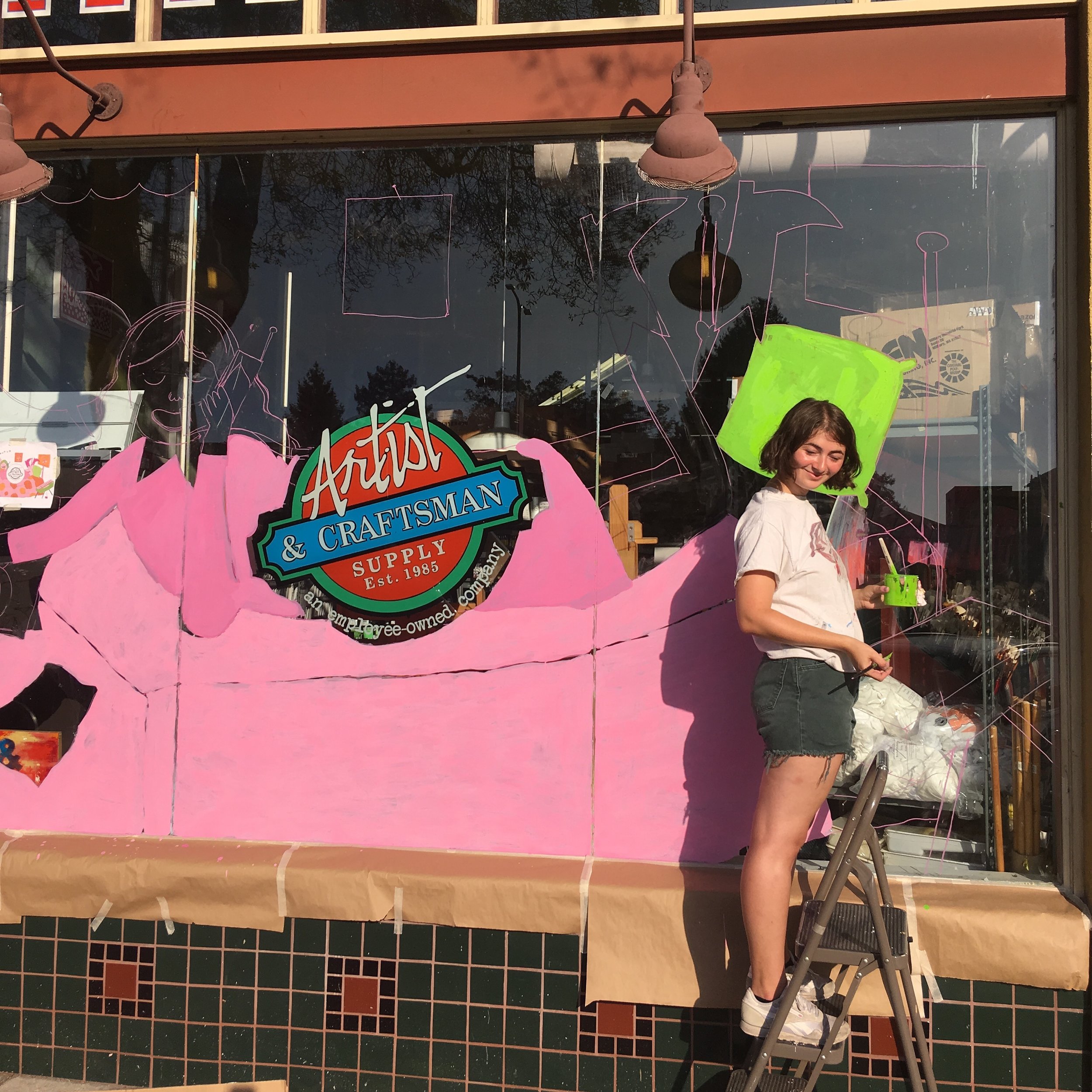
I visit the Artist and Craftsman in Berkeley (on 2573 Shattuck Ave, to be specific) more than any other store in the whole world. I kid you not, I'm there running errands for my various art related jobs at least once a week. If you've never been, I implore you to hop on your moped, bike, scooter, or heck even Boeing 747 and check it out. Never have been to an art store with cooler vibes, nicer people or more expansive color selection of gouache paints. After a solid year of hard crushin' on A&C (visiting every week, sometimes twice in the same day, and lingering too long in the paint brush section, where I would philosophize on the benefits of the filbert brush) they finally popped the big Q: Would I be interested in painting their Fall window mural? "I'm so down!!" I most likely said, after mopping up the puddle of profound honor and excitement my body melted into. 

A&C left side smaller.jpg
A&C right side smaller.jpg

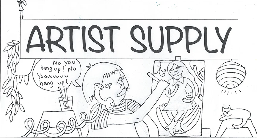
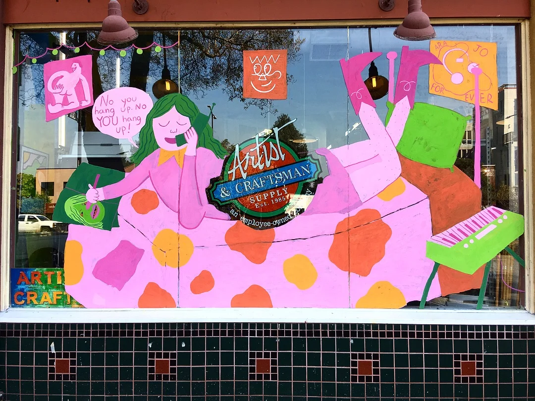
After proposing a couple sketches, we landed on the one I made of two best friends talking on the phone while making art in their rooms, which is by no coincidence how I spend the majority of my time.

A&C window art left side .jpg
After making a sketch, I scanned it onto my computer and played around with the color in Photoshop. 

After making a sketch, I scanned it onto my computer and played around with the color in Photoshop. 

The initial inspiration for the mural, titled No You Hang Up, was the playfulness and kitschy nostalgia of early 2000s TV friendships like Lindsay Mcguire, as well as my gratitude for my creative group of friends. As I finalized my sketches, I realized I also wanted the mural to be a celebration of the brilliant, loving, and inclusive Bay Area art community that I feel lucky to be apart of. For me, celebrating this community meant paying homage to the vital artists and organizers who dedicated their lives to supporting and building it. 

IMG_3710.JPG

No You Hang Up references Ara Jo, a radiant human being who supported, welcomed and befriended countless artists in the Bay Area and beyond. The mural also makes reference to Aaron Curry, commonly known as ORFN, a prolific and raw creative who influenced generations of street artists. Both artists passed away a year ago, in December 2016. This mural is dedicated to them, as well as artist Jeffery Chung, founder of Unity Press who continues to build and grow community for queer and POC folks in the East Bay. 

IMG_3711.JPG
IMG_3709.JPG

Painting the mural was such a blast and tremendous privilege to paint, and I couldn't have done without the help of my friends and the awesome crew at A&C. If you're in the area, come stop by! It will be up until the end of December. And if you're an East Bay resident, stay tuned for a zine workshop I'll be teaching there on December 10th! 


Cray-Pas Oil Pastels


The first time I picked up an oil pastel was in the fourth grade, when I fell head-over-heels in love with the notoriously shorty of Post-Impressionist fame, Henri de Toulouse-Lautrec. If I recall, it all started with an assignment to create a class report on a famous artist that I took far too seriously. When the project was assigned, there was no doubt in my mind that I would report on Toulouse-Lautrec. Just the weekend before my grandma and I had visited the Norton Simon Museum in Pasadena, where I became hypnotized by the artist's boisterous cabaret ladies drawn fanatically in day-glo colors I never knew we were allowed to use. That a lady's face could be colored absinthe green and her legs neon purple simply blew my mind.

Seated Dancer in the Pink Tights, Henri de Toulouse-Lautrec, 1890. 

Seated Dancer in the Pink Tights, Henri de Toulouse-Lautrec, 1890. 

At the Moulin Rouge, Henri de Toulouse-Lautrec, 1895. 

At the Moulin Rouge, Henri de Toulouse-Lautrec, 1895. 

I came away from the museum knowing two things:

1. Henri de Toulouse-Lautrec was my new favorite artist of all time. 
2. Oil pastels, Toulouse-Lautrec's art material of choice, were the coolest thing ever. 

Fast-forward thirteen years later, and I still feel the same way. If you ask me, oil pastels, specifically Sakura of America's Cray-Pas Junior Artist Oil Pastels, are an essential in any art class or creative home. Why, you ask? Well if Toulouse-Lautrec's paintings aren't proof enough, get this: oil pastels are so incredibly waxy and smooth that when you drag a stick across the page it feels like drawing with butter. It's insanely satisfying! 

Also, Cray-Pas are filled to the brim with delicious pigment, and are exceedingly more rich and vibrant than your run-of-the-mill oil pastels. The smooth quality of the sticks allows Cray-Pas colors to be super easy to mix and blend. There's many different styles and techniques for drawing and blending, and it's fun to experiment with oil pastels to see what works.  

Some helpful tips and tricks for using Cray-Pas oil pastels that I've learned over the years:

1. Mixing colors with your fingers (like you easily can with chalk pastels) is fun, but pretty messy. Try using a palette knife to mix, or experiment with the amount of pressure you use when you press down your pastel. 

2. Experiment with different drawing surfaces. Grey and dark beige heavy weight paper amplify the vibrance of the pastels. Pastels also look ultra-cool on cardboard!

3. There are many different stroke methods you can use to create interesting effects with oil pastels. You can layer colors to create unique color combinations, or try sgraffito, a method of scratching lines through thick layers of colors to reveal the color underneath. 

You can also try stippling, a method where you use short, quick strokes or dots of color to create an optical effect when seen from far away, as in Georges Seurat's Pointillism paintings. To create a soft, defused effect like Claude Monet, try scumbling by creating controlled scribbled marks. 

Close-Up of Circus Slideshow,  George Seurat, 1888

Close-Up of Circus Slideshow,  George Seurat, 1888

Impression, Sunrise, Claude Monet, 1872

Impression, Sunrise, Claude Monet, 1872


4. For inspiration, make sure to check out Toulouse-Lautrec's gorgeous oil pastel sketches of everyday life. 

Henri Toulouse-Lautrec

Henri Toulouse-Lautrec

Henri Toulouse-Lautrec

Henri Toulouse-Lautrec


We're so excited to have Sakura sponsor Issue #4 of Illustoria, which is on shelves and available now. We hope you enjoy our Cray-Pas oil pastel tips, now get out there and start sketching! 

Giveaway! Art supplies + Issue 3


Get your hands on The Outside-In Issue plus these amazing art supplies by our issue 3 sponsor, Sakura of America. Kids and grownups will love drawing with Pen-touch paint markers. If you haven't read our review of these versatile, easy-to-use markers, check it out here. And Micron pens are our absolute go-to tool for letter writing, drafting, doodling, sketching, and drawing. 

Head to our Instagram post for giveaway entry details. Good luck!

Sakura's Pen Touch Marker Review


If you’re like me, the kind of person that makes a beeline for the pen section at an art store, and then lingers farrrr too long before making a purchase, than you too will understand that there is truly nothing more satisfying than a thick, inky marker. Finding a marker that is super opaque, saturated with color, lasts a long time, AND is shiny is a rare, rare thing. Pretty much the holy grail of markers. Well, you can call me King Arthur because the quest is over. Ladies and gentleman, I give you Sakura’s Pen Touch paint markers.

Tee-dah! Wow, so beautiful right? While these markers will not provide eternal youth or instant nirvana; abundant happiness it can offer - I’ll promise you that much. These markers are extremely versatile. They can draw on pretty much any surface (glass, wood, porcelain, plastic, paper and metal) and will dry instantly. But it’s not regular ol’ ink coming out of the tip--- it’s super rich, opaque paint!

They come in a range of sizes from 0.7mm (thin) to 2.0mm (super thick) which is great for creating and experimenting with variety of line widths. Packs come in metallic (gold, silver, and copper) and assorted colors (purple, blue, yellow, red, green, white and black).

The ink flows from the chamber of the pen to the tip, so to get started give ‘em a couple shakes with the cap still on, then uncap. Depress the tip in an upright position to release any internal pressure. Press firmly on a piece of paper until the ink is released. (Be sure not to over-pump.) Occasionally, the tip will run out of ink, but fear not! Just continue to shake the marker and more paint will flow.

sakura pic.jpg

I’ve been using these guys on everything from protest posters to paper mache! Gatta say, they make nearly every project 100% cooler, and they’re waaayyyy faster to use than actual paint. You can achieve finer, smoother detail too. Just remember, these paint markers are permanent and will stain! So, best to use on non-precious objects, aka NOT the walls, hands, grandma’s hundred year old porcelain, etc.

We're so excited to have Sakura sponsor Issue #4 of Illustoria, which will be on shelves this spring. Meanwhile, you can grab your Pen Touch paint markers and start drawing! 

**** NOW thru 3/31/17: Enter promo code SAKURA at checkout for a 10% discount off ILLUSTORIA subscriptions and gift subscriptions! ****