Creating Cover Art for #7: The Black & White Issue

Hi All! 

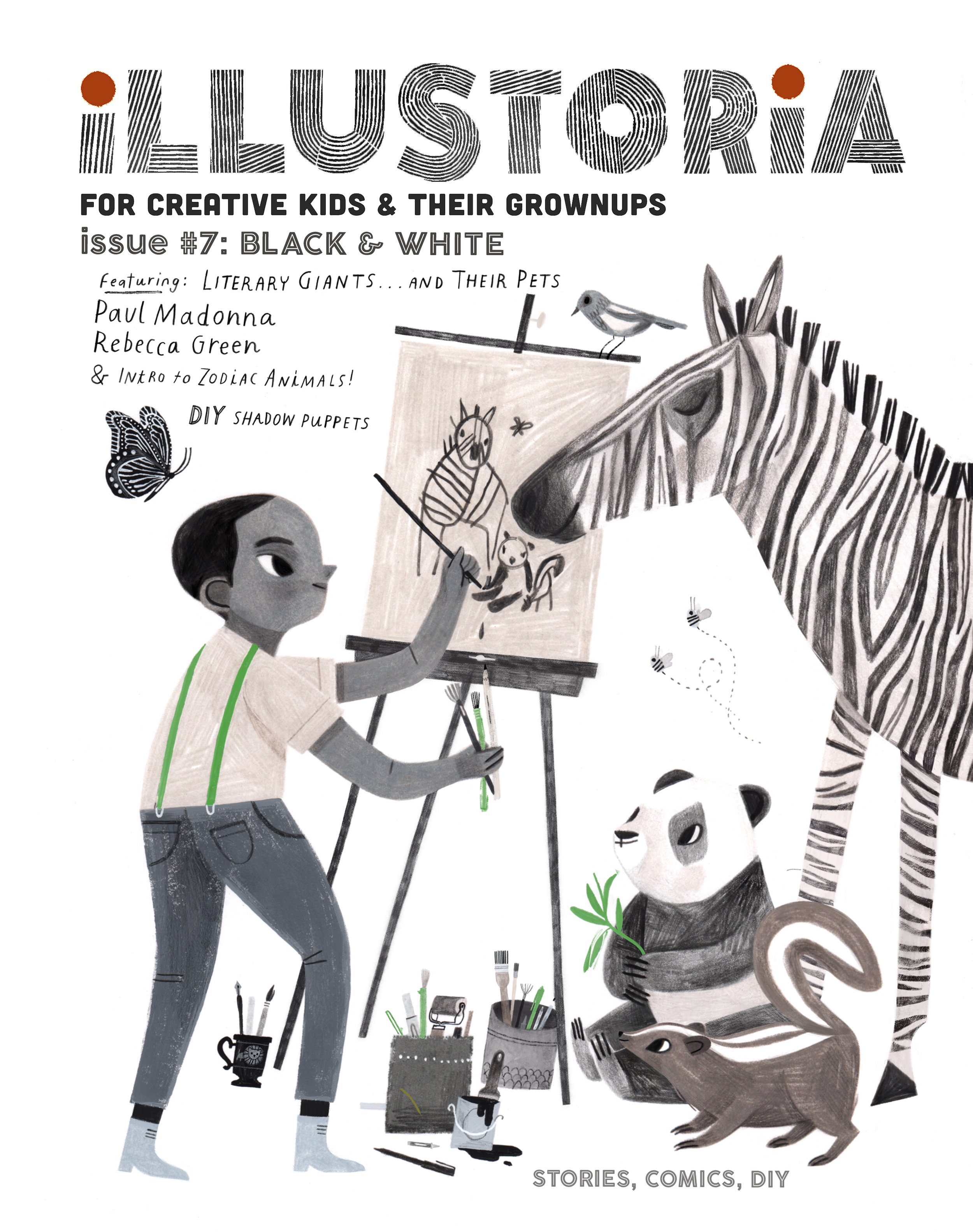
Rebecca Green here (you can call me Becca!). I had the pleasure of creating the cover for Illustoria Issue #7, The Black and White Issue, and today we're going to walk through a bit of the creative process behind the illustration. 

Illustration by ©  Rebecca Green 

Illustration by ©  Rebecca Green 

Besides sending along keywords, details about the features, and some of my previous art they were drawn to, Joanne and Beth of Illustoria gave me a lot of freedom to choose which direction I wanted to go with the artwork. Immediately, I knew I wanted to draw a little boy with black and white animals. I started with this simple sketch. 

Illustration by © Rebecca Green

Illustration by © Rebecca Green

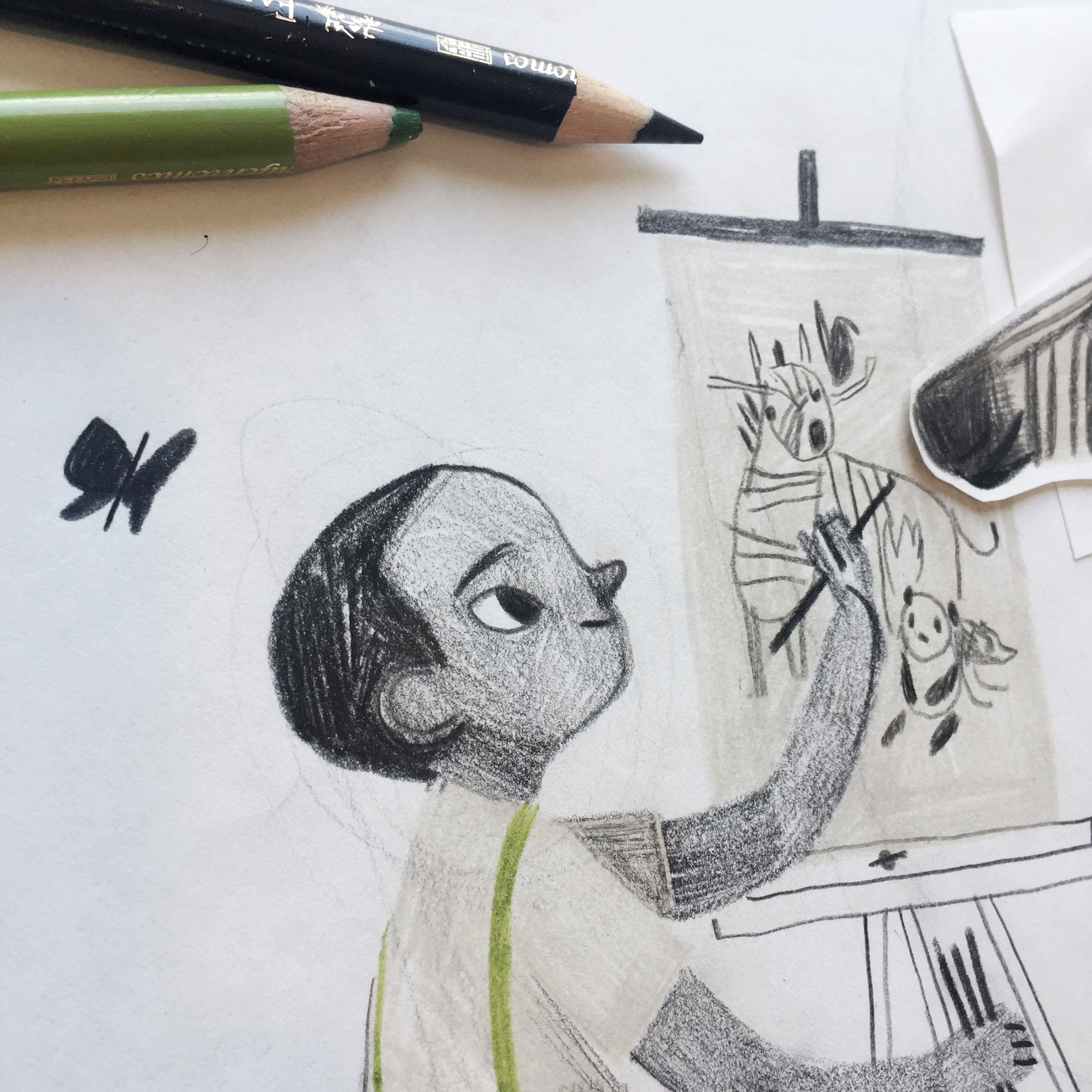
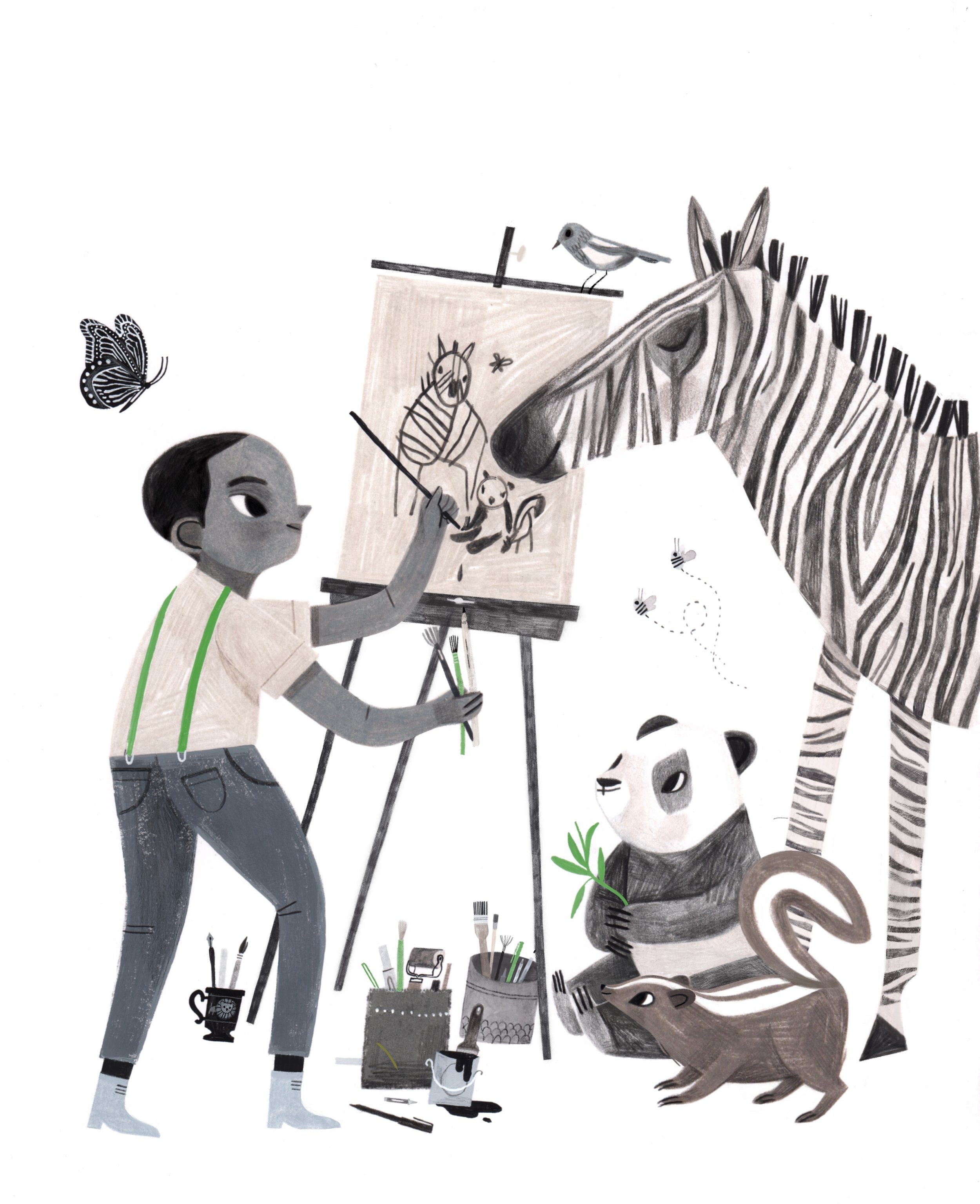
The drawing, I decided, needed something more. The boy would be...an artist! Complete with an easel and lots of brushes and markers. One thing I did like in the first drawing was the use of one simple color. Green felt right. (and not because it's my last name!) The sketch was drawn in colored pencil (I use Faber-Castell and Prismacolor). 

becca 2.jpg
becca 3.jpg
Illustrations by © Rebecca Green

Illustrations by © Rebecca Green

beeca 5.jpg

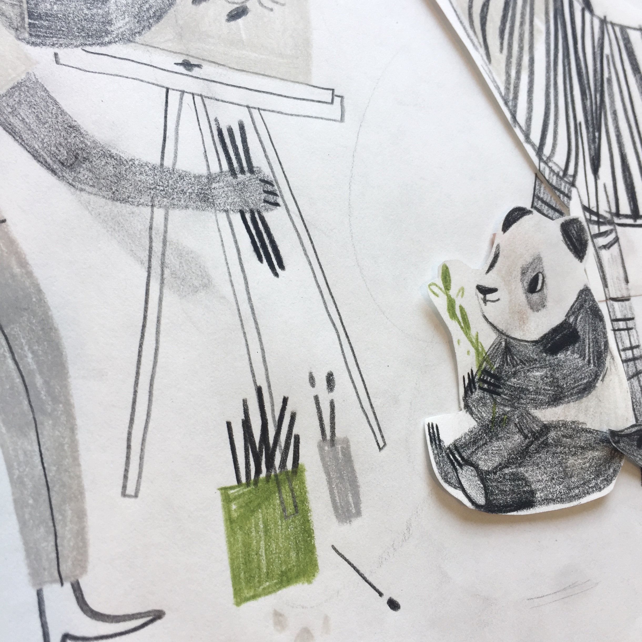
As you can see, I drew some of the elements on a separate piece of paper and cut them out so I could try out placing them in multiple places. One I had my complete sketch, I scanned it, cleaned it up a bit in Procreate (on my IPad), and send it in for approval. 

Illustration by © Rebecca Green

Illustration by © Rebecca Green

Once the sketch was approved (this meant making the image a little bigger and enhancing the butterfly), I went to work on the final. I created the final illustration in gouache and colored pencil. Here are some peeks of the cover before it was edited!

Illustrations by © Rebecca Green

Illustrations by © Rebecca Green

becca 7.jpg
becca 8.jpg

The final illustration was edited in Procreate and Photoshop, along with the hand-lettered text. When finished, it was sent to the kind folks at Illustoria and voilà! A cover was born!

Illustration by © Rebecca Green

Illustration by © Rebecca Green

There you have it - a glimpse into the world of the cover creation. Hope you guys enjoy the issue, and thanks for letting me share a peek into my process. And thanks to Illustoria for having me! 

Cray-Pas Oil Pastels


The first time I picked up an oil pastel was in the fourth grade, when I fell head-over-heels in love with the notoriously shorty of Post-Impressionist fame, Henri de Toulouse-Lautrec. If I recall, it all started with an assignment to create a class report on a famous artist that I took far too seriously. When the project was assigned, there was no doubt in my mind that I would report on Toulouse-Lautrec. Just the weekend before my grandma and I had visited the Norton Simon Museum in Pasadena, where I became hypnotized by the artist's boisterous cabaret ladies drawn fanatically in day-glo colors I never knew we were allowed to use. That a lady's face could be colored absinthe green and her legs neon purple simply blew my mind.

Seated Dancer in the Pink Tights, Henri de Toulouse-Lautrec, 1890. 

Seated Dancer in the Pink Tights, Henri de Toulouse-Lautrec, 1890. 

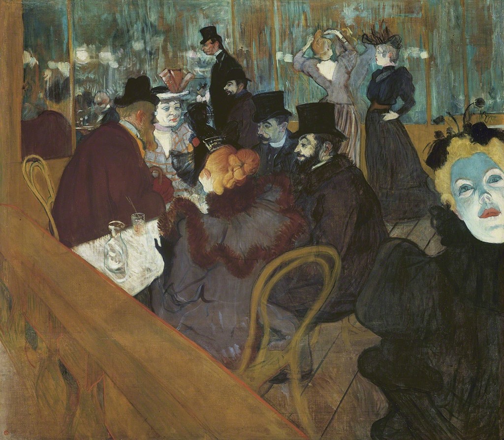
At the Moulin Rouge, Henri de Toulouse-Lautrec, 1895. 

At the Moulin Rouge, Henri de Toulouse-Lautrec, 1895. 

I came away from the museum knowing two things:

1. Henri de Toulouse-Lautrec was my new favorite artist of all time. 
2. Oil pastels, Toulouse-Lautrec's art material of choice, were the coolest thing ever. 

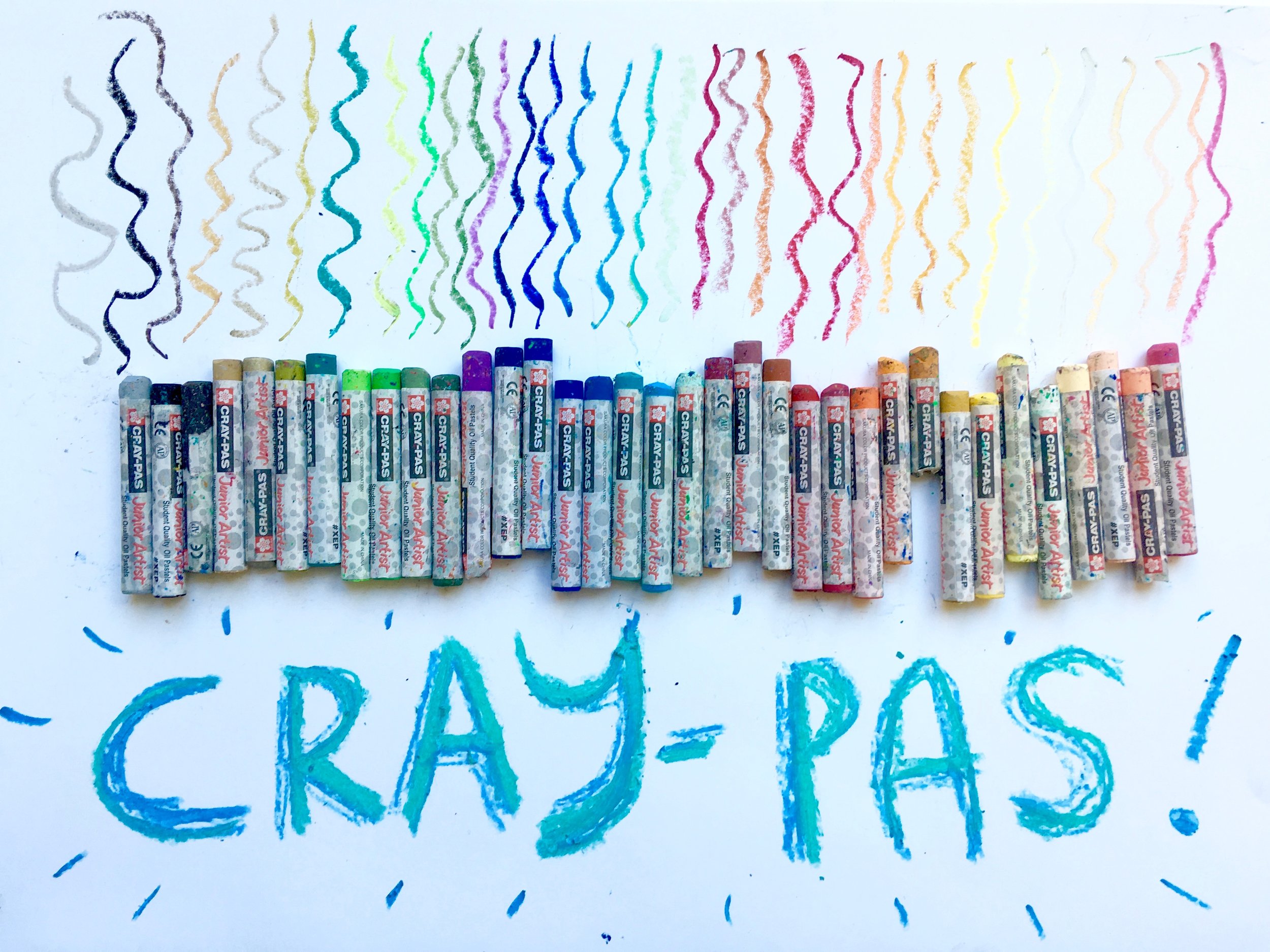
Fast-forward thirteen years later, and I still feel the same way. If you ask me, oil pastels, specifically Sakura of America's Cray-Pas Junior Artist Oil Pastels, are an essential in any art class or creative home. Why, you ask? Well if Toulouse-Lautrec's paintings aren't proof enough, get this: oil pastels are so incredibly waxy and smooth that when you drag a stick across the page it feels like drawing with butter. It's insanely satisfying! 

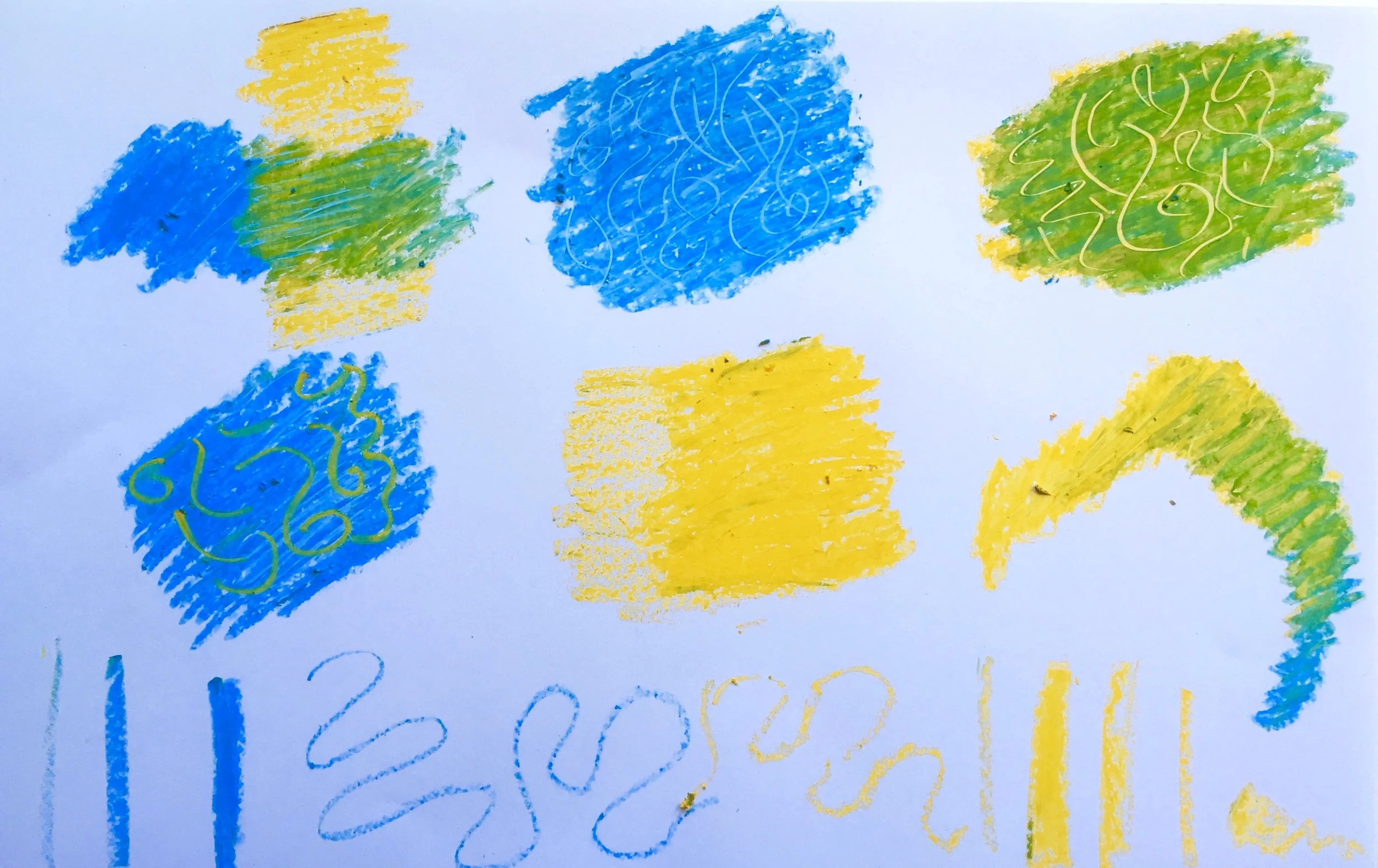
Also, Cray-Pas are filled to the brim with delicious pigment, and are exceedingly more rich and vibrant than your run-of-the-mill oil pastels. The smooth quality of the sticks allows Cray-Pas colors to be super easy to mix and blend. There's many different styles and techniques for drawing and blending, and it's fun to experiment with oil pastels to see what works.  

Some helpful tips and tricks for using Cray-Pas oil pastels that I've learned over the years:

1. Mixing colors with your fingers (like you easily can with chalk pastels) is fun, but pretty messy. Try using a palette knife to mix, or experiment with the amount of pressure you use when you press down your pastel. 

2. Experiment with different drawing surfaces. Grey and dark beige heavy weight paper amplify the vibrance of the pastels. Pastels also look ultra-cool on cardboard!

3. There are many different stroke methods you can use to create interesting effects with oil pastels. You can layer colors to create unique color combinations, or try sgraffito, a method of scratching lines through thick layers of colors to reveal the color underneath. 

You can also try stippling, a method where you use short, quick strokes or dots of color to create an optical effect when seen from far away, as in Georges Seurat's Pointillism paintings. To create a soft, defused effect like Claude Monet, try scumbling by creating controlled scribbled marks. 

Close-Up of Circus Slideshow,  George Seurat, 1888

Close-Up of Circus Slideshow,  George Seurat, 1888

Impression, Sunrise, Claude Monet, 1872

Impression, Sunrise, Claude Monet, 1872


4. For inspiration, make sure to check out Toulouse-Lautrec's gorgeous oil pastel sketches of everyday life. 

Henri Toulouse-Lautrec

Henri Toulouse-Lautrec

Henri Toulouse-Lautrec

Henri Toulouse-Lautrec


We're so excited to have Sakura sponsor Issue #4 of Illustoria, which is on shelves and available now. We hope you enjoy our Cray-Pas oil pastel tips, now get out there and start sketching! 

Giveaway! Art supplies + Issue 3


Get your hands on The Outside-In Issue plus these amazing art supplies by our issue 3 sponsor, Sakura of America. Kids and grownups will love drawing with Pen-touch paint markers. If you haven't read our review of these versatile, easy-to-use markers, check it out here. And Micron pens are our absolute go-to tool for letter writing, drafting, doodling, sketching, and drawing. 

Head to our Instagram post for giveaway entry details. Good luck!

Sakura's Pen Touch Marker Review


If you’re like me, the kind of person that makes a beeline for the pen section at an art store, and then lingers farrrr too long before making a purchase, than you too will understand that there is truly nothing more satisfying than a thick, inky marker. Finding a marker that is super opaque, saturated with color, lasts a long time, AND is shiny is a rare, rare thing. Pretty much the holy grail of markers. Well, you can call me King Arthur because the quest is over. Ladies and gentleman, I give you Sakura’s Pen Touch paint markers.

Tee-dah! Wow, so beautiful right? While these markers will not provide eternal youth or instant nirvana; abundant happiness it can offer - I’ll promise you that much. These markers are extremely versatile. They can draw on pretty much any surface (glass, wood, porcelain, plastic, paper and metal) and will dry instantly. But it’s not regular ol’ ink coming out of the tip--- it’s super rich, opaque paint!

They come in a range of sizes from 0.7mm (thin) to 2.0mm (super thick) which is great for creating and experimenting with variety of line widths. Packs come in metallic (gold, silver, and copper) and assorted colors (purple, blue, yellow, red, green, white and black).

The ink flows from the chamber of the pen to the tip, so to get started give ‘em a couple shakes with the cap still on, then uncap. Depress the tip in an upright position to release any internal pressure. Press firmly on a piece of paper until the ink is released. (Be sure not to over-pump.) Occasionally, the tip will run out of ink, but fear not! Just continue to shake the marker and more paint will flow.

sakura pic.jpg

I’ve been using these guys on everything from protest posters to paper mache! Gatta say, they make nearly every project 100% cooler, and they’re waaayyyy faster to use than actual paint. You can achieve finer, smoother detail too. Just remember, these paint markers are permanent and will stain! So, best to use on non-precious objects, aka NOT the walls, hands, grandma’s hundred year old porcelain, etc.

We're so excited to have Sakura sponsor Issue #4 of Illustoria, which will be on shelves this spring. Meanwhile, you can grab your Pen Touch paint markers and start drawing! 

**** NOW thru 3/31/17: Enter promo code SAKURA at checkout for a 10% discount off ILLUSTORIA subscriptions and gift subscriptions! ****