Food for Thought

A guest post by Elizabeth Haidle, Illustoria’s art director.

I was recently visiting the Kansas City Art Institute, as a guest artist this fall. I ran a special assignment, asking students to illustrate a topic related to food & to pair words with their images in any style of their choosing. I was pleased with their surprising variety of responses—family recipes, history of food, cultural traditions, comic journalism featuring food, and food-related ethical concerns. Some went the scientific route, with food diagrams and food traveling through the digestive tract. (Yuck, but fascinating!) Here are some of my favorites, with comments by the artists about their choice of imagery / subject matter:

————————

Art by Nicole Richardson@crimsonrib

Art by Nicole Richardson

@crimsonrib

“With my piece, I wanted to illustrate some things you might find in your kitchen that you might not want to eat. I chose to do this in a style like a medieval herbal manuscript.” — Nina Gookin@NinaGookin

“With my piece, I wanted to illustrate some things you might find in your kitchen that you might not want to eat. I chose to do this in a style like a medieval herbal manuscript.” — Nina Gookin

@NinaGookin

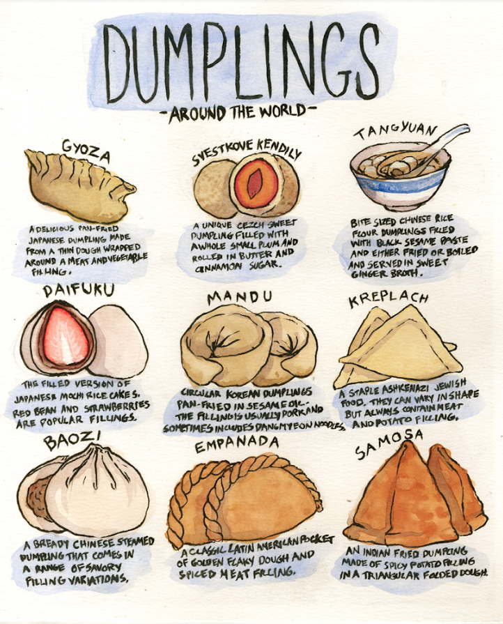
"This illustration was inspired by an emotional revelation i had late one night about how dumplings mirror the human experience. Despite the vast differences in food around the world, nearly every culture has some variation of the dumpling, as diver…

"This illustration was inspired by an emotional revelation i had late one night about how dumplings mirror the human experience. Despite the vast differences in food around the world, nearly every culture has some variation of the dumpling, as diverse in form as the cultures they come from, but all the same in their basic form. It is nice to remember that no matter where you come from or who you are that we all understand the universal comfort and appeal of a small packet of dough." — CJ Nelson

@crowclub

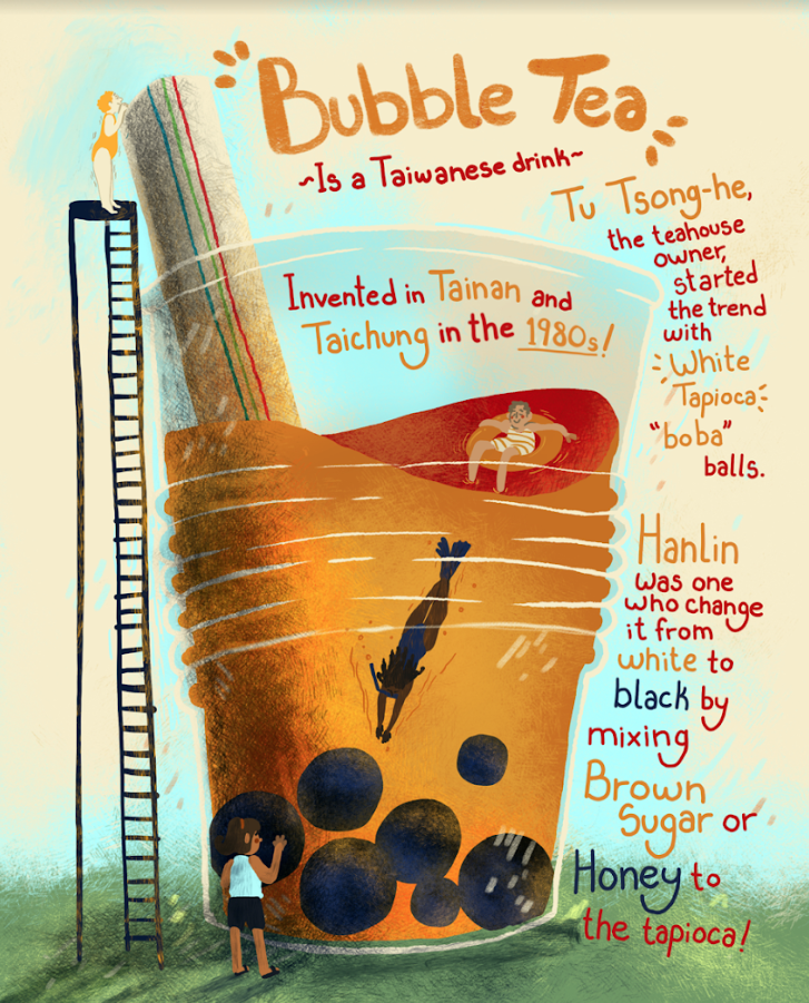
“For the Illustration, I was struggling to create a fun artwork for anyone to learn and appreciate. Then I got inspired by my nostalgia for bubble tea when my friends and I recalled our memories. I remembered that I almost always go to a Bubble Tea …

“For the Illustration, I was struggling to create a fun artwork for anyone to learn and appreciate. Then I got inspired by my nostalgia for bubble tea when my friends and I recalled our memories. I remembered that I almost always go to a Bubble Tea booth to get a tea with my friend weekly. It was one of my favorite memories. Yet that hangout time with my friend led me to a new drink that I grew very fond of. I realized that I barely know anything about my own favorite drink, thus the informative illustration!” —Lacey Vonderschmidt

@Impossibmax

“The recipe I chose to illustrate is a very important one. During the holidays my family and I always make this yummy tea together as a way to bond. We take turns juicing the fruit while mom gets the other ingredients ready. Its always a wonderful t…

“The recipe I chose to illustrate is a very important one. During the holidays my family and I always make this yummy tea together as a way to bond. We take turns juicing the fruit while mom gets the other ingredients ready. Its always a wonderful time and the house is always left smelling delicious!” —Lana Laughlin

@lanalaughlinillustration

“Because I'm originally from Oklahoma, I chose to bring up one of the wackiest facts I know about the state! Most people don't believe me when I tell them about my state vegetable, so I created a colorful comic about it!” — Parker@Hardcoreparker

“Because I'm originally from Oklahoma, I chose to bring up one of the wackiest facts I know about the state! Most people don't believe me when I tell them about my state vegetable, so I created a colorful comic about it!” — Parker

@Hardcoreparker

"When people think about the ethics of eating, they normally think about vegetarianism and animal abuse. I grew up knowing that my extended family were produce farmers that used migrant labor, grew up worrying about the human rights abuses that farm…

"When people think about the ethics of eating, they normally think about vegetarianism and animal abuse. I grew up knowing that my extended family were produce farmers that used migrant labor, grew up worrying about the human rights abuses that farm workers have suffered since the days of Cesar Chavez. The food industry is a huge, wasteful, looming titan that consumes workers and animals alike, and I wanted nothing more than to illustrate exactly why it took up so much space in my head." — Malachi Peters

@malachi_makes

“My interest in honey began with by my agricultural roots. My aunt and uncle are beekeepers. When I moved to the city, I was surprised to learn that some people don't know where food comes from. Migrant workers and small family farms perform the dif…

“My interest in honey began with by my agricultural roots. My aunt and uncle are beekeepers. When I moved to the city, I was surprised to learn that some people don't know where food comes from. Migrant workers and small family farms perform the difficult labor that makes our food possible. I love honey in particular because it has beneficial medicinal properties and because beekeeping directly improves the health of the environment. We rely on farmers as much as farmers rely on bees!” —Casper Warren

@Holytheft

We at Illustoria are always so amazed to see how various artists and writers interpret a theme—often in ways that we would have never imagined ourselves, and certainly in styles and voices that are original and captivating. Thanks to Elizabeth and the students at the Kansas City Art Institute for sharing their beautiful, thoughtful, and inspired illustrations with us!


Creating Cover Art for #7: The Black & White Issue

Hi All! 

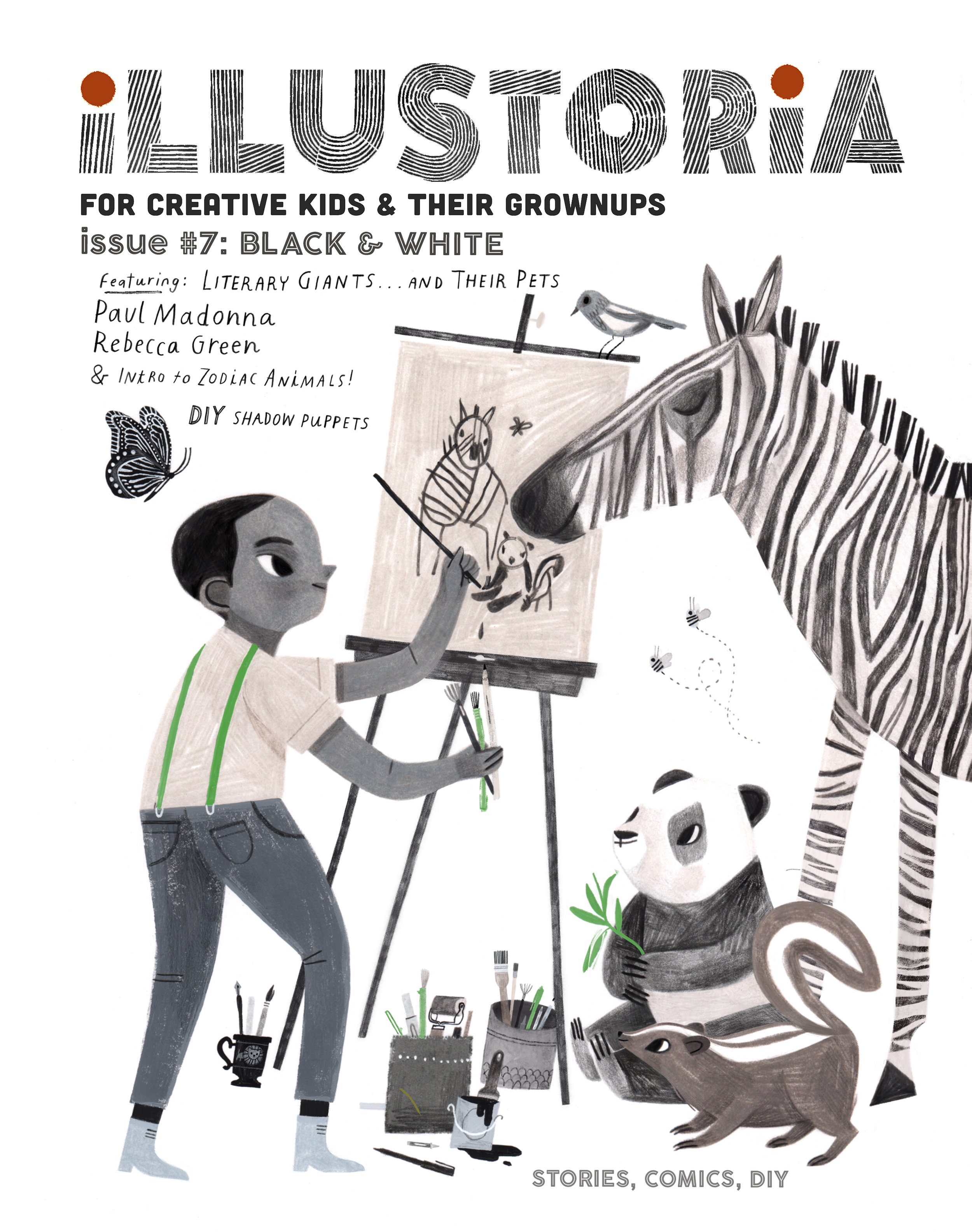
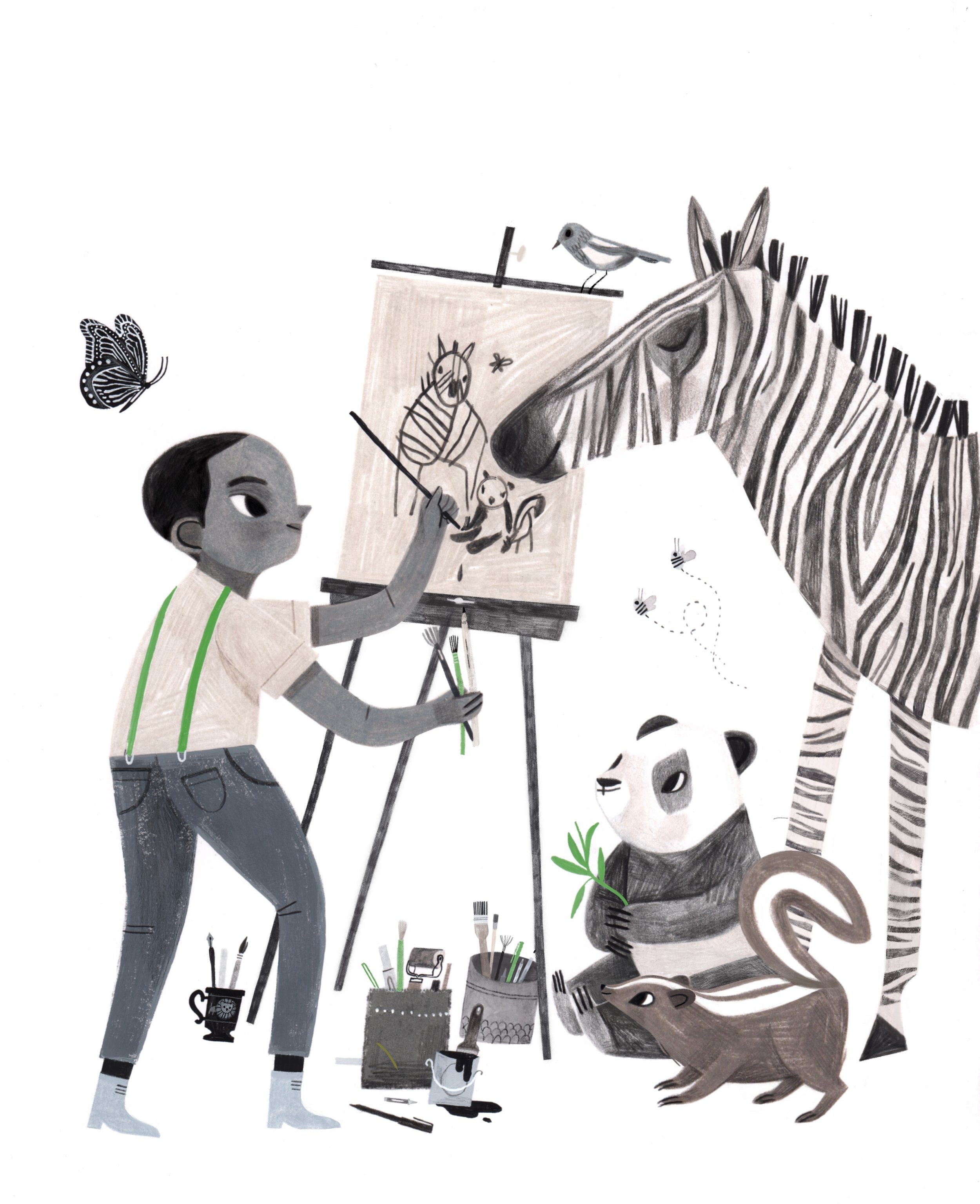
Rebecca Green here (you can call me Becca!). I had the pleasure of creating the cover for Illustoria Issue #7, The Black and White Issue, and today we're going to walk through a bit of the creative process behind the illustration. 

Illustration by ©  Rebecca Green 

Illustration by ©  Rebecca Green 

Besides sending along keywords, details about the features, and some of my previous art they were drawn to, Joanne and Beth of Illustoria gave me a lot of freedom to choose which direction I wanted to go with the artwork. Immediately, I knew I wanted to draw a little boy with black and white animals. I started with this simple sketch. 

Illustration by © Rebecca Green

Illustration by © Rebecca Green

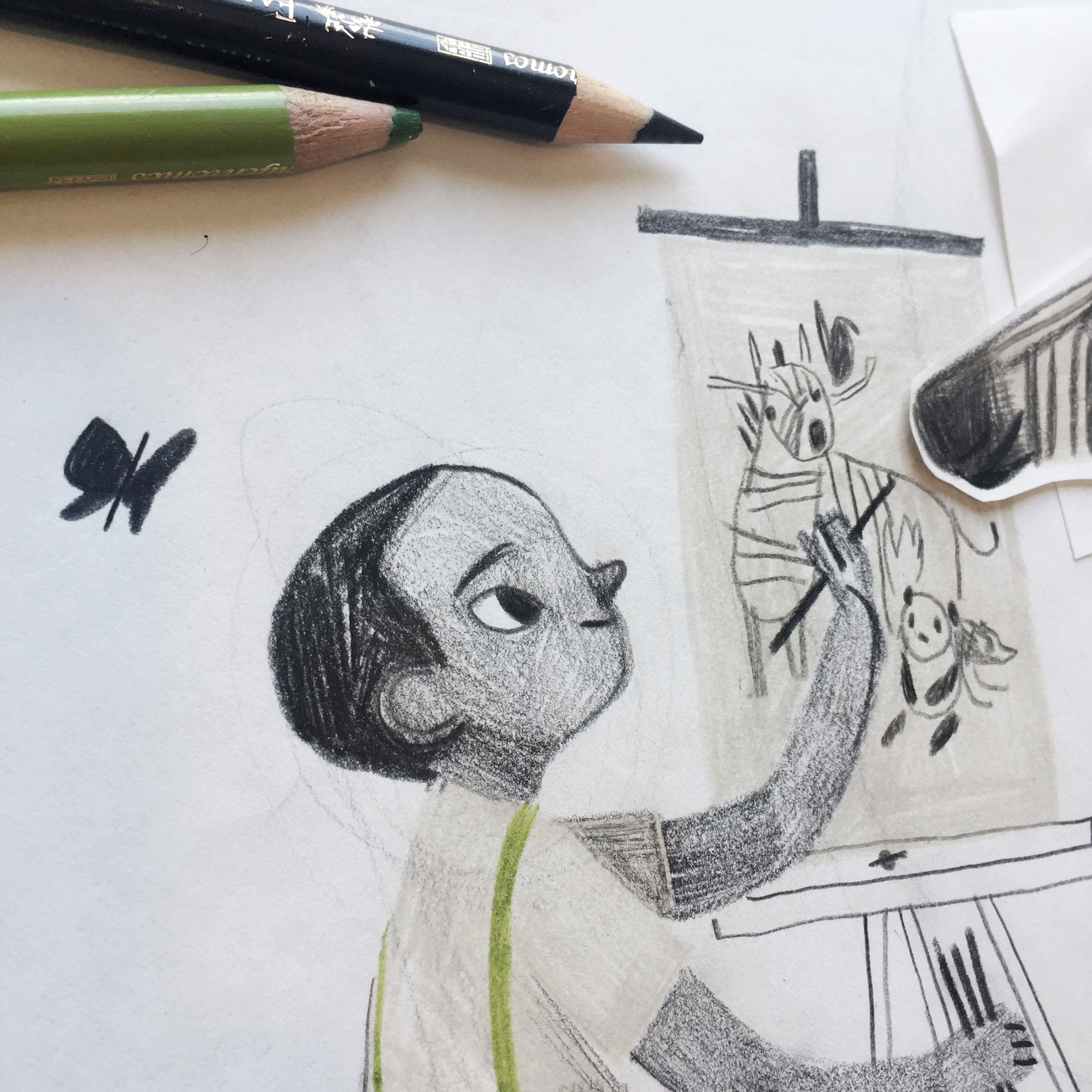
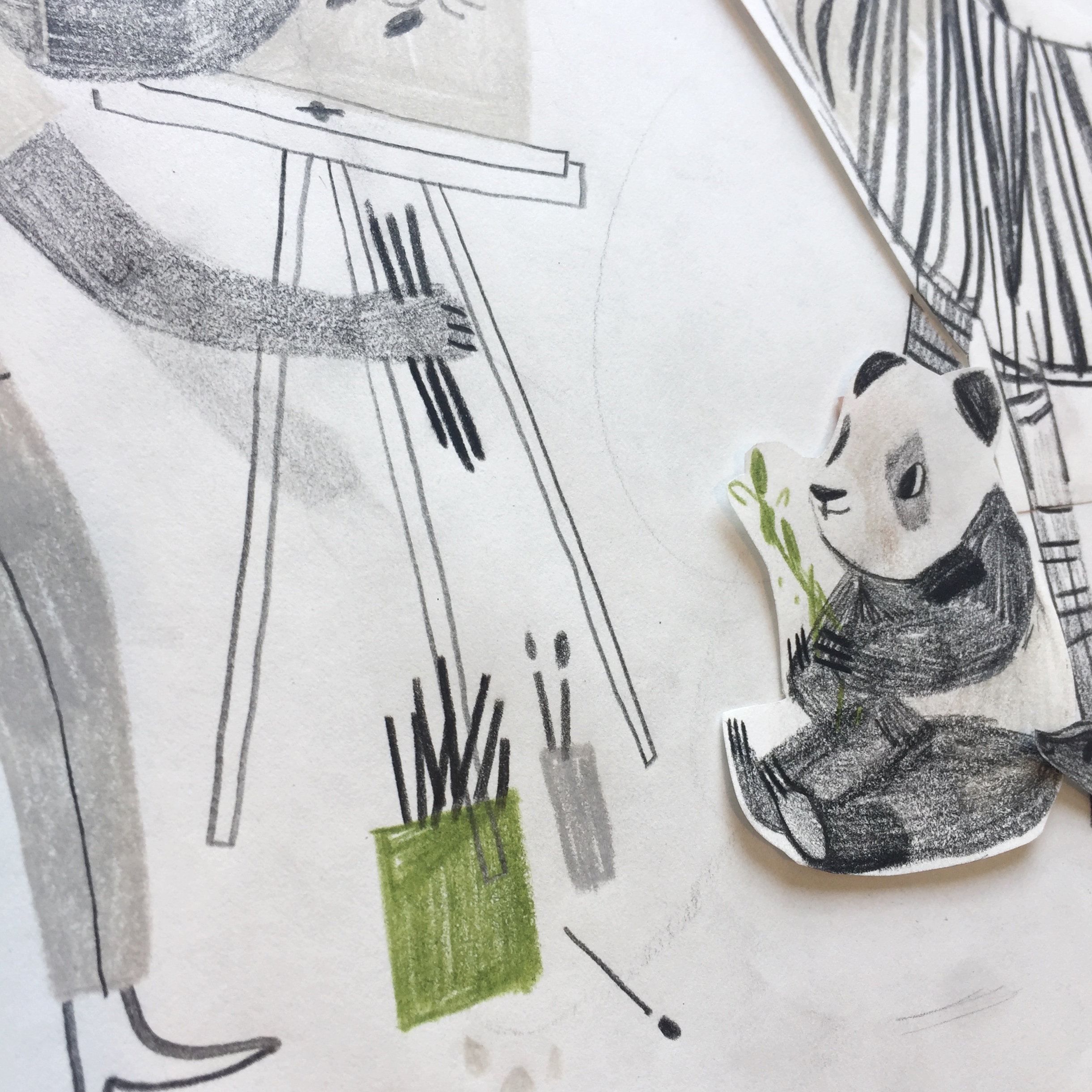
The drawing, I decided, needed something more. The boy would be...an artist! Complete with an easel and lots of brushes and markers. One thing I did like in the first drawing was the use of one simple color. Green felt right. (and not because it's my last name!) The sketch was drawn in colored pencil (I use Faber-Castell and Prismacolor). 

becca 2.jpg
becca 3.jpg
Illustrations by © Rebecca Green

Illustrations by © Rebecca Green

beeca 5.jpg

As you can see, I drew some of the elements on a separate piece of paper and cut them out so I could try out placing them in multiple places. One I had my complete sketch, I scanned it, cleaned it up a bit in Procreate (on my IPad), and send it in for approval. 

Illustration by © Rebecca Green

Illustration by © Rebecca Green

Once the sketch was approved (this meant making the image a little bigger and enhancing the butterfly), I went to work on the final. I created the final illustration in gouache and colored pencil. Here are some peeks of the cover before it was edited!

Illustrations by © Rebecca Green

Illustrations by © Rebecca Green

becca 7.jpg
becca 8.jpg

The final illustration was edited in Procreate and Photoshop, along with the hand-lettered text. When finished, it was sent to the kind folks at Illustoria and voilà! A cover was born!

Illustration by © Rebecca Green

Illustration by © Rebecca Green

There you have it - a glimpse into the world of the cover creation. Hope you guys enjoy the issue, and thanks for letting me share a peek into my process. And thanks to Illustoria for having me! 

Creator Crush: Willie Real

 
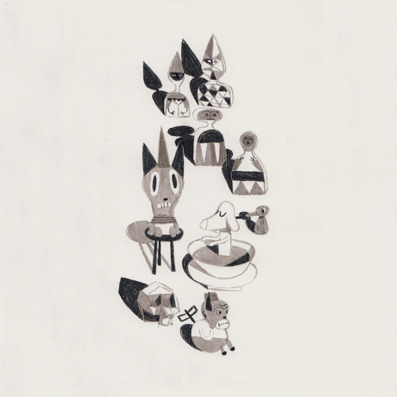
artwork by © Willie Real

artwork by © Willie Real

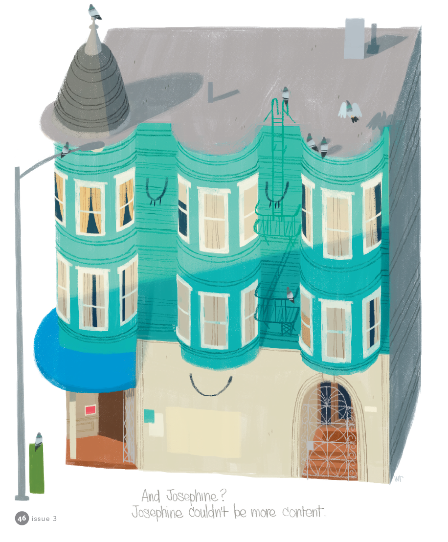
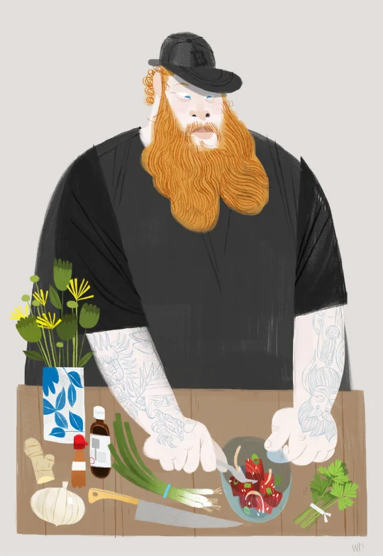
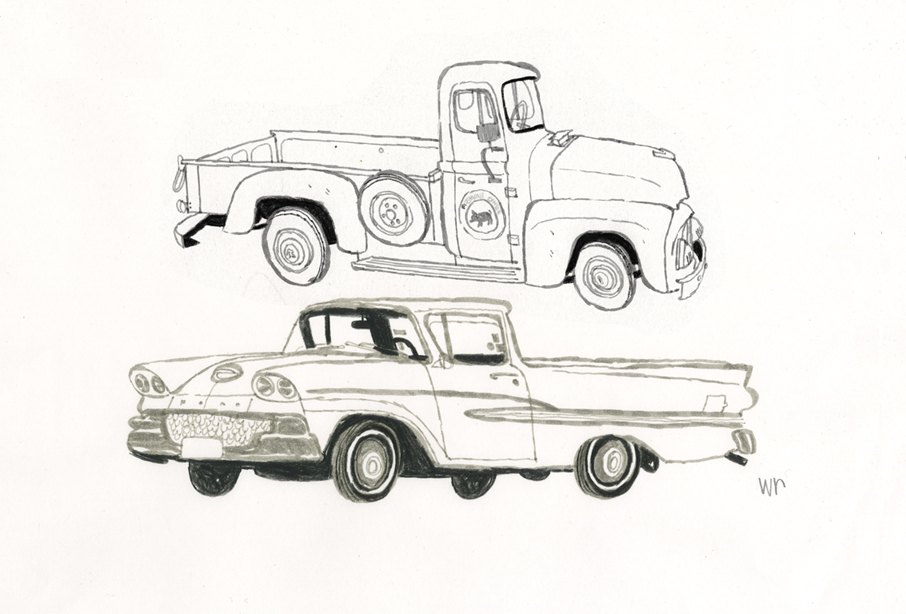
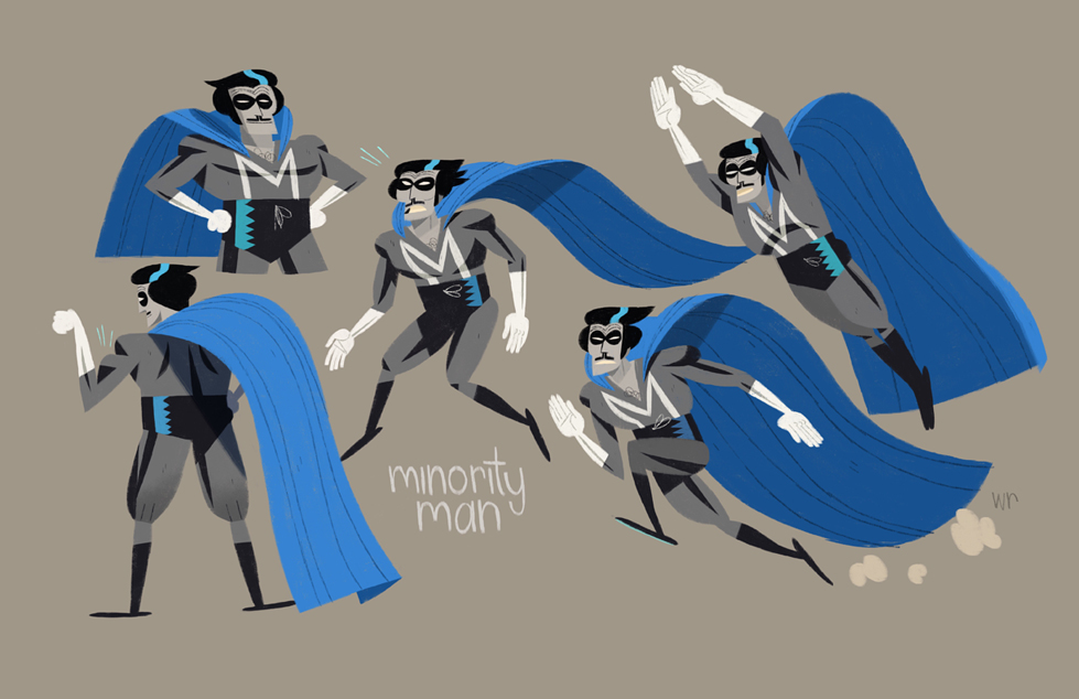
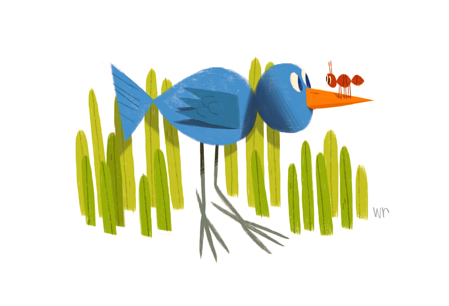
Encapsulating the eclectic spirit, rich diversity and historical gravitas of San Francisco is no easy task. But the ultra nostalgic and mischievously charming illustrations by local Bay Area artist Willie Real make capturing the uniqueness of the 510 area code look effortless. With street scenes of anonymous pedestrians waiting for the bus and gorgeously detailed drawings of the Victorian structures distinct to California, Real's illustrations pull on the heart strings of anyone who aches for the foggy hilltops of SF. However, you don't have to know anything about the Bay to dig Real's illustrations. The satisfying geometric simplicity and bold sensibility in his work recalls the style of Mid-Century Modern children's book illustrations (think Miroslav Sasek and Bernice Myers) that are universally heart warming. Real's style veers from the trendiness of this mold with a distinctly urban coolness seen through his earthy color palette and edgy characters that are reminiscent of Bay Area street art legend Barry McGee

artwork by © Willie Real

artwork by © Willie Real

artwork by © Willie Real

artwork by © Willie Real

We were lucky enough for Willie to grace the pages of Illustoria in our Issue #3: Outside-In, which featured his imaginative 263 Josephine, a story of a Victorian apartment complex with a heart of its own. Since then, we had the chance to pick Real's brain for a bit and get an inside scoop on his process, inspiration and fond memories as a kid growing up in SF. Check out more of Real's work on his website and Instagram

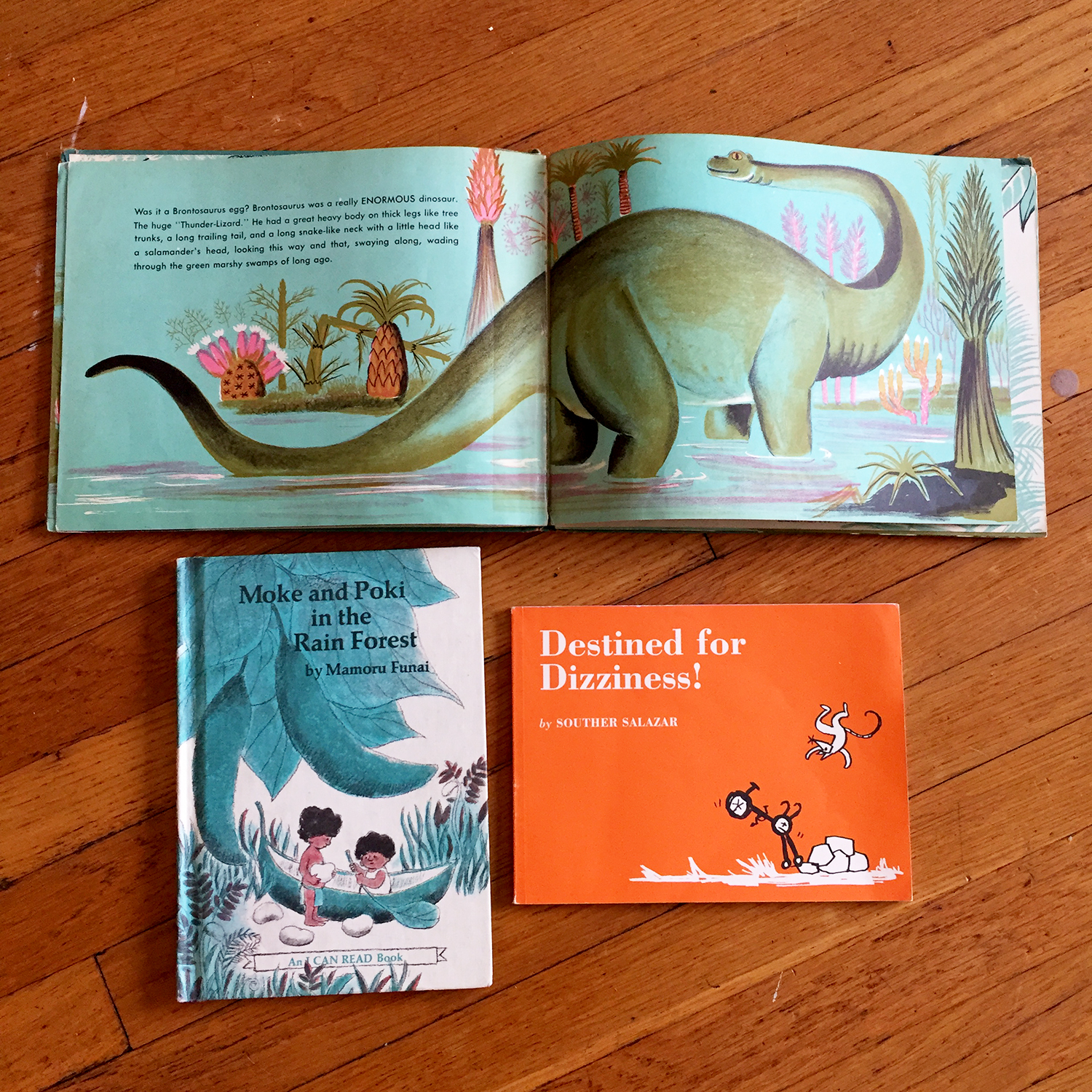
artwork by © Willie Real

artwork by © Willie Real

Hi Willie, tell us a little about yourself! 
Hi, my name is Willie Real and I'm a freelance character designer and illustrator from San Francisco. When I'm not working or dabbling on my own projects I go outside and play in Golden Gate Park or along the Pacific Ocean.

What are you currently working on?
I just finished designing characters for an animated movie with a friend! It's a good time when you get to work with people you're close to. I'm doing visual development sketches for another animated project so it's been busy for me which is great. I still manage to get out for some personal sketching though. 

Can you talk about your process of creating a work/project/book/zine/product from start to finish, and share some process pics with us?
This is an illustration or a portrait if you will, of a victorian home. 

1. This is my favorite part... I go sketch homes outside, all day! I pick the sketch I like and it's ok if it's not perfect, I'll tweak it to my liking later.

wr_process_01.jpg

2. I scan it in and twek away... finalizing my sketch. I print it out at the final size I want and tape the pieces together. 

wr_process_02.jpg

3. I trace/transfer the sketch onto bristol board using a light box. 

wr_process_03.jpg

4. Once the drawing is complete I'm ready to paint with acrylics and gouache. I establish my colors and values on my palette and paint away. I kept this one simple... yellow for the building, grey for the roof and a few accent colors for the door and the chimney. I start with lighter colors first, filling in all the shapes and colors and build up to the darks. Once the paint dries I add the drawing and details with prismacolor pencils. 

wr_process_04.jpg

5. I scan it back in, make any final adjustments I want and that's it!

artwork by © Willie Real

artwork by © Willie Real

Where did you grow up? Where do you live now? 
I gre up in SF till I was 12 and moved to a small town in Sonoma County where I went to high school and later a Junior College. I live in SF now... the Lower Haight! 

What were you like as a kid?
Active. I loved playing outside with friends from the block in the Excelsior, playing tag, baseball and going to the deli on the corner. They gave us salami ends! When I wasn't outside I was conducting these elaborate scenarios in my imagination with my toys... that or always drawing away. 

artwork by © Willie Real

artwork by © Willie Real

What were your favorite childhood books?
I remember the Highlights magazines from the doctor's office! Those were fun. 
Did you have a favorite subject in school? A least favorite subject?
From 1st grade all the way into High School I loved art classes. All of them! Painting, Drawing, Cursive Writing, Woodshop, Computer Graphics, Pottery... they all scratched the creative itch. Math was always tough for me... too many numbers! 

artwork by © Willie Real

artwork by © Willie Real

Can you describe your first childhood memory?
Can't say this is the first but one of my earliest memories is when our parents would take us to La Taqueria in the Mission. I remember the smell, the mural and there were these wooden stools with leather weaving that looked like they were hand made a hundred years ago. They're still there today! The blue and red tiles along the sidewalks in the Mission are also a fond, early memory. 

artwork by © Willie Real

artwork by © Willie Real

When did you know you wanted to be an artist and writer?
In high school my English teacher (Mrs. Wolf) pointed me in the right direction and told me that I had a passion I should pursue...and that illustration was an actual profession! I'm eternally grateful to her. 

Who or what inspires you?
Oh man, so many things...family, food, walking around the city, art museums, nature...I get so much out of 'the little things' in life. 

What is the most challenging part about being an artist/writer/maker?
I get nervous when showing personal work I've created. I think making art is a very personal, honest and intimate practice... an extension of yourself. You're putting yourself out there with your work which can be very scary and empowering as well. 

artwork by © Willie Real

artwork by © Willie Real

Do you have a favorite project that you worked on?
Earlier this year I made a poster for the women's day march that took me a couple of hours.. short but very sweet. My sign was a portrait of my mom and it said 'Marching for my Momma'. She approved :)

artwork by © Willie Real

artwork by © Willie Real

When do you feel your most creative?
Right after I've seen a great movie or an art show. It's very inspiring to see other makers and creatives succeed at their craft. It's a contagious feeling! I want to rush home and get my ideas down. 

artwork by © Willie Real

artwork by © Willie Real

Do you have a favorite tool (type of pen, or brush, or paper, etc. --- related to your work)? 
Grey Tombo markers and black prismacolor pencils. I keep it simple. It's a quick an easy way to get line variation, you can fill in shapes super quick and you get all three values with black (the pencil), grey (the marker) and white (the paper). 

What advice would you share with young aspiring artists?
Dedicate time to your work and your craft. Don't be afraid of getting lost or not knowing what to do. Getting lost is an adventure, go on it, explore, experiment, and most of all have fun with it. Soon you'll find what you're looking for and it'll show in your art. And don't forget to go outside!

artwork by © Willie Real

artwork by © Willie Real

To see more of Real's work check out his website http://www.williereal.org/. Thanks Willie, and Happy Holidays from ILLUSTORIA to all you readers out there!


Todd Webb Follows Georgia O'Keeffe in the Desert

Meet Todd Webb, who lives in Virginia Beach, Virginia, and who graces the pages of the — upcoming! — second issue of Illustoria with a gorgeous, reflective piece about the great American painter Georgia O'Keeffe. Todd's comic is drawn, literally and figuratively, from O'Keeffe's own writings — he uses her own words. Webb shared shots of his studio, and his thoughts about creativity, and much more, in the following interview.

What were you like as a kid?

Shy and quiet — picked on a lot, so I kept to myself or a small but close group of friends. My favorite place was the library, and I was always reading or drawing. 

What were some of your favorite childhood books?

Early on I read all the Encyclopedia Brown and Hardy Boys books — my dad still had a full set of Tom Swift books too and we read those together when I was really little. I've still got those. I read a lot of Peanuts collections. And Calvin & Hobbes. My dad had a lot of sci fi books so I read a bunch of those at an early age too, but eventually started reading "classics" — Salinger, Hemingway, etc. etc. 

When did you know you wanted to be an artist and writer?

When I figured out that Charles Schulz made Peanuts and that was his job — the idea that you could grow up and draw comics for a living instantly overtook my brain, and I never stopped shooting for that goal, though eventually my aim shifted to comic books instead of comic strips.

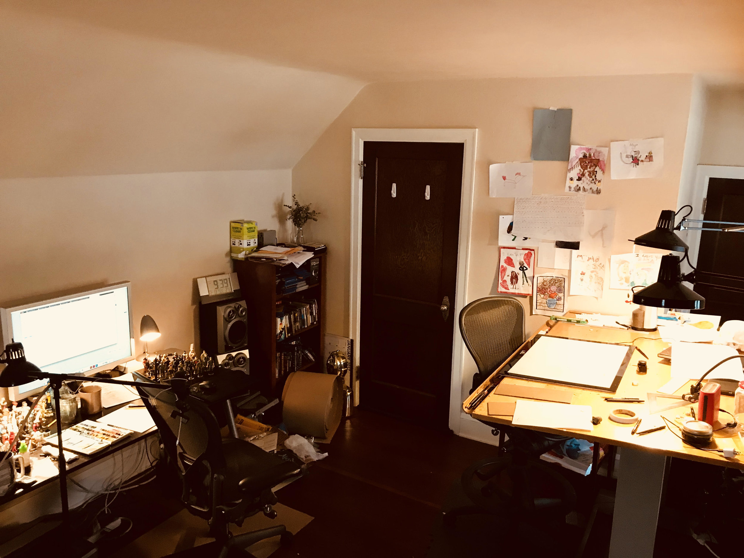
Todd Webb's studio

Who or what inspires you? 

Everything — haha. I'm constantly getting ideas from things and people I encounter, see, read about, etc. I like to read poetry. That always gives me weird fun ideas to try out with comics. 

When do you feel you're most creative?

It used to be late at night, but as I've grown older I think I tend to do my best work if I get started first thing in the morning. But a big aspect of being creative is being able to make yourself just do the work every day — even if you're not feeling "inspired" — you've still gotta hit the drawing board and make something! 

The artist at work

Do you have a favorite type of pen, or brush, or paper for drawing with?

For years now I've been inking with Faber Castell Pitt Artist brush pens. I love them! I usually draw on Strathmore Bristol board. I'll buy a big pad of it and trim the paper to whatever size I need for a specific project.  

It all starts with pencil on paper.

What advice would you share with young aspiring artists?

Keep at it! And do it because you love it. Make work and show it to artists you admire. Don't be afraid of mistakes and don't think you need to draw a certain way or that you need special supplies. Do the best you can do with what you have! 
 
Why did you draw something about Georgia O'Keefee?

There's a couple reasons. A few years back I got to see her painting "The Lawrence Tree" (which is a great painting of a tree she used to sit beneath on the Lawrence ranch, seen from beneath as if you were looking up through the branches) and I really liked it. So I started to dig through other works of hers I hadn't been familiar with, and that led me to a big collection of her letters, which were a great read as well. I ended up writing a song about the Lawrence Tree painting, as well as one inspired by a letter ("The Lawrence Tree" and "Georgia, 1931" respectively on the Seamonster album Baldessari). So that was one thing. In the interim, I've really enjoyed connecting with other artists and writers and musicians from the past whose work really speaks to me by making something myself inspired by their works, be it a comic, a drawing, or a piece of music. I think engaging with an inspiring piece of work by making a piece of my own helps me process and figure out what it is I like about it so much, and also serves as a way of having a "conversation" with that person who maybe isn't even alive anymore. Anyways, back to Georgia: in reading books about her I realized she was good friends with the photographer Todd Webb (which is my name!) and it was amusing to me when I'd come across a letter of hers addressed to someone with my name. It was pretty surreal. I was already familiar with that Todd Webb's work, because ever since Google was invented, if you search for me, you'd also get results for him (he was very well known, and many of his photos were of Georgia O'Keeffe) So I thought it would be fun to further confuse the internet by putting a work of my own out there about Georgia O'Keeffe. 
 

Four panels from Todd's upcoming Illustoria comic

What was the process like, working from her own words?

Great fun! When I'm working on a piece like this, I really respond to particular writings of the artists that resonate with my own thinking. For years I used to keep a comic strip diary, and so working on a comic like "Georgia in the Desert" feels almost like drawing my own cartoon journal. I may be drawing about someone else and using their words, but it feels very personal to my own thinking. If that makes any sense! 
 
How does the idea of making art from the things you come upon in everyday life — which is a theme of the comic you drew — inform your own work?

Immensely. I think the things we encounter every day we often take for granted, so it's fun to focus a work on something small and seemingly insignificant — we are surrounded by so much wonder and beauty and we often forget to pay it any mind — Georgia painting huge gorgeous abstractions based on the surface of a rock, or a bone, or a flower or a row of clouds is a perfect example of really appreciating your everyday surroundings, whatever they may be.  

Todd's synthesizers are right on his studio bookshelf.

Tell us a bit about your music?

When I'm not drawing, I'm usually making music. At this point I have two projects: Seamonster is my main outlet, which is poppy semi-electronic songs that I guess sound a bit like girl groups from the 1950s mixed with something like Kraftwerk, haha. Contemporary songwriters like Stephen Merritt (of the Magnetic Fields), Mark Mulcahy (Miracle Legion, Polaris), and Dean Wareham (Galaxie 500) are huge influences. I also recently have started releasing music under the name Oahu, which is quieter ambient electronic experiments in the vein of Brian Eno or someone like William Basinski. Oahu uses lots of synthesizers and tape loops and has no singing. Its good background music for reading. 

What work of yours should an Illustoria parent read next?

Chance Operations: it's a collection of shorter experimental comics where I used chance operations (made famous by composer John Cage) and flipped coins to determine where images, colors, and text would go. It reads more like poems than a traditional narrative, and has a little essay explaining the process in more detail. 

An interior page from Webb's Chance Operations

What work of yours should an Illustoria kiddo read next?

Tuesday Moon: it's the story of a girl named Tuesday who has a rotten day at school, and is paid a visit by the Mann (two n's) in the Moon. They go on an adventure in space together and the moon helps her realize maybe her day wasn't as rotten as she thought it was. Raina Telgemeier, author of Smile, said, "Tuesday Moon is charming, thoughtful, and full of the best kind of whimsy."

An interior page from Tuesday Moon

Process: Designing ILLUSTORIA's First Cover


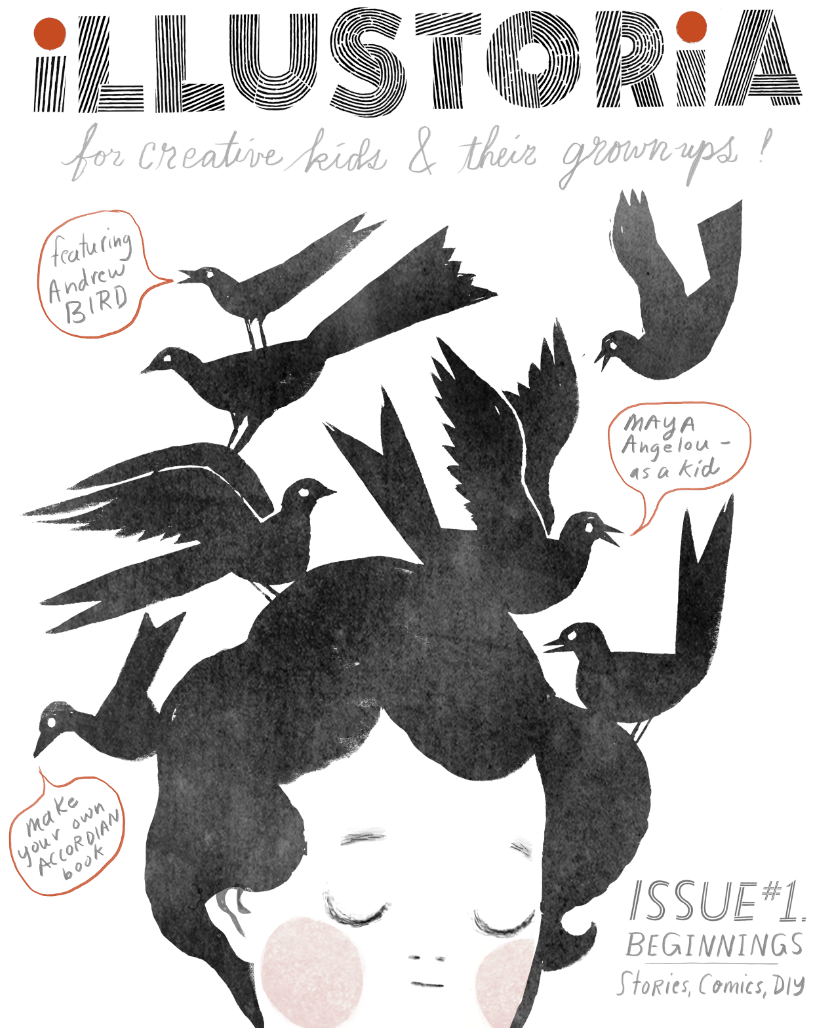
Introducing...our cover for the premiere issue of ILLUSTORIA!

After a long cover design process during which we conceptualized, developed, reiterated and debated for many months, we had that "A-ha!" moment when we saw this version. We think it's contemporary and fresh with a DIY feel that speaks to who we are: a totally new kind of magazine for kids & grownups. 

As we worked on our cover, we asked ourselves: how do we spark the curiosity and interest of a 9-year-old and his or her parent? Will artists and writers find camaraderie? Will teachers and librarians see value? How do we stand out from the crowd with a single image and just a few words? 

It was a real identity challenge and pushed us to make an authentic statement about who we are and what we value through pictures and words—which is what our magazine is all about, after all. 

For those who want to get beneath the surface, here’s a behind-the-scenes look at the making of our very first cover. 

Step 1: Settle on a logo!

Our very first logo, which we still love and use sometimes. 

This is the logo we were very happy with for quite some time. Interestingly, when we applied it to a mock-up cover we learned that what worked on stationary and business cards felt out of sync with our visual aesthetics, which had evolved over almost two years of incubation and development. 

We wanted our logo to show off a DIY attitude and be, as one of our team members put it, “perfectly imperfect.” Our aim was to not stray too far off course from the original which, as mentioned, we were still smitten with.

Logo variant #1

Logo variant #1

Logo variant #2

Logo variant #2

Logo variant #3...which we really liked.

Logo variant #3...which we really liked.

We finally settled on a design close to the more understated original but with a bit of an edge. 

Final logo. We opted for the simplicity of b & w + red.

Final logo. We opted for the simplicity of b & w + red.

Step 2: Cover art!

We went through several really strong cover mockups that were quite beautiful. But beauty isn’t everything and we needed to make an instant connection on an emotional level too. That happens through tone, mood and an original voice which can be really hard to pinpoint. We wanted to say to our readers-to-be, “This is good stuff. We have something unique to offer you. Look and linger a while.” Even, “You and I—we’re gonna become quick friends, I can tell.”

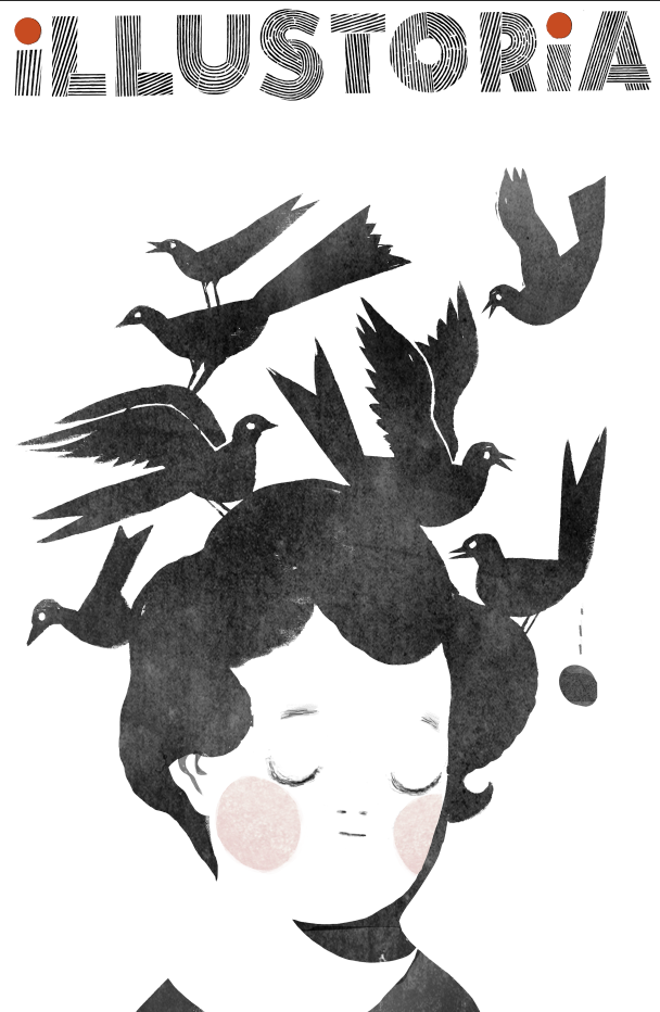
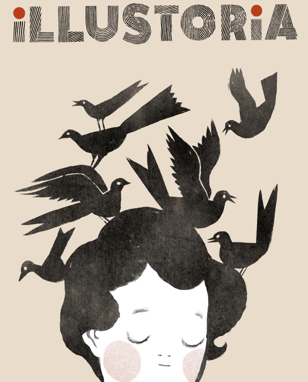
The experiment that inspired our cover art.

The experiment that inspired our cover art.

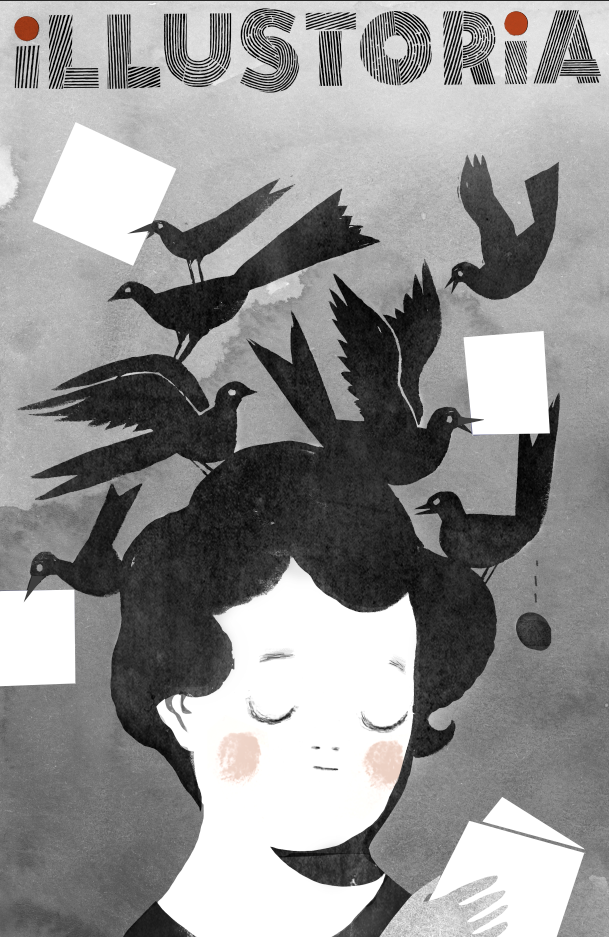
It's strange how you sometimes find inspiration--or rather, it jumps at you--when you least expect it to. Our creative director, Elizabeth Haidle, was working on an ILLUSTORIA gift card. Out of convenience she used an existing piece of art to create a placeholder fake cover, meaning to swap it out later. But seeing the image and the logo together…something immediately clicked for us. A happy, happy accident.

I asked Beth to illustrate a young reader in the same pose, perhaps with a book in her hands. Within a day she came back with several cover options that instantly said to us, “Watch out, world—there’s a new kid (err, magazine) in town!”

These were gorgeous though I'm sad to say we ended up nixing the egg being laid in midair!

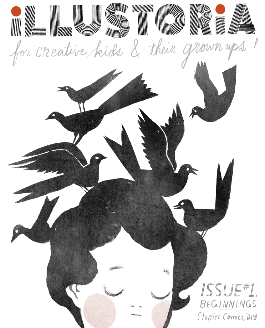
We experimented with a colored background and hand lettering. Along the way we corrected the trim size, which was off in the first iterations. See how minor details take time to finesse?!

Step 3: Integrating text and art

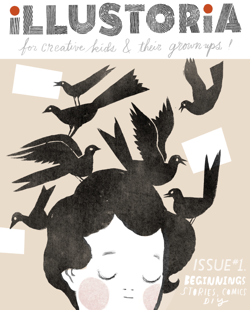
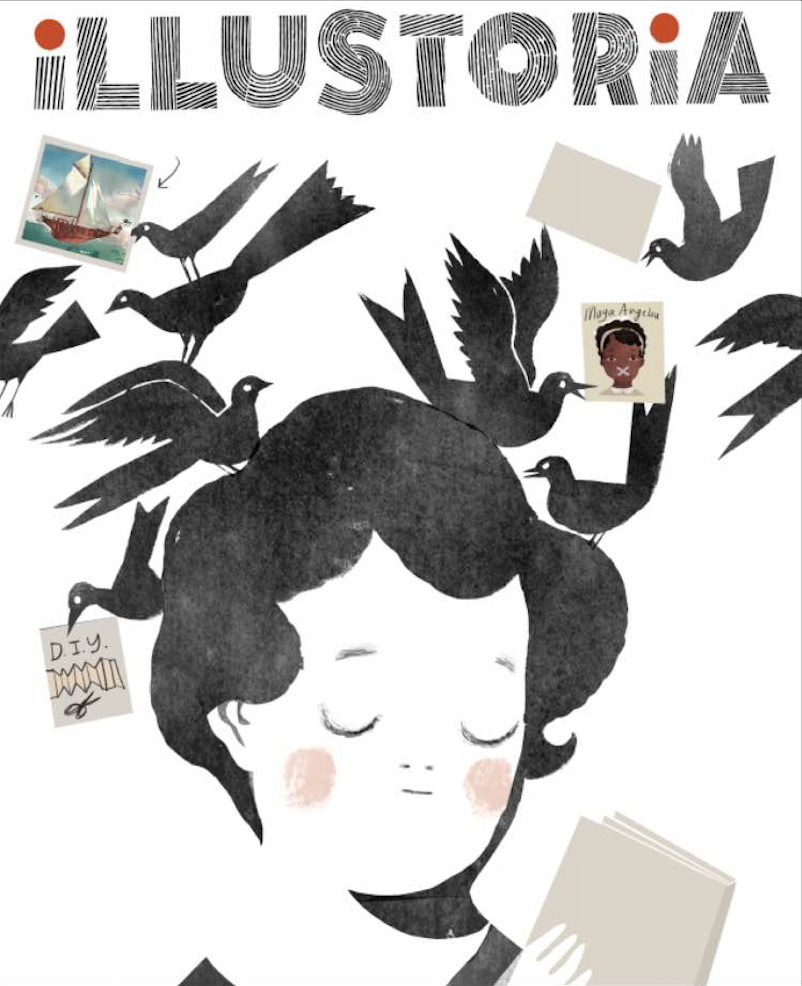
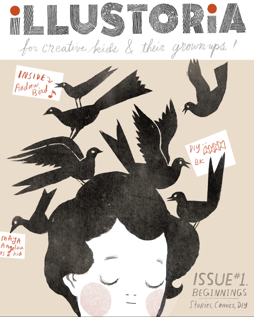
We experimented with showcasing our featured articles through words and pictures—sometimes only pictures. A high priority for us, as a magazine that celebrates visual storytelling, was to integrate the text callouts with the cover art in a way that worked together seamlessly. I didn’t want the text to feel secondary, and we certainly didn’t want the art to get cluttered by too much editorial content. It was important for the callouts to not be dry and overly informative. They needed to engage and appeal to both kids and grownups.

As much as we adored the thumbnail images, they distracted some from the simplicity and impact of our main illustration. It was a tough call, but ultimately the word balloons won out. We continued to futz around with the typefaces and hand lettering and even corrected a typo that had (admittedly) been overlooked for weeks, until we settled on...our winning cover!

Step 4: Make it look effortless


Our final cover


So get to it and spread the word! Order and subscribe to ILLUSTORIA and ask your local bookstore or shop about stocking it. You won’t be disappointed by all the good stuff in the packed 64 pages of each issue. We're just scratching the surface of what may become a wonderful, lasting friendship with all of you: our coveted readers-to-be.