
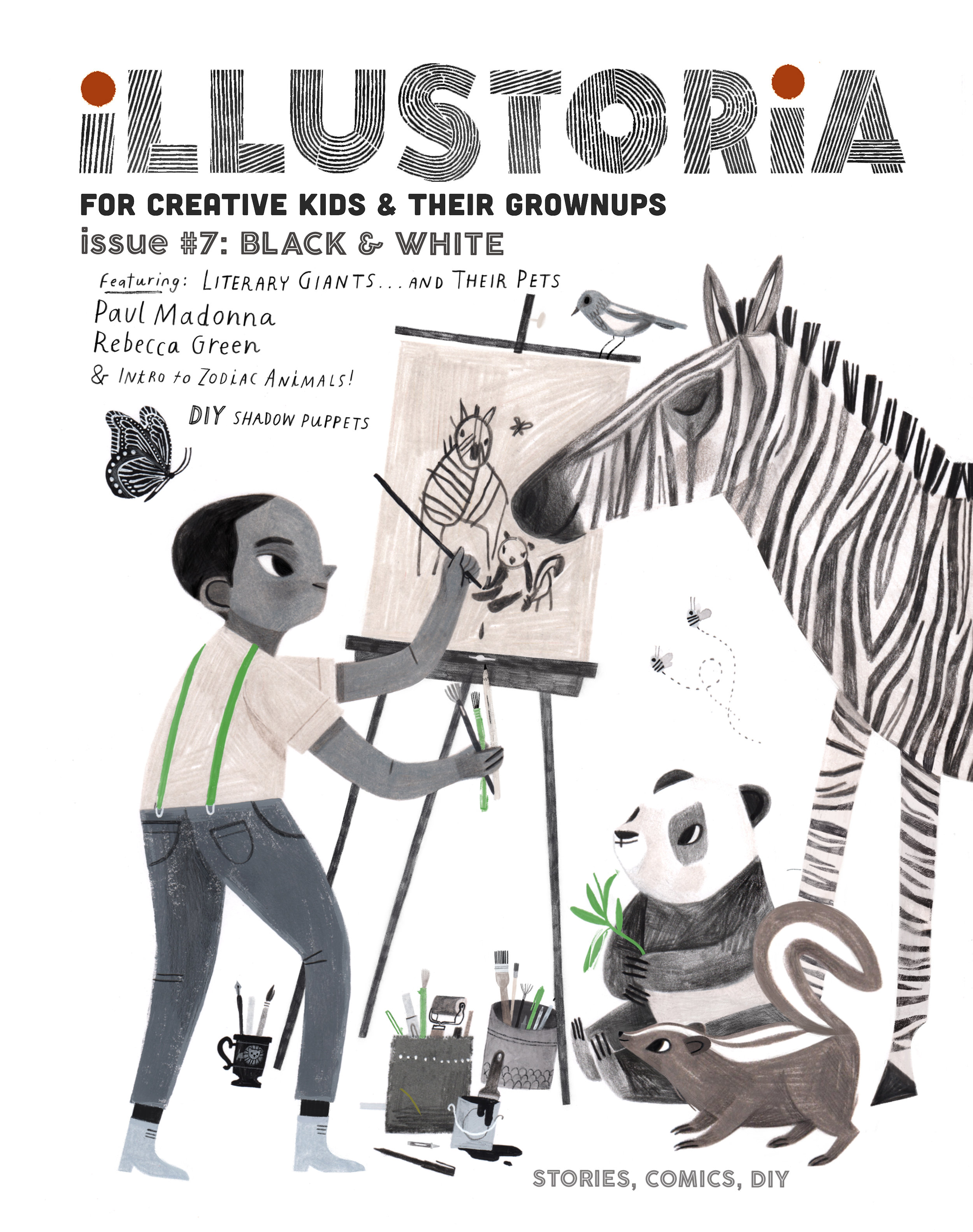
Creating Cover Art for #7: The Black & White Issue
Hi All!
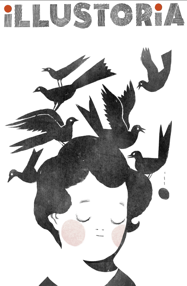
Rebecca Green here (you can call me Becca!). I had the pleasure of creating the cover for Illustoria Issue #7, The Black and White Issue, and today we're going to walk through a bit of the creative process behind the illustration.

Illustration by © Rebecca Green
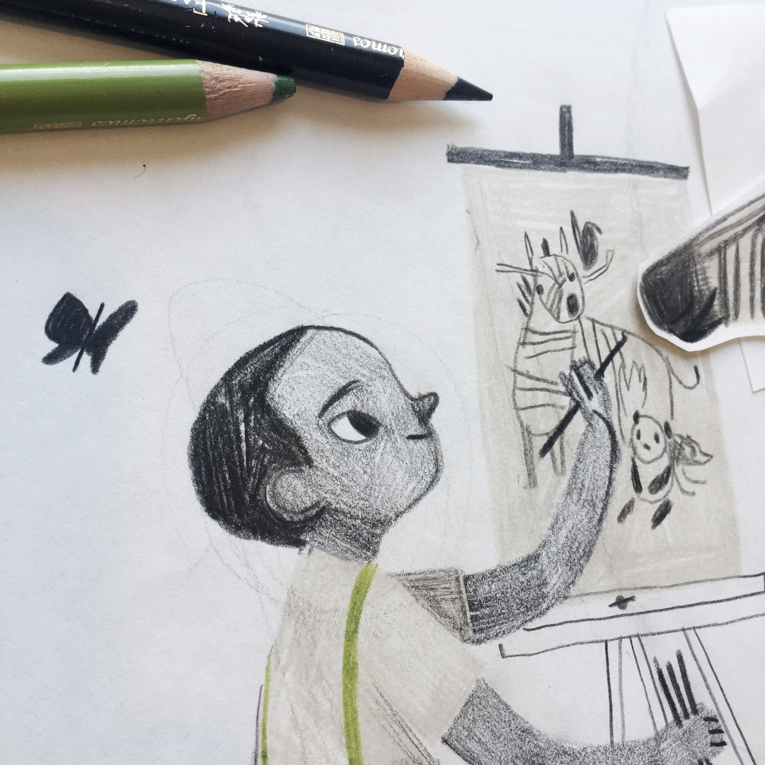
Besides sending along keywords, details about the features, and some of my previous art they were drawn to, Joanne and Beth of Illustoria gave me a lot of freedom to choose which direction I wanted to go with the artwork. Immediately, I knew I wanted to draw a little boy with black and white animals. I started with this simple sketch.

Illustration by © Rebecca Green
The drawing, I decided, needed something more. The boy would be...an artist! Complete with an easel and lots of brushes and markers. One thing I did like in the first drawing was the use of one simple color. Green felt right. (and not because it's my last name!) The sketch was drawn in colored pencil (I use Faber-Castell and Prismacolor).


Illustrations by © Rebecca Green
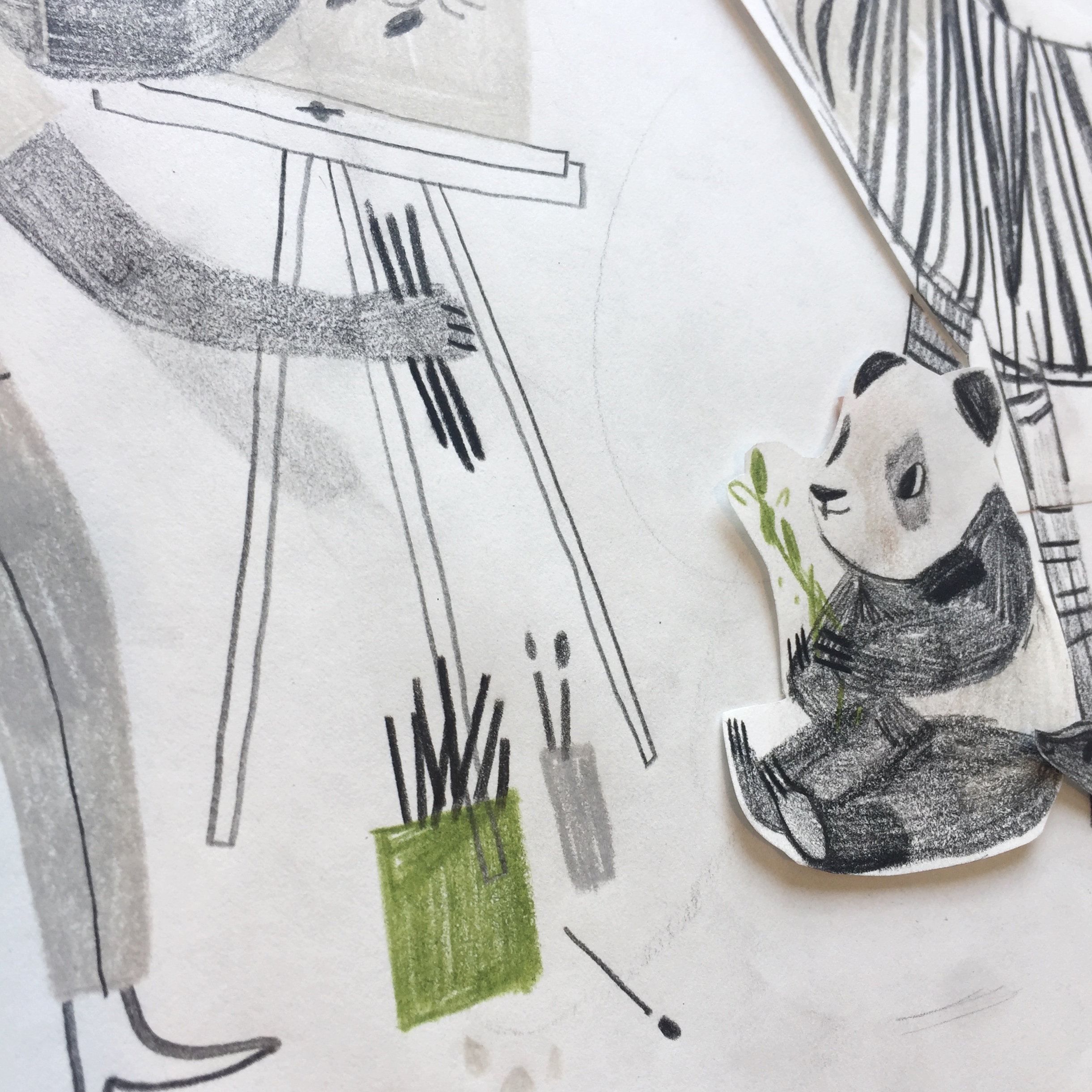
As you can see, I drew some of the elements on a separate piece of paper and cut them out so I could try out placing them in multiple places. One I had my complete sketch, I scanned it, cleaned it up a bit in Procreate (on my IPad), and send it in for approval.

Illustration by © Rebecca Green
Once the sketch was approved (this meant making the image a little bigger and enhancing the butterfly), I went to work on the final. I created the final illustration in gouache and colored pencil. Here are some peeks of the cover before it was edited!

Illustrations by © Rebecca Green


The final illustration was edited in Procreate and Photoshop, along with the hand-lettered text. When finished, it was sent to the kind folks at Illustoria and voilà! A cover was born!
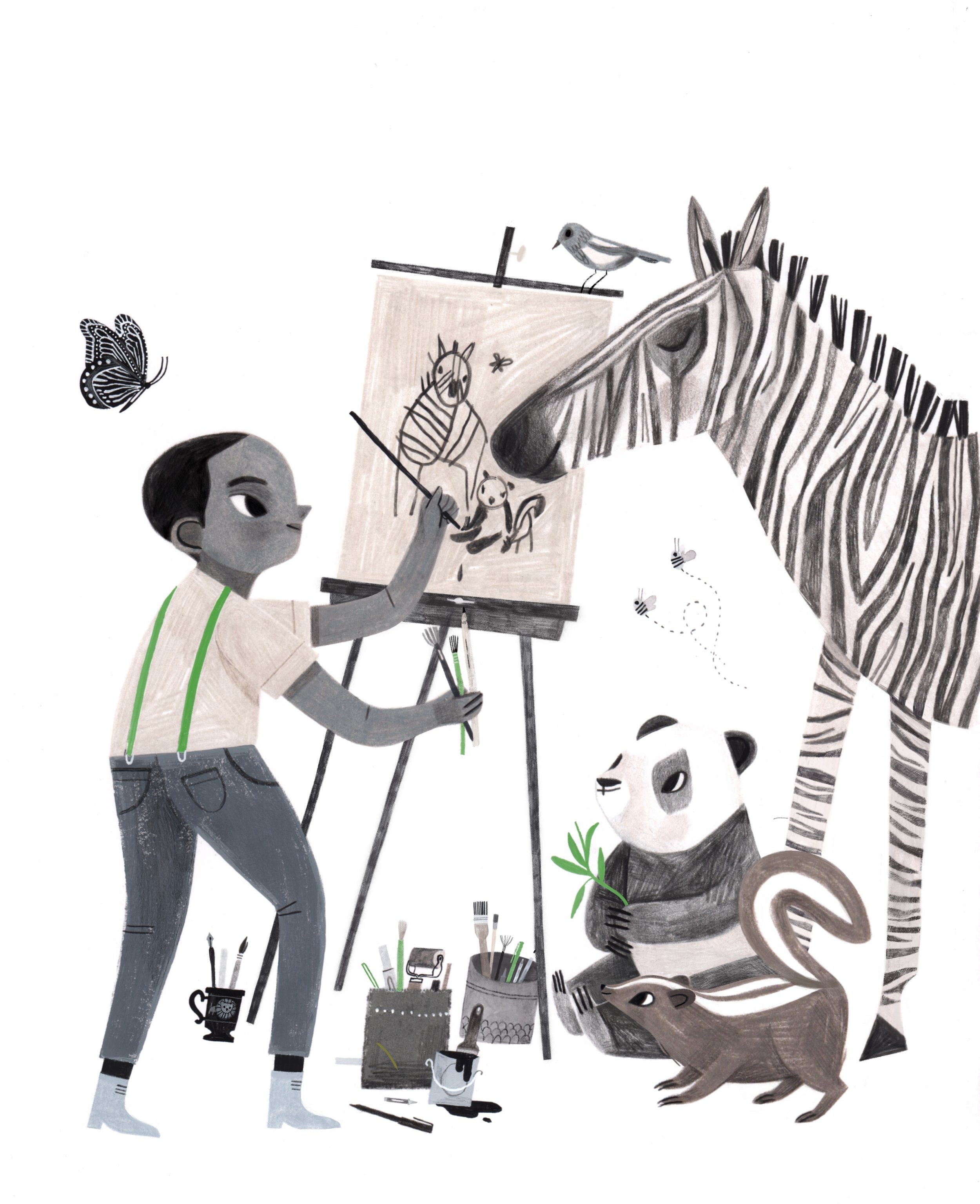
Illustration by © Rebecca Green
There you have it - a glimpse into the world of the cover creation. Hope you guys enjoy the issue, and thanks for letting me share a peek into my process. And thanks to Illustoria for having me!
The Grow Issue: A Cover Comes to Life

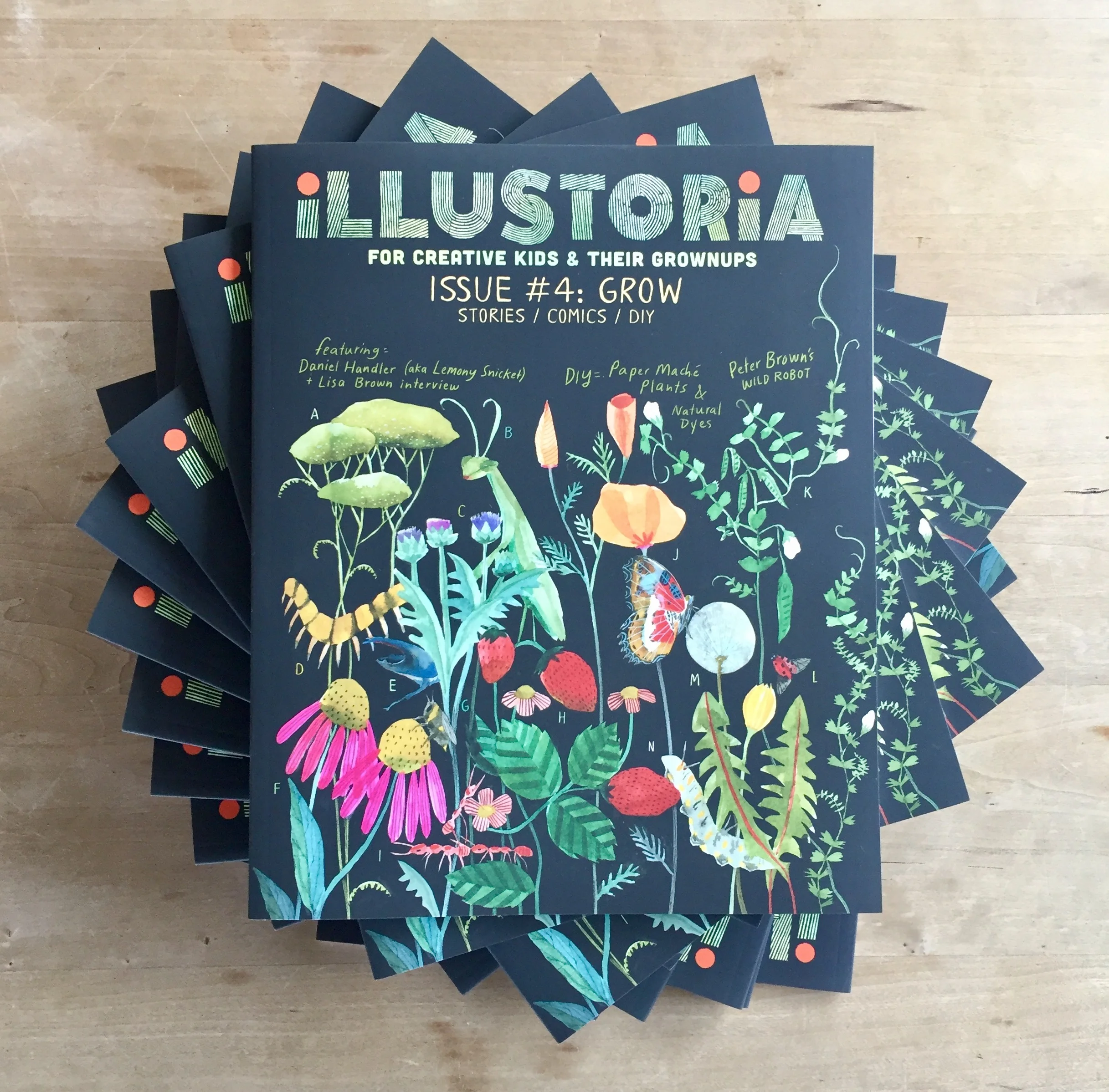
We couldn't be more excited to announce that Issue #4 has arrived from the printer! The contents of The Grow Issue are as rich and teeming with life as the cover. I'll share more about all the amazing writers, artists, and makers who contributed to this issue soon. But for today I'd love to highlight the wonderful artist behind this cover and the making of it.
Fave local artist and watercolorist extraordinaire Lindsay Stripling graces our cover with her lovely art depicting the flowers and insects that she remembers from long days spent playing in her grandparents' backyard in Lafayette during her childhood, and the flourishing flora she finds in Northern California. Lindsay is a master of her craft, who paints dreamy tableaus of scenes set in folk and fairytale worlds from her imagination. She tells us that the best way to tackle her paintings is to allow for mistakes, since they are impossible to avoid. As soon she messes something up, she just turns it into something else. Find her awe-inspiring work here. You'll also find Lindsay's gorgeous watercolors in another spot in this issue, accompanying our illustrated story A Brief History of Ultramarine Blue written by Alexis Joseph, pigment expert and founder of the swoon-worthy art supplies shop Case for Making in the Outer Sunset of San Francisco.
Here's a look at Lindsay's issue 4 cover sketch, already so beautiful:

We knew we wanted the flora and fauna to contrast against a black background. Our creative director, Elizabeth Haidle, came up with this nuanced coloring of the masthead against black:
Lindsay's final art in place with a mock cover design:

As much as we loved the simplicity of this cover, we knew we'd want to accommodate callouts for our delectable main features, so Lindsay filled out the space with added pea tendrils. We also included lettering so the plants could be identified on the back cover.
And so...the final cover!

Elizabeth designed and illustrated the back cover to beautifully compliment Lindsay's art and the theme of nature and the outdoors, introducing the legend for curious kids (and grownups) to pore over.

We hope you love how this cover turned out and the entire contents of this issue as much as we do! Find out more about all the goodies in issue 4, which includes contributions from creative duo Lisa Brown and Daniel Handler (aka Lemony Snicket); an essay on the making of The Wild Robot by Peter Brown, author of The Curious Garden; an inspiring, illustrated Q & Artist interview with illustrator Diana Sudyka; a new Literary Giants as Kids comic featuring Mark Twain; stories, art, DIY, and activities galore. Click here to see our full table of contents and a few spreads from The Grow Issue. Enjoy!
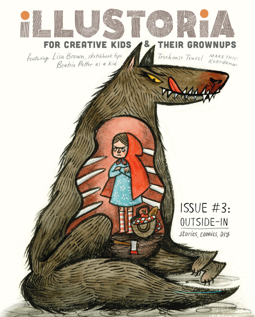
Lisa Brown cover art: The OUTSIDE-IN Issue

We are so pleased to reveal our cover for issue 3, The Outside-In Issue, featuring delectably delicious, wondrously charming art by the amazing Lisa Brown!
As many of you picture book and comic fans know, Lisa is the creator of the ingenious Three Panel Book Review strips featured in The Rumpus, co-creator with Lemony Snicket of The Latke Who Couldn't Stop Screaming, author/illustrator of the hilarious Baby Be of Use board book series, and author/illustrator of her very latest, The Airport Book. Needless to say we've had a creator crush on Lisa Brown for some time....
So when a few months ago Lisa graciously took a morning out of her busy schedule as a writer, illustrator, teacher, mom, and passionate kid-lit advocate to meet with me at one of her favorite cafes in San Francisco, I was beyond excited and a little nervous. I knew through her work that she was exceedingly intelligent and bitingly witty. Being the warm and generous person that she is, Lisa immediately put me at ease. I should have known--after all, those who work in children's books generally are a kind-hearted bunch! Lisa shared with me her thoughts on why it's important to cultivate creativity in kids through that excruciating, self-conscious phase around the middle school years, the range of diverse picture books on her syllabus at CCA, the challenges that women illustrators face in the publishing industry, and she even gave me a sneak peek of her upcoming picture book. (Psst...interview with her and her elusive co-author to come in issue 4!) By the end of the meeting, she sent me along with a list of fabulous artists to contact and agreed to create cover art for an upcoming issue. I was totally blown away...and so grateful, and excited!
Now, here we are several months later with a gorgeous cover by Lisa that speaks volumes about what we at Illustoria care most about: timeless, captivating art with a unique point of view that resonates across generations; the value and delights of print publishing; the power of illustration; our ever-lasting love for visual storytelling. And how cool is this take on the swallowed-whole dilemma from Little Red Riding Hood??! Just wait until you see her back cover....
Thank you, Lisa, for your fabulous contribution to The Outside-In Issue!!
Inside you'll also find Lisa's sketchbook tips to aspiring artists. Truly the inside of issue 3 is just as delectable as the outside, with contributions by an array of lovely artists and writers whom we couldn't have pulled this off without, including: Nina Chakrabarti, Amy Novesky, Paul duCoudray, Micah Player, Willie Real, Elizabeth Haidle, Ruth Kneass, Mike Dutton, Alexis Joseph / Case for Making, Britt Browne, Claire Astrow, Yuliya Gwilym, Alexandra Rose Franco of Rito-ito, Rachel Garrison, Kristen Solecki, Clark Jackson, Martin Cendreda, Anne Pomel, Karl Dotter, and Jeremy Anderson. More sneak peeks to come so follow us on Instagram to see the latest updates.
Here's a look at #3's table of contents, and be sure to check out our Shop page to see sample spreads from this issue and to pre-order. We'll send out copies in March 2017.

The Outside-In issue's table of contents. So much good inside....
I hope you enjoy this issue as much as we loved putting it together.
Lastly, thanks to Sakura of America and Case for Making for sponsoring issue 3!
Process: Designing ILLUSTORIA's First Cover
Introducing...our cover for the premiere issue of ILLUSTORIA!
After a long cover design process during which we conceptualized, developed, reiterated and debated for many months, we had that "A-ha!" moment when we saw this version. We think it's contemporary and fresh with a DIY feel that speaks to who we are: a totally new kind of magazine for kids & grownups.
As we worked on our cover, we asked ourselves: how do we spark the curiosity and interest of a 9-year-old and his or her parent? Will artists and writers find camaraderie? Will teachers and librarians see value? How do we stand out from the crowd with a single image and just a few words?
It was a real identity challenge and pushed us to make an authentic statement about who we are and what we value through pictures and words—which is what our magazine is all about, after all.
For those who want to get beneath the surface, here’s a behind-the-scenes look at the making of our very first cover.
Step 1: Settle on a logo!
Our very first logo, which we still love and use sometimes.
This is the logo we were very happy with for quite some time. Interestingly, when we applied it to a mock-up cover we learned that what worked on stationary and business cards felt out of sync with our visual aesthetics, which had evolved over almost two years of incubation and development.
We wanted our logo to show off a DIY attitude and be, as one of our team members put it, “perfectly imperfect.” Our aim was to not stray too far off course from the original which, as mentioned, we were still smitten with.
Logo variant #1

Logo variant #2
Logo variant #3...which we really liked.
We finally settled on a design close to the more understated original but with a bit of an edge.

Final logo. We opted for the simplicity of b & w + red.
Step 2: Cover art!
We went through several really strong cover mockups that were quite beautiful. But beauty isn’t everything and we needed to make an instant connection on an emotional level too. That happens through tone, mood and an original voice which can be really hard to pinpoint. We wanted to say to our readers-to-be, “This is good stuff. We have something unique to offer you. Look and linger a while.” Even, “You and I—we’re gonna become quick friends, I can tell.”
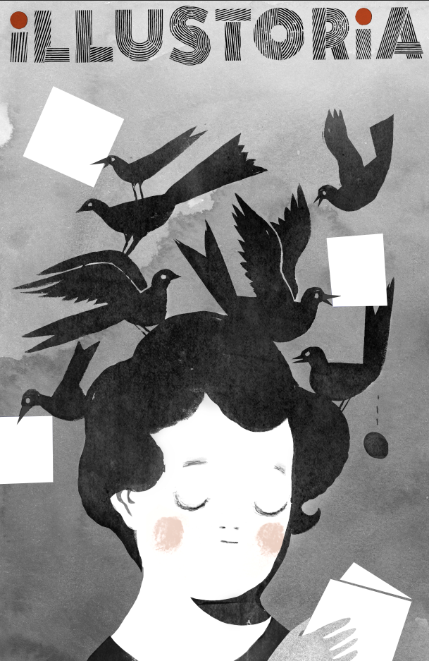
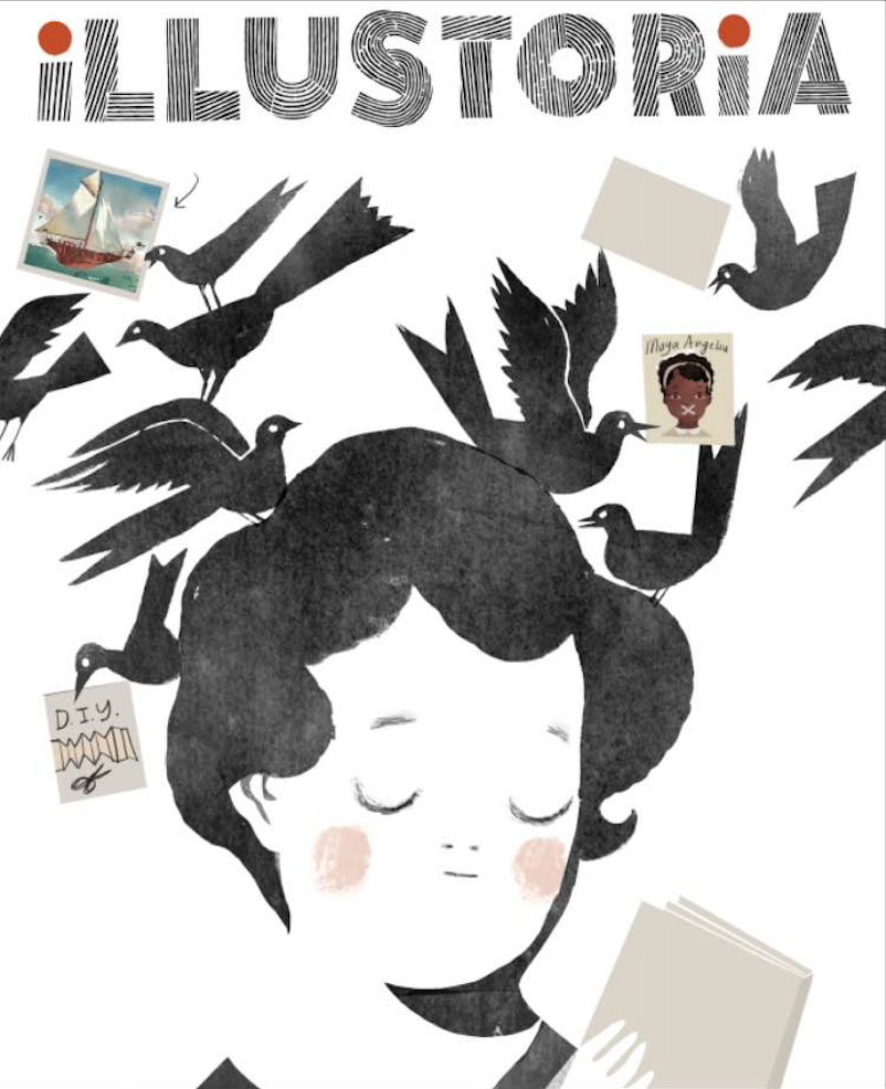
The experiment that inspired our cover art.
It's strange how you sometimes find inspiration--or rather, it jumps at you--when you least expect it to. Our creative director, Elizabeth Haidle, was working on an ILLUSTORIA gift card. Out of convenience she used an existing piece of art to create a placeholder fake cover, meaning to swap it out later. But seeing the image and the logo together…something immediately clicked for us. A happy, happy accident.
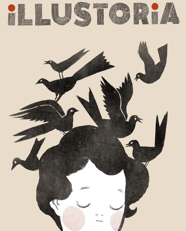
I asked Beth to illustrate a young reader in the same pose, perhaps with a book in her hands. Within a day she came back with several cover options that instantly said to us, “Watch out, world—there’s a new kid (err, magazine) in town!”
These were gorgeous though I'm sad to say we ended up nixing the egg being laid in midair!
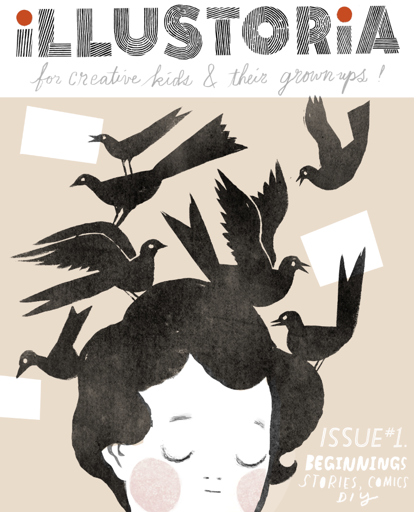
We experimented with a colored background and hand lettering. Along the way we corrected the trim size, which was off in the first iterations. See how minor details take time to finesse?!
Step 3: Integrating text and art
We experimented with showcasing our featured articles through words and pictures—sometimes only pictures. A high priority for us, as a magazine that celebrates visual storytelling, was to integrate the text callouts with the cover art in a way that worked together seamlessly. I didn’t want the text to feel secondary, and we certainly didn’t want the art to get cluttered by too much editorial content. It was important for the callouts to not be dry and overly informative. They needed to engage and appeal to both kids and grownups.
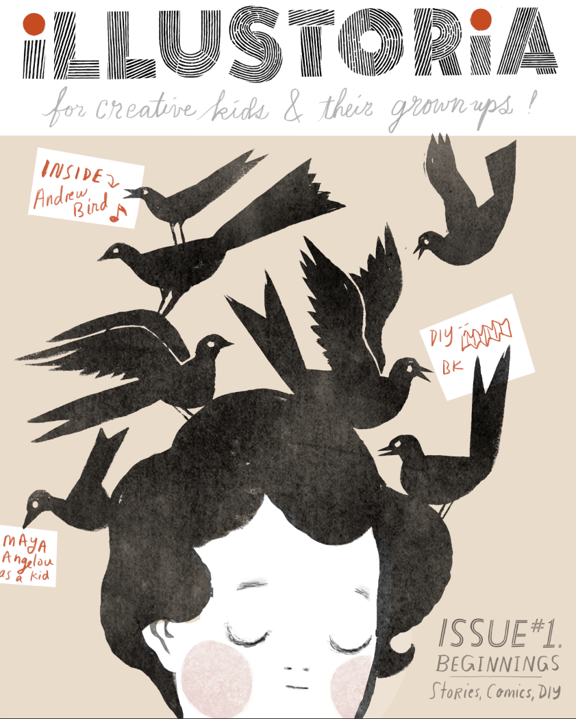
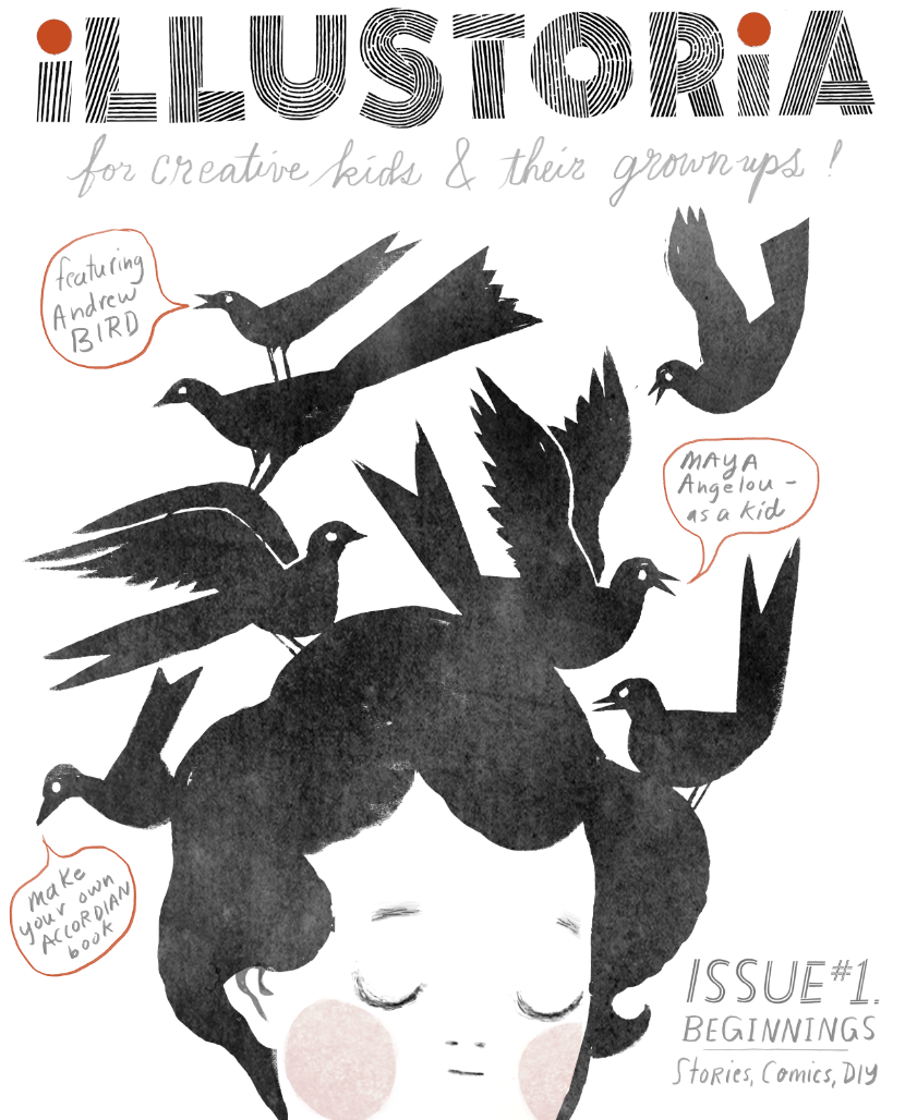
As much as we adored the thumbnail images, they distracted some from the simplicity and impact of our main illustration. It was a tough call, but ultimately the word balloons won out. We continued to futz around with the typefaces and hand lettering and even corrected a typo that had (admittedly) been overlooked for weeks, until we settled on...our winning cover!
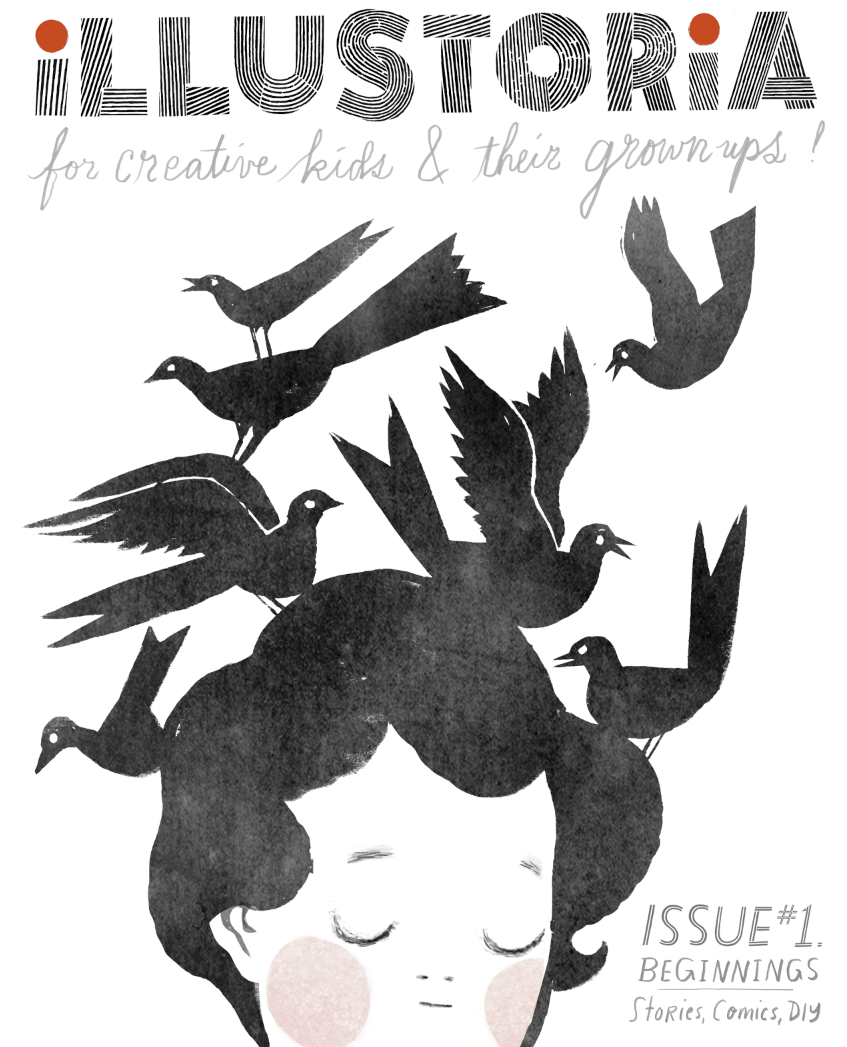
Step 4: Make it look effortless
Our final cover
So get to it and spread the word! Order and subscribe to ILLUSTORIA and ask your local bookstore or shop about stocking it. You won’t be disappointed by all the good stuff in the packed 64 pages of each issue. We're just scratching the surface of what may become a wonderful, lasting friendship with all of you: our coveted readers-to-be.