The Making of a Mural
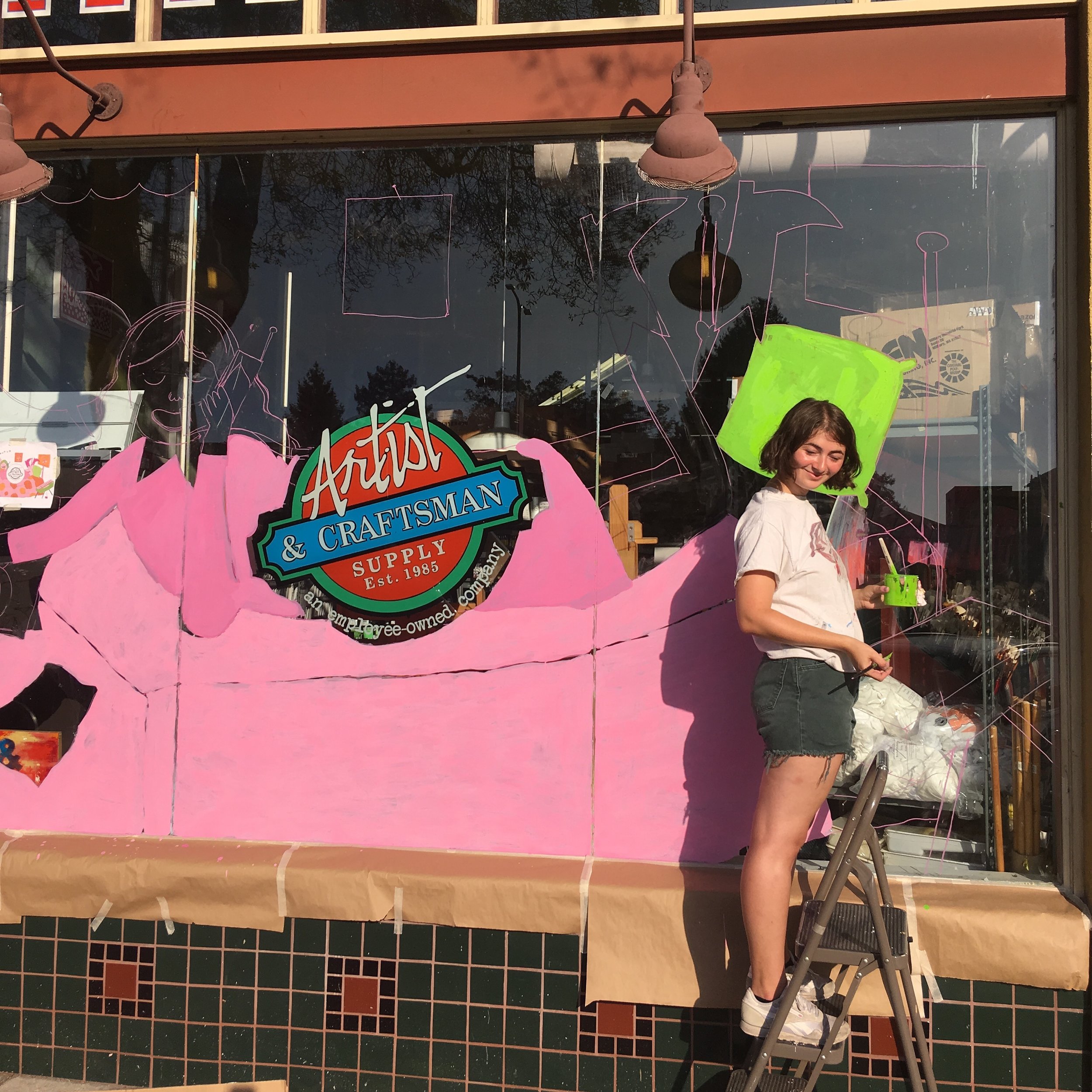
I visit the Artist and Craftsman in Berkeley (on 2573 Shattuck Ave, to be specific) more than any other store in the whole world. I kid you not, I'm there running errands for my various art related jobs at least once a week. If you've never been, I implore you to hop on your moped, bike, scooter, or heck even Boeing 747 and check it out. Never have been to an art store with cooler vibes, nicer people or more expansive color selection of gouache paints. After a solid year of hard crushin' on A&C (visiting every week, sometimes twice in the same day, and lingering too long in the paint brush section, where I would philosophize on the benefits of the filbert brush) they finally popped the big Q: Would I be interested in painting their Fall window mural? "I'm so down!!" I most likely said, after mopping up the puddle of profound honor and excitement my body melted into.
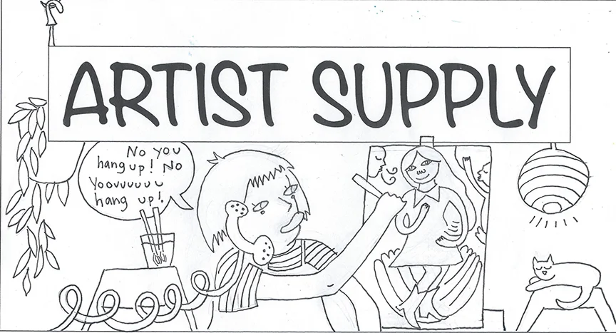
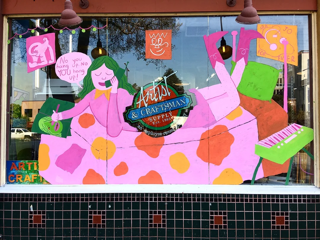
After proposing a couple sketches, we landed on the one I made of two best friends talking on the phone while making art in their rooms, which is by no coincidence how I spend the majority of my time.
After making a sketch, I scanned it onto my computer and played around with the color in Photoshop.
The initial inspiration for the mural, titled No You Hang Up, was the playfulness and kitschy nostalgia of early 2000s TV friendships like Lindsay Mcguire, as well as my gratitude for my creative group of friends. As I finalized my sketches, I realized I also wanted the mural to be a celebration of the brilliant, loving, and inclusive Bay Area art community that I feel lucky to be apart of. For me, celebrating this community meant paying homage to the vital artists and organizers who dedicated their lives to supporting and building it.
No You Hang Up references Ara Jo, a radiant human being who supported, welcomed and befriended countless artists in the Bay Area and beyond. The mural also makes reference to Aaron Curry, commonly known as ORFN, a prolific and raw creative who influenced generations of street artists. Both artists passed away a year ago, in December 2016. This mural is dedicated to them, as well as artist Jeffery Chung, founder of Unity Press who continues to build and grow community for queer and POC folks in the East Bay.
Painting the mural was such a blast and tremendous privilege to paint, and I couldn't have done without the help of my friends and the awesome crew at A&C. If you're in the area, come stop by! It will be up until the end of December. And if you're an East Bay resident, stay tuned for a zine workshop I'll be teaching there on December 10th!
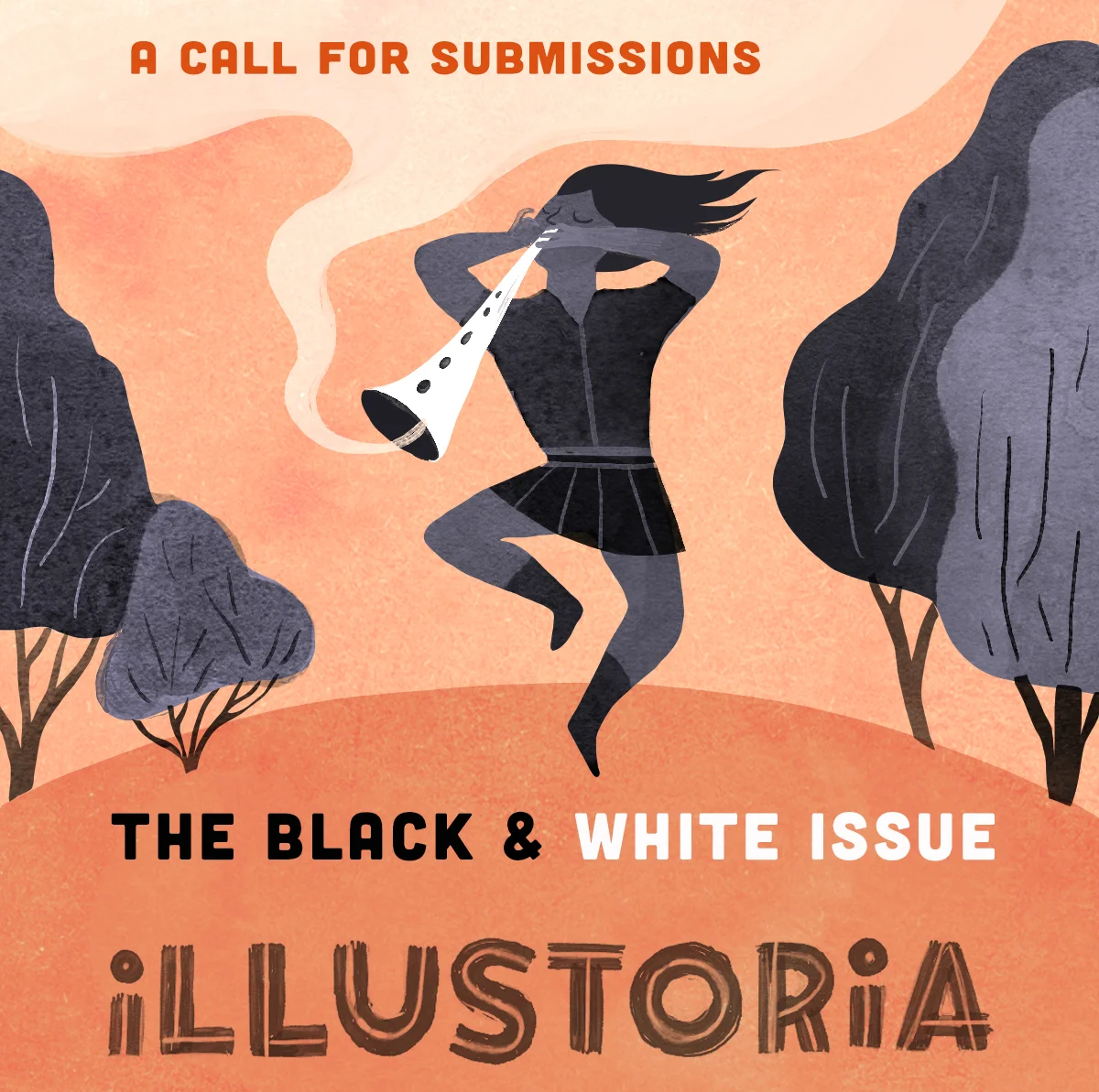
CALL FOR SUBMISSIONS! THE BLACK & WHITE ISSUE
Art by Elizabeth Haidle
Are you an artist or writer who would love to contribute to ILLUSTORIA? Well, we'd love to hear from you!
We have a few slots left in our upcoming issue, themed "BLACK & WHITE." In particular, we're looking for:
- a couple of 2- to 3-page comics or illustrated stories
-spot art or standalone illustrations + minimal text or poetry
-1–3 panel comic strips
Pssst...! We may be a wee bit biased toward work that celebrates diversity, silent films, and b&w photography...but also totally open and excited to see your original ideas!
Submissions due by October 12th, 2017. Find out more about our submissions guidelines here, then email your submission to: submissions@illustoria.com.
Good luck!
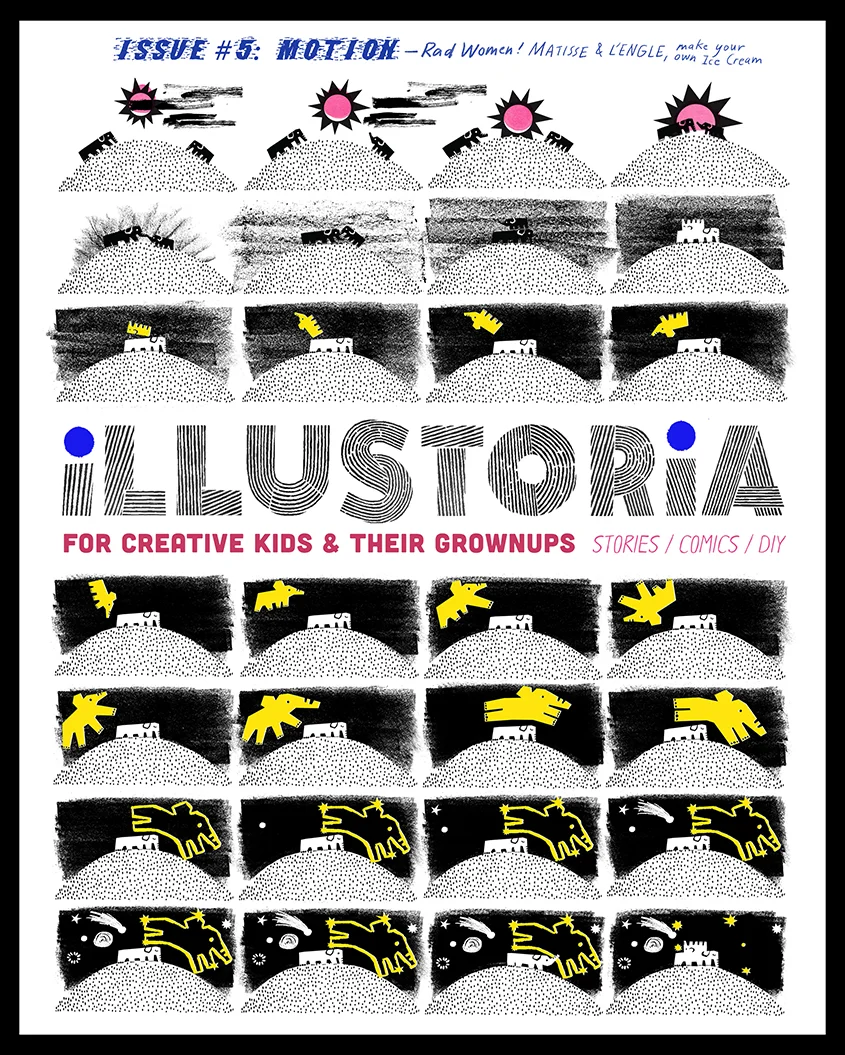
Announcing #5: THE MOTION ISSUE
We are thrilled to present issue #5 of ILLUSTORIA, The Motion Issue. This issue is currently at the printer and will be delivered in the coming weeks so be on the lookout!
The Motion issue is bursting with invigorating stories and comics that will get your brain humming and your feet gearing up for action. We asked writers, artists, and makers to explore motion in all different forms, and the result is a meditation in movement in the form of sea creatures at the aquarium, the gallop of horses, journeys into space and fantastical worlds, the capturing of motion through art and photography, and even the progressive, forward-movement of trailblazers and activists.
Start off the school year inspired and energized through interviews with writer/activist Kate Schatz and visionary artist Miriam Klein Stahl of the bestseller Rad Women Wordwide.
A spread from our interview with rad women Kate Schatz and Miriam Klein Stahl of Rad Women Worldwide and Rad American Women A-Z
Learn how to make your own Victorian-era animated thaumatrope with a DIY activity by our creative director, Elizabeth Haidle.
DIY Victorian-era thaumatrope activity
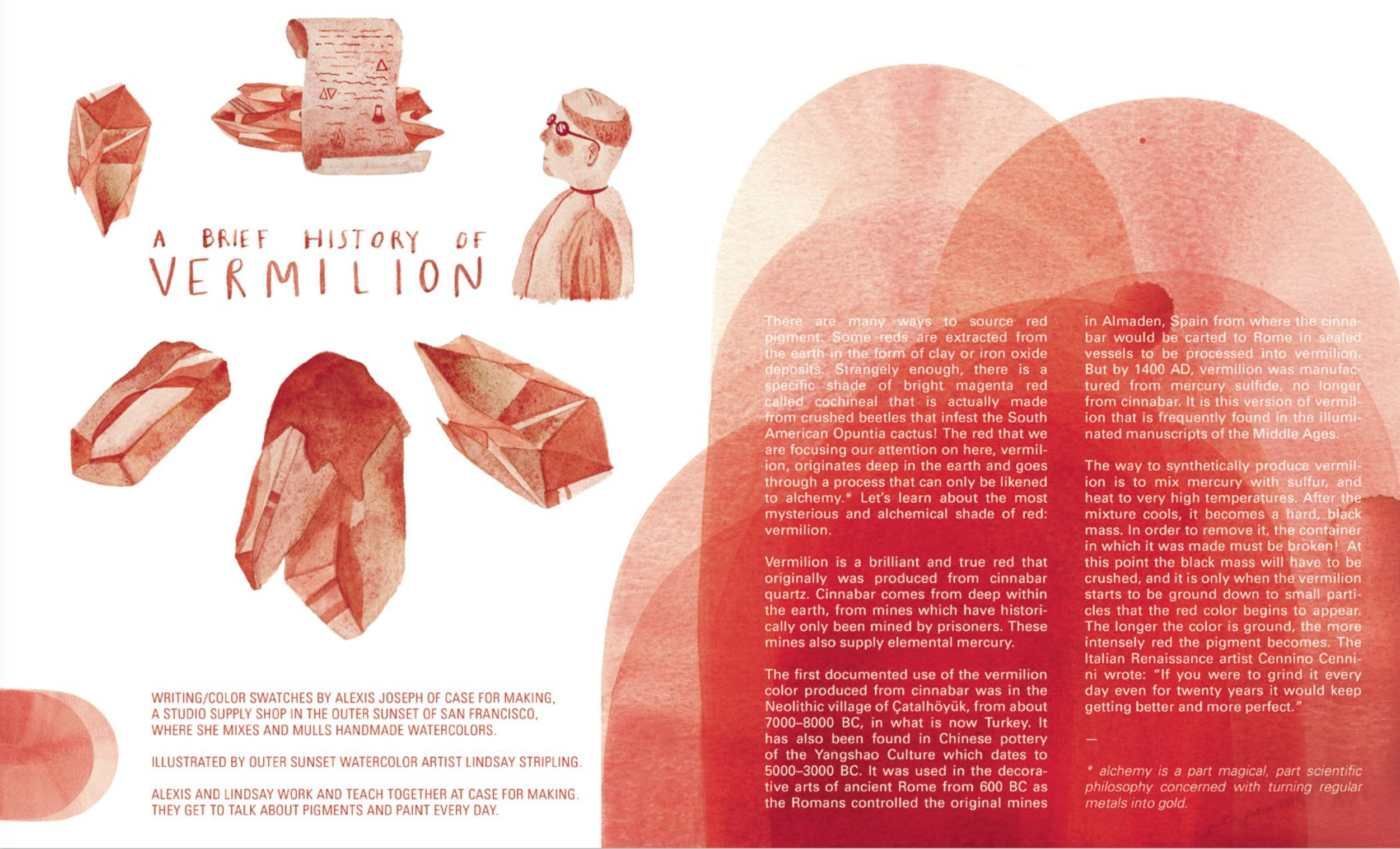
Become a color detective when you read a brief history of vermilion by pigment and watercolor expert Alexis Joseph of Case for Making and master watercolorist Lindsay Stripling.
A Brief History of Vermilion by Alexis Joseph and Lindsay Victoria Lee, for issue #5: Motion
Fall in love with heroes of art history through eye-opening comics on Eadweard Muybridge, Madeline L'Engle, and Henri Matisse, and enjoy so much more in the form of comics, illustrated stories, book recommendations, a playlist and recipe, coloring pages, and activities.
Photographing Motion: Eadweard Muybridge, by Marlowe Dobbe for issue #5: Motion
Spread from Literary Giants as Kids: Madeleine L'Engle, by Elizabeth Haidle for issue #5: Motion
So get moving and pre-order your copy of The Motion Issue on our shop page or at your local favorite shop, newsstand, or bookstore!
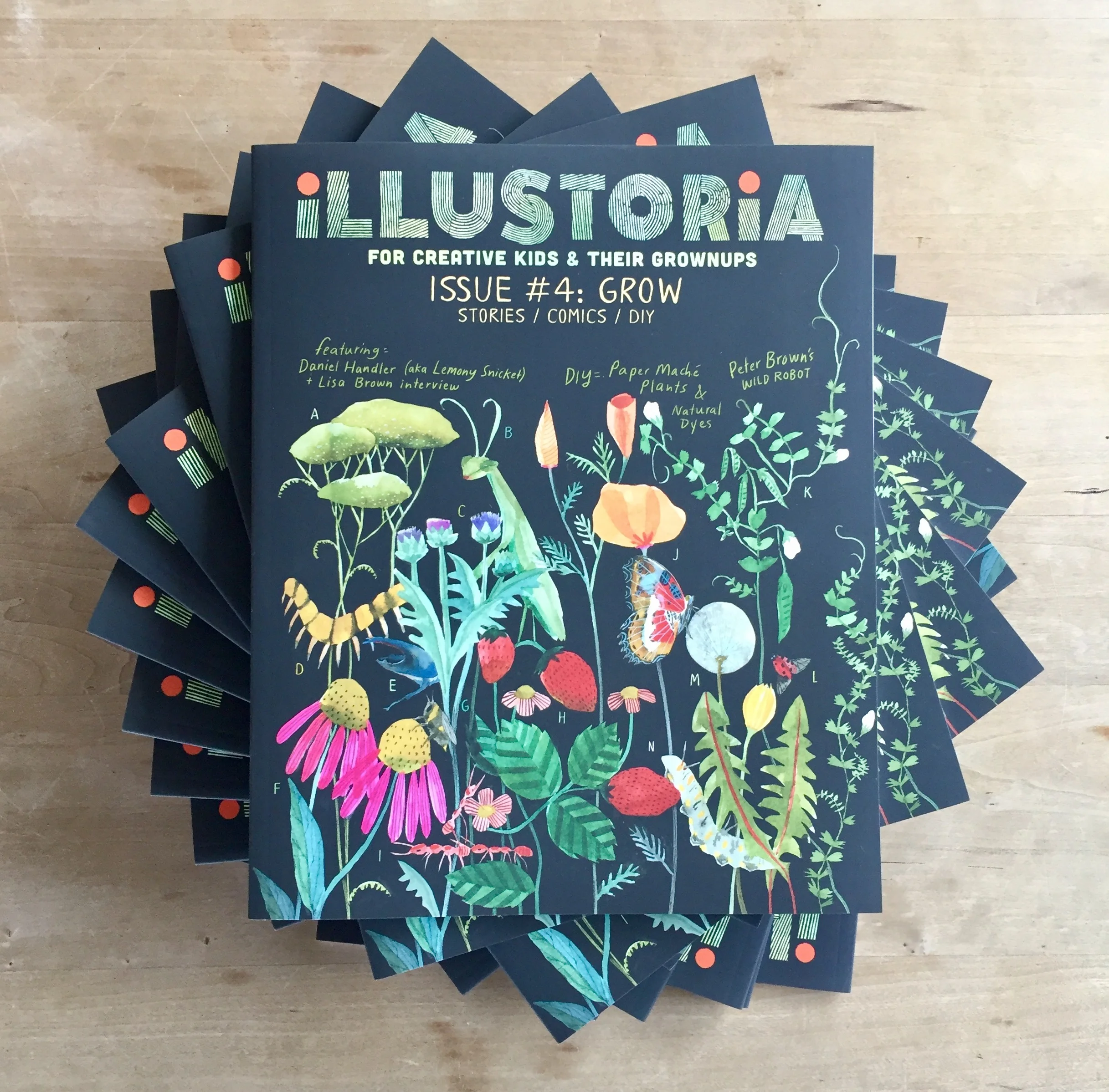
The Grow Issue: A Cover Comes to Life
We couldn't be more excited to announce that Issue #4 has arrived from the printer! The contents of The Grow Issue are as rich and teeming with life as the cover. I'll share more about all the amazing writers, artists, and makers who contributed to this issue soon. But for today I'd love to highlight the wonderful artist behind this cover and the making of it.
Fave local artist and watercolorist extraordinaire Lindsay Stripling graces our cover with her lovely art depicting the flowers and insects that she remembers from long days spent playing in her grandparents' backyard in Lafayette during her childhood, and the flourishing flora she finds in Northern California. Lindsay is a master of her craft, who paints dreamy tableaus of scenes set in folk and fairytale worlds from her imagination. She tells us that the best way to tackle her paintings is to allow for mistakes, since they are impossible to avoid. As soon she messes something up, she just turns it into something else. Find her awe-inspiring work here. You'll also find Lindsay's gorgeous watercolors in another spot in this issue, accompanying our illustrated story A Brief History of Ultramarine Blue written by Alexis Joseph, pigment expert and founder of the swoon-worthy art supplies shop Case for Making in the Outer Sunset of San Francisco.
Here's a look at Lindsay's issue 4 cover sketch, already so beautiful:
We knew we wanted the flora and fauna to contrast against a black background. Our creative director, Elizabeth Haidle, came up with this nuanced coloring of the masthead against black:
Lindsay's final art in place with a mock cover design:
As much as we loved the simplicity of this cover, we knew we'd want to accommodate callouts for our delectable main features, so Lindsay filled out the space with added pea tendrils. We also included lettering so the plants could be identified on the back cover.
And so...the final cover!
Elizabeth designed and illustrated the back cover to beautifully compliment Lindsay's art and the theme of nature and the outdoors, introducing the legend for curious kids (and grownups) to pore over.
We hope you love how this cover turned out and the entire contents of this issue as much as we do! Find out more about all the goodies in issue 4, which includes contributions from creative duo Lisa Brown and Daniel Handler (aka Lemony Snicket); an essay on the making of The Wild Robot by Peter Brown, author of The Curious Garden; an inspiring, illustrated Q & Artist interview with illustrator Diana Sudyka; a new Literary Giants as Kids comic featuring Mark Twain; stories, art, DIY, and activities galore. Click here to see our full table of contents and a few spreads from The Grow Issue. Enjoy!
Women Who Draw, Write, and Inspire Us
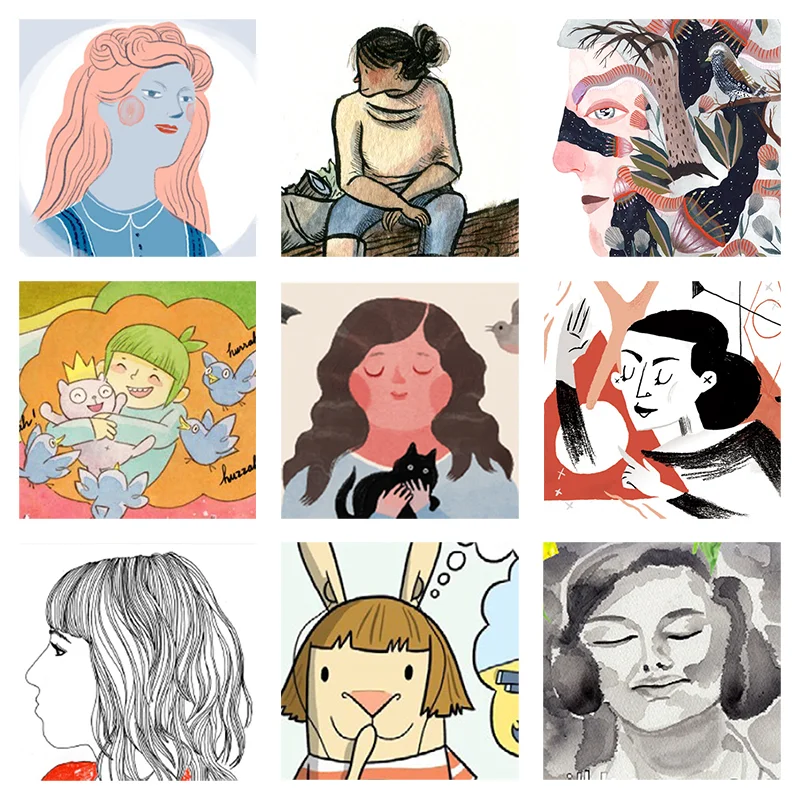
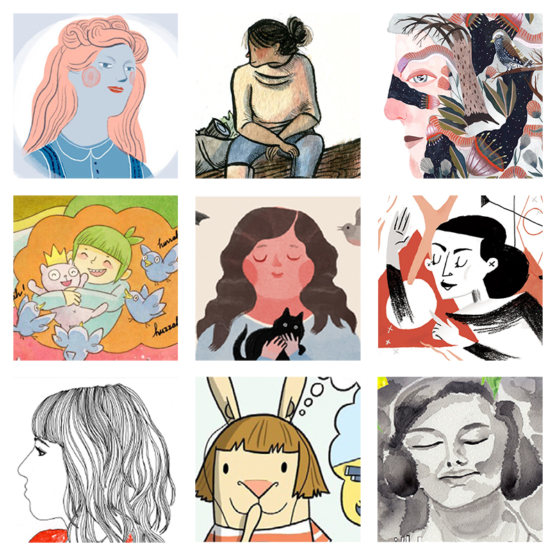
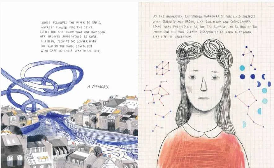
Images left to right: Louise Bourgeois by Elizabeth Haidle (issue 2); sketchbook drawing by Lisa Brown (issue 3); watercolor portrait by Lindsay Stripling (issue 2); "Dream Before Building" by Lark Pien (issue 1); Beatrix Potter by Elizabeth Haidle (issue 3); Martha Graham by Marlowe Dobbe (issue 2); self-portrait by Nina Chakrabarti (issue 3); excerpt from El Deafo by Cece Bell (issue 1); "Hiroshima Mon Amour" by Britt Browne (issue 3)
Women's History Month is coming to a close, but we at Illustoria think every month should be women's history month! We are proud to pay homage to the courageous, intelligent, and rebellious women who have revolutionized their fields and empower us to dream big. Of recent, we've been thrilled to see collectives and movements such as Women Who Draw creating an inspiring platform for talented women illustrators. Today, we would like to take a moment to thank some of the amazing women who draw, write, and inspire us here at Illustoria.
artwork © Lisa Brown
cover art © Lisa Brown
artwork © Lisa Brown
Lisa Brown
Lisa Brown, the stupendous illustrator behind our Issue 3 cover, is a critically acclaimed illustrator, author, and cartoonist who resides in foggy San Francisco. She is the mastermind illustrator behind Emily's Blue Period by Cathleen Daly and 29 Myths on the Swinster Pharmacy by Lemony Snicket and has written and illustrated the fantastic Depressed. Repressed. Obsessed. 3 Panel Book Reviews as well as Vampire Boy's Goodnight, The Airport Book, and How to Be. (And this is all just for starters!) Brown also featured her sketchbook and mini-drawing activity in Issue 3, which we love to pieces. Stay tuned for more highlights of Brown this spring, in our super-exciting-filled-to-the-brim-with-inspiration Issue 4: The Grow Issue! You can find more of her amazing work at http://www.americanchickens.com/.
artwork © Cece Bell
images © Cece Bell
Cece Bell
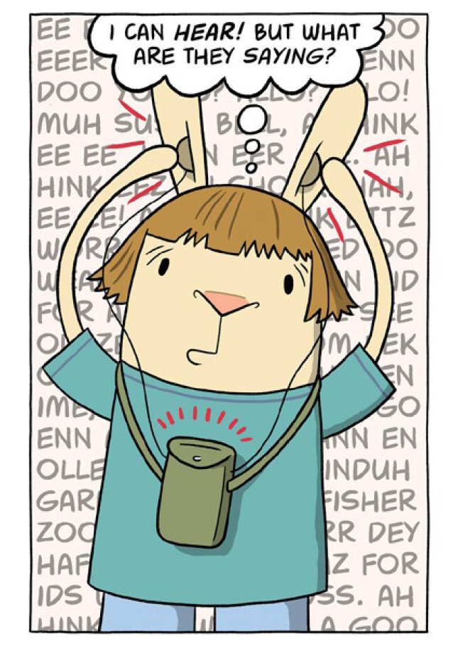
If you haven't gotten your hands on the heart-melting and hilarious El Deafo by the genius Cece Bell, you might want to stop reading right now and run to the nearest book store immediately. El Deafo is a graphic novel memoir that tells the story of Bell's hearing loss and subsequent adventures with a clunky hearing-aid-turned-super-power. Alongside this Newbery Award Winner, Bell has published I Yam Donkey, Rabbit and Robot: The Sleepover, and Chuck and Woodchuck amongst many others. We are so honored to have featured an interview with Cece in Issue 1 and a full length Q&A which you can read here. Check out more of Cece Bell's work on her website https://cecebell.wordpress.com.
artwork © Lark Pien; from "Dream Before Building" in Illustoria issue 1, The Beginnings Issue
artwork © Lark Pien
sketchbook art © Lark Pien
Lark Pien
Lark Pien is a Portland-based acclaimed illustrator and the amazing talent behind the Long Tail Kitty series (for which she won the Friends of LuLu Award) and Mr.Elephanter. Pien was the colorist of American Born Chinese by Gene Luen Yang and Sunny Side Up, two graphic novels for young readers that we could not recommend more highly. We are blown away by "Dream Before Building," a mini-comic she created for Issue 1, and cannot wait to share some new projects she's dreaming up for Illustoria. Find more of Pien's work at http://larkpien.blogspot.com/?view=classic.
artwork by © Elizabeth Haidle
artwork by © Elizabeth Haidle
artwork by © Elizabeth Haidle
Elizabeth Haidle
Have you ever met an artist so talented you want to simultaneously: do cart wheels, bake them a 10-layered Boston cream pie, and hold a radio outside their window à la John Cusack in Say Anything? That's how we feel about our genius, prolific, and awe-inspiring Creative Director Elizabeth Haidle. In addition to spinning up magic at Illustoria, Haidle is the creator of Literary Giants As Kids, a fantastic series you can find in each issue of Illustoria, and illustrator of the dreamy Mind Afire - The Visions of Nikola Tesla, written by Abigail Samoun. We absolutely cannot hold our excitement for the release of I, Parrot, her most recent (breathtaking) graphic novel written by Deb Olin Unferth, which she is currently putting the final touches on. We love the ever-busy Haidle, whose work you can find at http://www.docucomix.com/ and http://www.ehaidle.com/
Cloth Lullaby by Amy Novesky, illustrated by Isabelle Arsenault
Iomogen by Amy Novesky, illustrated by Lisa Congdon
Me, Frida by Amy Novesky, illustrated by David Diaz
Georgia in Hawaii by Amy Novesky, illustrated by Yuyi Morales
Amy Novesky
Amy Novesky is an award-winning children's book author and editor whom we adore five trips to the moon and back. Most recently, she has written Cloth Lullaby, a gorgeous tale of the illustrious, world-famous artist Louise Bourgeois, with stunning illustrations by Isabelle Arsenault. She has also written critically acclaimed books including Georgia in Hawaii, Me, Frida, and Imogen. We are so excited to have featured a full length interview with Novesky which you can find in issue 3. To read more about Novesky's work, check out http://amy-novesky.squarespace.com/.
Laurel Snyder
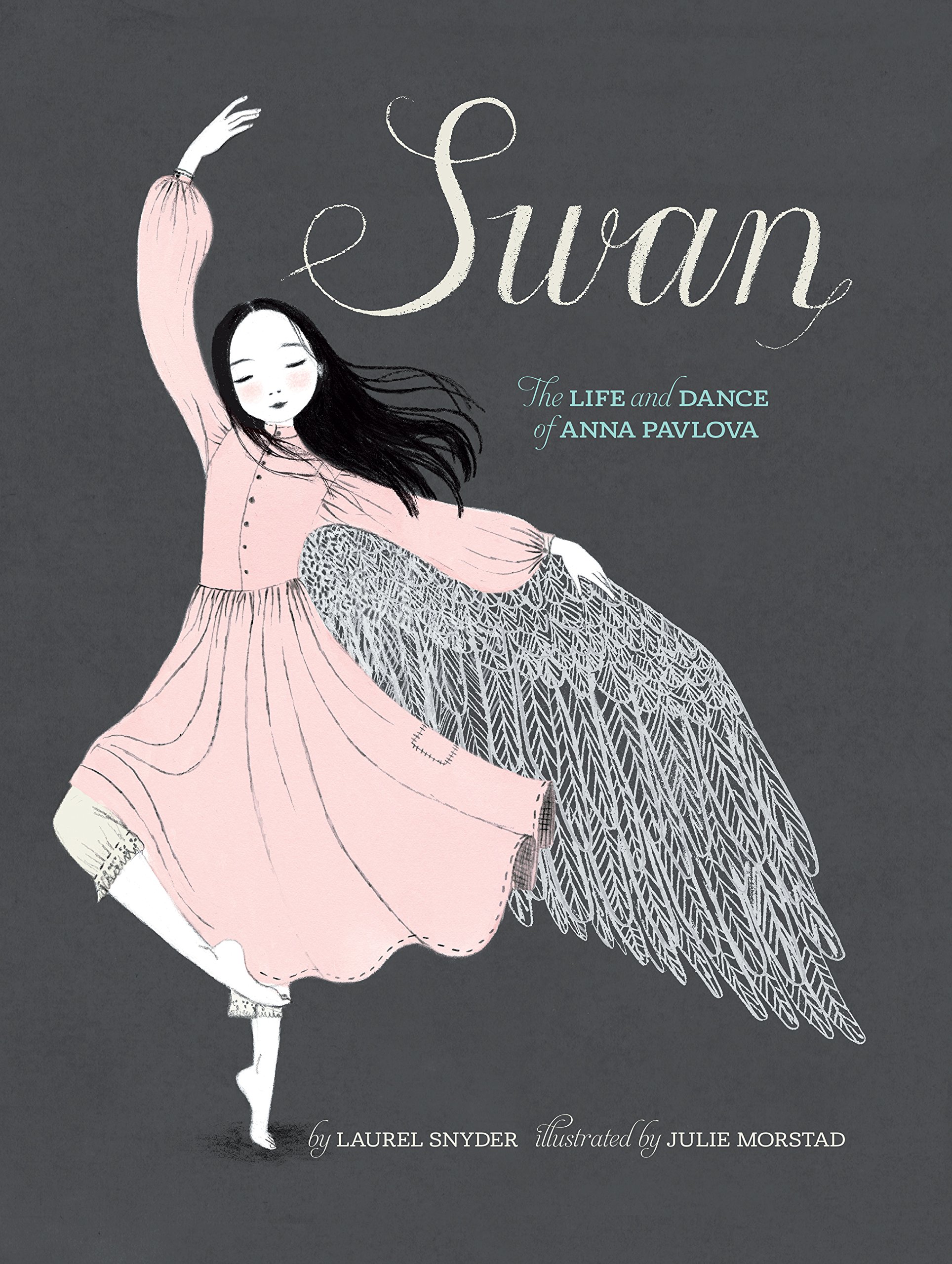
Laurel Snyder is a prolific, critically acclaimed children's author who makes us want to smile for days. She is the author of numerous, joyfully fun-to-read novels for children of which some of our favorites include Orphan Island and Bigger than a Bread Box. She has also written the gorgeous picture books Swan, the Life and Dance of Anna Pavlova and the adorable Charlie and Mouse. You can find Snyder in issue 2, with her biographical piece "Martha Graham In Motion," illustrated by fantastic artist Marlowe Dobbe, about the revolutionary Martha Graham, the Mother of Modern Dance. Check out http://laurelsnyder.com/ for more work by this beloved author.
art © Lindsay Stripling for "The Best Invisible Thing" in Illustoria Issue 2
art © Lindsay Stripling
art © Lindsay Stripling
Lindsay Stripling
A phenomenal woman artist whom we couldn't admire more, Lindsay Stripling works from her studio in the Outer Sunset of San Francisco. We fell in love with her paintings the first time we laid eyes on them for their dreamy palettes, mystical settings, and ethereal subjects. Her folk and fairy tale-inspired narratives lead us into inner worlds that are rich and boundless. We're thrilled to announce that Lindsay's gorgeous artwork will grace the cover of our upcoming issue 4: The Grow Issue--so be on the lookout. Find more of Lindsay's work here: https://www.lindsaystripling.com/
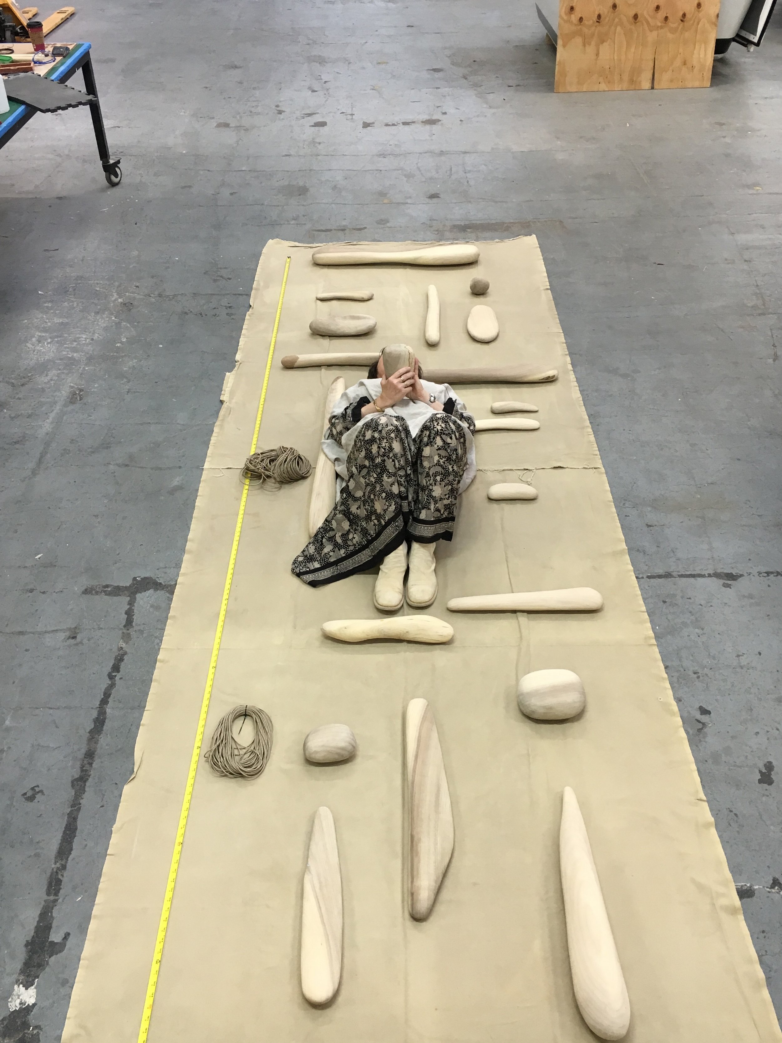
Ruth Kneass laying with the meticulously sculpted pieces of her Bay Tower mobile. © Ruth Kneass
Blonde Driftwood © Ruth Kneass
Nine pieces in collage; a search-and-find activity in issue 3
© Ruth Kneass
Ruth Kneass
Driftwood artist and mobile sculptor Ruth Kneass creates stunning works of art that take years of patience, time, and skill to produce. She shares the story of her mother's influence and her inspiration growing up to be an artist in Illustoria issue 3. A true appreciator of beauty and nature, Ruth infuses her art and life with a feminine love, care, determination, wisdom, and strength that we find simultaneously awe-inspiring and reassuring. You'll find a treat in issue 3, where she disassembled one of her precious driftwood mobiles to create the most gorgeous search-and-find activity we've ever seen! Find more of Ruth's work here: http://www.kneassboatworks.com/
self-portrait © Nina Chakrabarti
art © Nina Chakrabarti; from Nina's upcoming title My Collection of Collections: A Sticker Book
Nina Chakrabarti
We had the chance to interview talented illustrator and activity book creator Nina Chakrabarti and learn all about her inspiration growing up between Calcutta, India and the UK. Born to an English mother and an Indian father, Nina's vivid childhood memories of bright colored saris and streets clamoring with the sounds of trams, trains, and rickety rickshaws; Chinatown and Brick Lane in London; and museums and nature all inspire the joyful work she produces today. In issue 3, she talks about her process creating books such as Hello Nature, My Wonderful World of Fashion, and her upcoming title, My Collection of Collections that will equally inspire young artists and grownup ones. Fun fact: Nina doesn't keep sketchbooks but rather "scribbles on loose scraps of paper, post-its, and newspapers that eventually get tucked away in a box, put up on a wall, or thrown away"! We love her passion for life and her eclectic style, which encourages us to get outside, observe, and appreciate all the diversity our wonderful world has to offer. Find her work here: http://ninachakrabarti.com/
These are just a few of the many amazing women whom we've had the chance to collaborate with over the course of our first three issues. At Illustoria, we are dedicated to increasing the visibility of female creatives by continually supporting and showcasing their work. Additionally, we are committed to promoting women's empowerment in the pages of our mag with stories of both world-famous and lesser-known female leaders from Beatrix Potter to Lee Bontecou. We hope that the stories in Illustoria and the artists behind them will inspire you and the next generation of strong, creative women for years to come.
Creator Crush: Yuliya Gwilym
artwork by © Yuliya Gwilym
artwork by © Yuliya Gwilym
artwork by © Yuliya Gwilym
artwork by © Yuliya Gwilym
One day I was flipping through a draft of Illustoria Issue 3: Outside-In and Yuliya Gwilym's illustrations immediately caught my eye. The bold shapes and extraordinarily unique color palette struck a chord in me, as if my subconscious always wished and longed for Gwilym's unmatched style and then boom -- it was miraculously handed to me on a silver plater.
Yuliya's piece, "Axe Soup," in ILLUSTORIA issue 3: The Outside-In Issue.
I became quickly obsessed with the graphic simplicity and dynamism of her artwork, reminiscent of the Soviet illustrations of Nathalie Parain and Suprematist Kazimir Malevich. Gwilym's accessible, energetic, and endlessly playful work will add an extra dose of happiness to your day. We're so lucky to have the chance to interview Yuliya, as well as showcase her work in Issue 3 and Issue 4 (which comes out this spring)! Make sure to catch more of Yuliya's work at http://cargocollective.com/yufrukt.
What are you currently working on?
I’m currently experimenting with a flip animation book that tells a story about a little elephant. I’m also designing a little game kit for kids with special needs.
artwork by © Yuliya Gwilym
Can you talk about your process of creating a project, from start to finish?
I start by talking about an idea I have with my partner or artist friends. I try to turn visuals I have in my head into words which usually helps me get a clearer idea. I then do a lot of rough sketches and after that go straight into finals, that way I have some room for experimentation and mistakes which sometimes bring the most fun results. I like to work with different media so my design process varies from time to time.
artwork by © Yuliya Gwilym
artwork by © Yuliya Gwilym
Where did you grow up? Where do you live now?
I grew up in Kiev, Ukraine. It’s a big but very cozy city, I spent my summers in the countryside hut built by my grandparents, helping grandma harvest tomatoes and pick up lost animals from the forest in my spare time. For the past 10 years I’ve been living by the North sea, in the Hague, the Netherlands. I definitely miss hot summers and sweet tomatoes but I love to live abroad -- exposure to other cultures brings out the best in people.
photo by © Yuliya Gwilym
What were you like as a kid?
Its hard to say these things about yourself, my mum says I made friends with everyone wherever I went and was generally very open (which often included telling our personal family stuff to strangers).
What were your favorite childhood books?
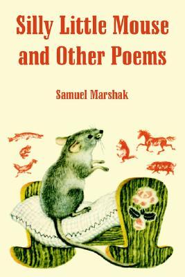
When I was very young I loved the poetry of Samuil Marshak, I knew most of his books by heart and they had beautiful illustrations by graphic artist Vladimir Lebedev who I still admire very much.
Slonenok (The Elephant's Child) by Vladimir Lebedev
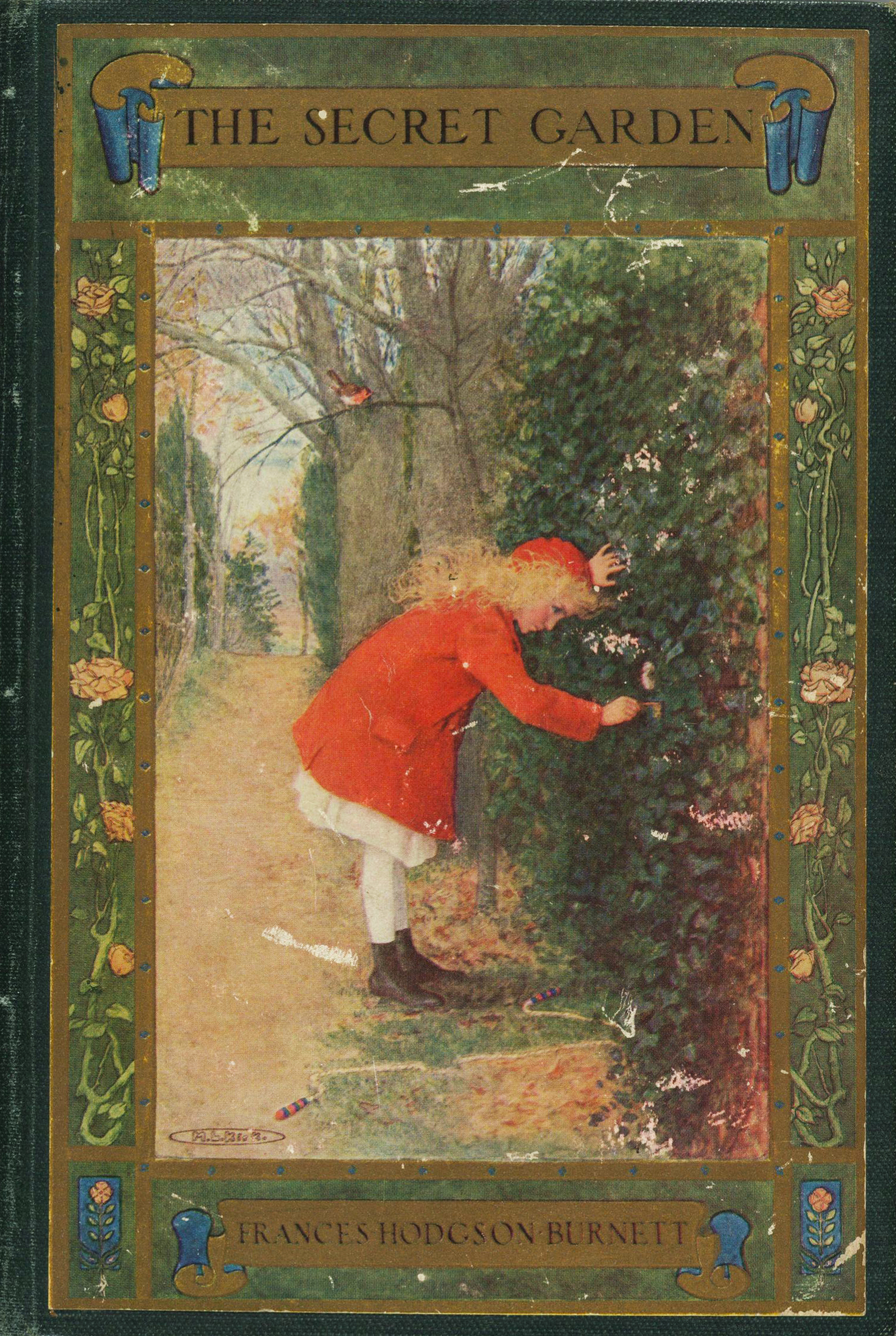
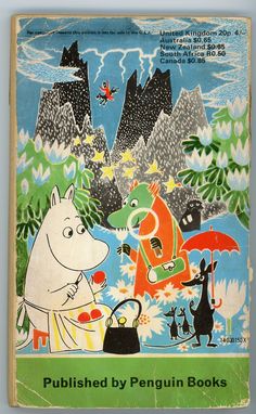
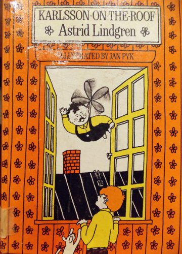
A bit later my favorite books were A Little Princess and The Secret Garden by Frances Hodgson Burnett, The Adventures of Family Mumin-trolls series by Tove Jansson and Karlsson On The Roof by Astrid Lindgren.
Did you have a favorite subject in school? A least favorite subject?
I liked classes of drawing, crafts, mythology, choreography and biology. I really didn't like math…
artwork by © Yuliya Gwilym
When did you know you wanted to be an artist and writer?
In primary school I wanted to build hotels for homeless animals (there are a lot of stray cats and dogs in Ukraine) or be a vet. Later in high school I decided I want to be artist and designer.
Who or what inspires you?
My biggest inspiration comes from children, listening to the weird things they say. I love starting strange discussions with kids and seeing where it brings their adventurous minds. I also find animation and movies very inspiring, old things and folklore, stories from when my grandma was a little girl, I’m inspired by Japan and Japanese yokai, traveling and meeting new people.
photo by © Yuliya Gwilym
What is the most challenging part about being an artist/writer/maker?
Constantly promoting your work, communicating the value, time and care you put into your craft to people who aren’t artists/makers themselves. Staying organised and being able to push forward and keep working even when you’re “not feeling inspired or motivated.”
When do you feel your most creative?
Just before I get into bed.
What advice would you share with young aspiring artists?
Try to be patient. When things seem slow, its not because you're not good it just takes lots of time. Make friends with other artists! It's so much easier when you're not alone and I find young artists’ community very supportive.
artwork by © Yuliya Gwilym
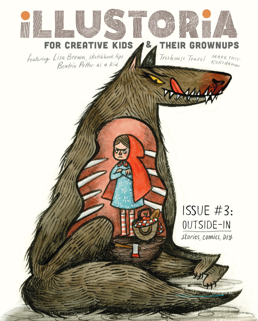
Lisa Brown cover art: The OUTSIDE-IN Issue
We are so pleased to reveal our cover for issue 3, The Outside-In Issue, featuring delectably delicious, wondrously charming art by the amazing Lisa Brown!
As many of you picture book and comic fans know, Lisa is the creator of the ingenious Three Panel Book Review strips featured in The Rumpus, co-creator with Lemony Snicket of The Latke Who Couldn't Stop Screaming, author/illustrator of the hilarious Baby Be of Use board book series, and author/illustrator of her very latest, The Airport Book. Needless to say we've had a creator crush on Lisa Brown for some time....
So when a few months ago Lisa graciously took a morning out of her busy schedule as a writer, illustrator, teacher, mom, and passionate kid-lit advocate to meet with me at one of her favorite cafes in San Francisco, I was beyond excited and a little nervous. I knew through her work that she was exceedingly intelligent and bitingly witty. Being the warm and generous person that she is, Lisa immediately put me at ease. I should have known--after all, those who work in children's books generally are a kind-hearted bunch! Lisa shared with me her thoughts on why it's important to cultivate creativity in kids through that excruciating, self-conscious phase around the middle school years, the range of diverse picture books on her syllabus at CCA, the challenges that women illustrators face in the publishing industry, and she even gave me a sneak peek of her upcoming picture book. (Psst...interview with her and her elusive co-author to come in issue 4!) By the end of the meeting, she sent me along with a list of fabulous artists to contact and agreed to create cover art for an upcoming issue. I was totally blown away...and so grateful, and excited!
Now, here we are several months later with a gorgeous cover by Lisa that speaks volumes about what we at Illustoria care most about: timeless, captivating art with a unique point of view that resonates across generations; the value and delights of print publishing; the power of illustration; our ever-lasting love for visual storytelling. And how cool is this take on the swallowed-whole dilemma from Little Red Riding Hood??! Just wait until you see her back cover....
Thank you, Lisa, for your fabulous contribution to The Outside-In Issue!!
Inside you'll also find Lisa's sketchbook tips to aspiring artists. Truly the inside of issue 3 is just as delectable as the outside, with contributions by an array of lovely artists and writers whom we couldn't have pulled this off without, including: Nina Chakrabarti, Amy Novesky, Paul duCoudray, Micah Player, Willie Real, Elizabeth Haidle, Ruth Kneass, Mike Dutton, Alexis Joseph / Case for Making, Britt Browne, Claire Astrow, Yuliya Gwilym, Alexandra Rose Franco of Rito-ito, Rachel Garrison, Kristen Solecki, Clark Jackson, Martin Cendreda, Anne Pomel, Karl Dotter, and Jeremy Anderson. More sneak peeks to come so follow us on Instagram to see the latest updates.
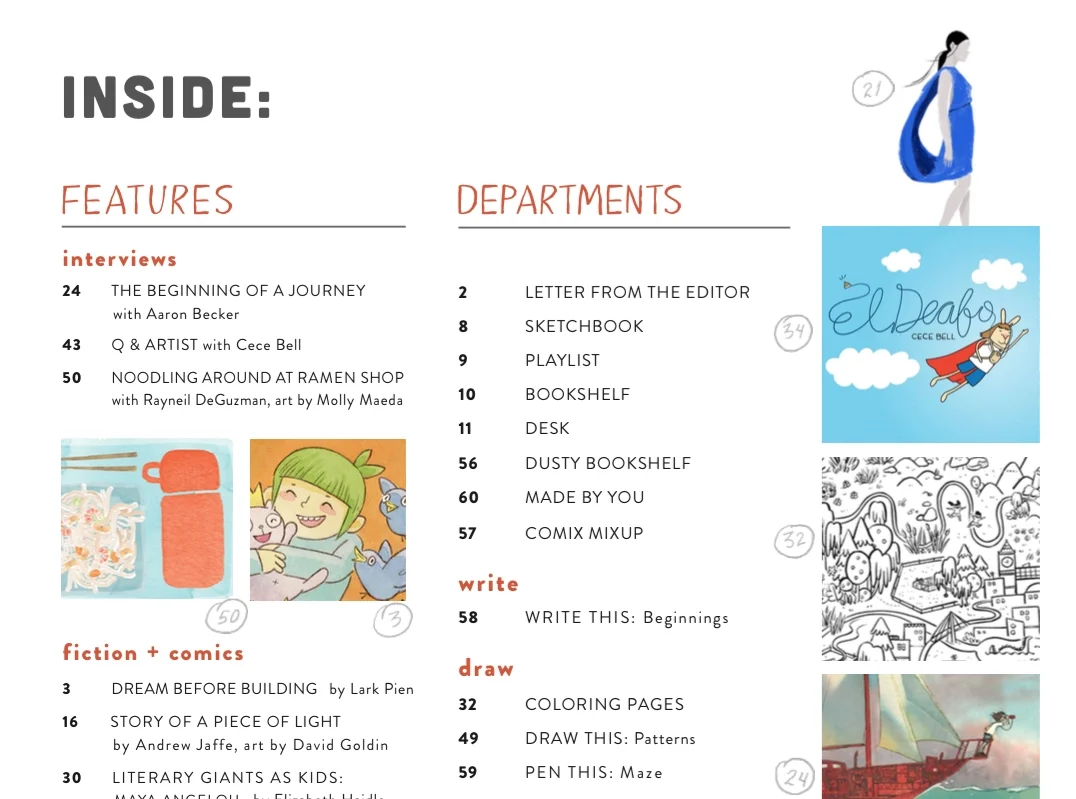
Here's a look at #3's table of contents, and be sure to check out our Shop page to see sample spreads from this issue and to pre-order. We'll send out copies in March 2017.
I hope you enjoy this issue as much as we loved putting it together.
Lastly, thanks to Sakura of America and Case for Making for sponsoring issue 3!
Shop Local & Support Your Fave Artists
Today we have guest blogger and Illustoria contributor Lindsay Stripling, one of our absolutely favorite local artists, sharing with us her thoughts on shopping locally and the artists in the San Francisco Bay Area whom she loves to support. We couldn't agree more with her choices and hope you get inspired to shop local wherever you are.
The shop local movement started as a way to support the local economies during the recession in 2008 and after, but the current shop local movement has transformed into a way to support local businesses and artists during a time when perhaps they are struggling to keep up with rising rent prices due to the local economic boom. There is no time like the present to support the shop around the corner or the artist you see every morning on a walk- every little bit counts and it helps to create the type of environment we wish to live within. I took a little time to map out a few creatives who are excellent and whom I will most definitely be gifting from this year and are perfect last minute holiday gifting ideas or a way to celebrate a new year!
Maria Shoettler’s work is so fresh and loose and documents local flowers, veggies and basically the Bay Area environment in a way that honors the land that they’ve come from. Her 2017 calendar has a recipe for each month with her beautiful watercolor illustrations showing the seasonal veggies and fruits that would honor each recipe. She is as thoughtful as she is creative and I cannot wait to give my niece her new coloring book depicting local wildflowers.
Maria Shoettler's 2017 Produce Calendar
Grace Levine is the genius behind Kitty Hawk Gallery, an adorable boutique and art gallery in Sebastapol. Grace always has time for a fun chat and a good back story on each of the items in her shop. If you do not have time to visit her in person, she has an incredible online shop and is able to honor over the phone orders. Her paintings are whimsical and sarcastic and make me laugh every time. She has her own artwork as well as that of other artists, clothing, jewelry and other goods made by talented local and national craftsmen and women. Definitely a good place to take a day with the fam to get some lunch at one of the cool little breweries and wander around downtown Sebastapol.
Kitty Hawk Gallery in Sebastabol
The first time I visited Julie Cloutier’s studio (the Mud Room) I was so surprised at how hidden it was amongst all the other sunset homes around it. It is in the top floor of a renovated, still in the works, Sunset home that she shares with its owner Georgia Hodges, who also has lovely ceramics to explore. I am always blown away by seeing how people work, and seeing Julie’s space was no different, she clearly is a woman of precision and repetition, a person of process. Her ceramics are incredibly designed, so that you can find any use for them. I have so many of her bowls, cups and tiny sake glasses, and they are always in use. Whether for actual drinks and food or to hold colored pencils, pencil sharpeners or shavings, water for painting or flowers from the park, they find a practical and beautiful appearance on my table. Julie’s ceramics make an appearance at another of my favorite local shops:
Julie Cloutier ceramics
Case for Making is an art supply store like you’ve never seen in the Outer Sunset of San Francisco next to the beach and the park. Alexis Petty who owns the shop designed the space and stocked items around the idea of what artists actually love using and experimenting with. All of the items stocked in shop are things that the working artists who staff the space actually use and love. Alexis is an artist herself and loves process and exploration and she has framed her store with the idea that you everyone has the ability to be creative. Alexis’ newest endeavor with Case is that she now make her own CFM watercolors from scratch! You can gift a set of locally handmade gorgeous watercolors- with colors like Ultramarine Blue, Florescent Red, and Sahara Ochre- you can choose what colors make up your set. There is something for everyone at Case, whether you are an experienced artist or someone who hasn’t ever created before and especially for kiddos, there is something to explore and feel empowered by. Grab some lunch up the street with the fam at Outerlands and then grab some supplies for a creative afternoon at Case.
Case For Making interior, photo credit Nick Forland
I first saw Illustoria Magazine when I was working on a Saturday morning at Case for Making. As a kid I grew up loving Highlights Magazine, where there were activities and articles that entertained me for weeks. Illustoria is totally a nod to old Highlights while also being for kids’ grown up counterparts! It's insane how Joanne Chan, the founder and editor-in-cheif of Illustoria, and Elizabeth Haidle, the creative director, have both created a magazine that is challenging and fun for both kids and adults. They have cram packed it with illustrations from talented artists from all over, made it informative and creative with projects, coloring sheets and articles from different creative people. I will say as a kid I had no idea that I could actually be a creative person as a grown up for a living, only because I never saw examples of adults I knew doing that, but had I grown up with Illustoria I would have had a completely different understanding of what my adult life could become. I already gifted subscriptions to kids in my life and I look forward to seeing what else they come up with!
Photo (c) Melissa Kaseman
Jen Garrido is a San Francisco Bay artist who works with oils, acrylics and watercolors. She does incredible, loose and colorful florals on paper and panels that she always has for sale on her website. Jen has an alter ego, when she isn’t painting, she is designing textiles for her home wear company Jenny Pennywood that she has printed locally items like tea towels, pillows and textiles. Jen’s patterns and paintings are fun for everyone in the family and are a perfect gift idea. You can find them in person along with all sorts of other equally beautiful items at the General Store, right next door to previously mentioned Case for Making in the outer sunset.
Jenny Pennywood napkins
Kindah Khalidy is a local oakland based painter that is just an explosion of color. I have been dreaming of getting one of her large paintings to hang in our bedroom. Her paintings are vibrant, playful and very very beautiful, she also makes them into small makeup bags, beautiful shirts and other fun items that you can find in her webshop. She will even make prints of any painting that you like for a more affordable option if an original isn’t in the cards this year.
Landscape Pop Diptych (#196) 2016, Mix Media on Paper, two panels 22" X 30" each
And finally if you are looking for a place to visit with the kiddos, a morning or afternoon trip to get everyone out of the house during this holiday season- take a short trip down the coast to Yonder Shop in Pacifica. Linda Fahey is the amazing ceramicist behind this space, she has turned her studio into a small boutique. When you visit Yonder you can see her work in process as well as shop finished mugs and bowls of hers and beautiful paintings, textiles and apothecary goods of other makers whom she has curated in her shop. Linda is a great host, has lived in Pacifica all her life and visiting Yonder is like stopping by a friends house. After you get some goodies I would wander down to Linda Mar beach and let the kids run around while you watch some surfers and look for whales.
Yonder Shop interior
Lindsay Stripling is a San Francisco based artist who lives and works in a neighborhood located right next to Golden Gate park which runs for miles, due west, straight to the Pacific. Lindsay works primarily with watercolor on paper, using color and form to create dreamlike narratives that echo folk and fairy tales that we vaguely remember from childhood, where the moral might be lost, switched, blurred or even just completely missing. Lindsay’s illustrations have shown up in Illustoria and she is currently working on a fun coloring book for both kids and adults.
Lindsay Stripling is a San Francisco based artist who lives and works in a neighborhood located right next to Golden Gate park which runs for miles, due west, straight to the Pacific. Lindsay works primarily with watercolor on paper, using color and form to create dreamlike narratives that echo folk and fairy tales that we vaguely remember from childhood, where the moral might be lost, switched, blurred or even just completely missing. Lindsay’s illustrations have shown up in Illustoria and she is currently working on a fun coloring book for both kids and adults.
You can learn more about Lindsay and her gorgeous work and support her here.
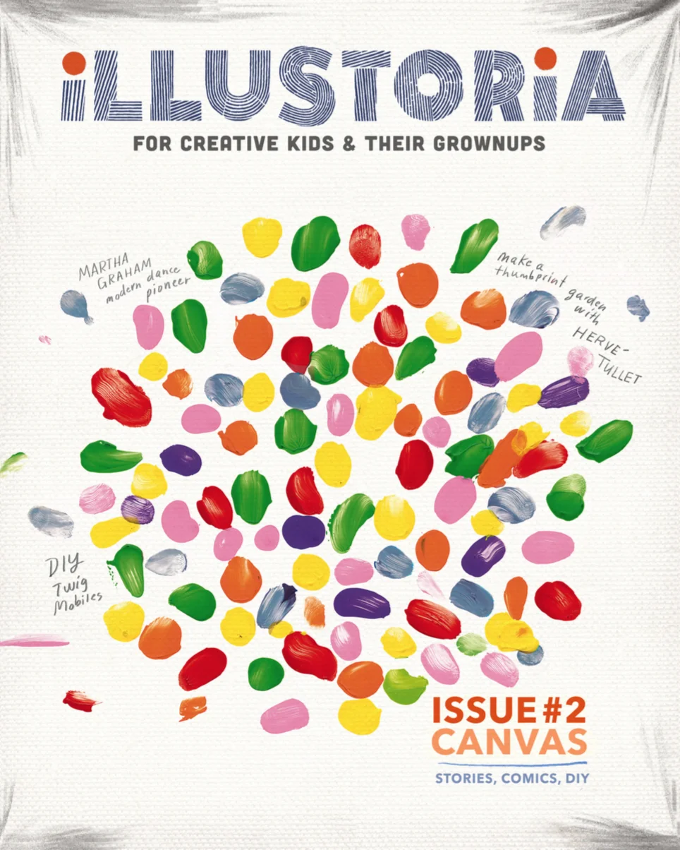
THE CANVAS ISSUE is IN
Cover art by Herve Tullet, from his book Mix It Up!, published by Chronicle Books; Cover design by Elizabeth Haidle
We are so thrilled to announce that Issue 2 has arrived and is getting ready to ship to our dear readers! (Stockists: Please contact us to place your order!) The Canvas Issue is overflowing with vibrant, gorgeous art by some of our favorite artists and writers. From the awesome cover art and interview feature with Press Here author Hervé Tullet to a Q&A with Tony DiTerlizzi of The Spiderwick Chronicles and The Search for WondLa series, a biographical story on Martha Graham by Laurel Snyder and illustrated by Marlowe Dobbe, a comic on Georgia O'Keeffe by Todd Webb, a non-fiction piece, "Beyond the Canvas," by our very own Elizabeth Haidle of Docu-Comix featuring artists Lee Bontecou, Frank Stella, Diego Rivera, Louise Bourgeois, and Christo & Jeanne-Claude and so so much more.... It's an embarrassment of riches to be sure!
Here are a few pages from the packed 64-page issue.... Please enjoy! : )
Excerpt from "Beyond the Canvas: Artists Who Reinvented the Rectangle" by Elizabeth Haidle
Excerpt from "Mix, Splash, Muddle" by Julia Breckenreid
DIY twig mobile by our very own Claire Astrow!
Excerpt from our interview with Tony DiTerlizzi
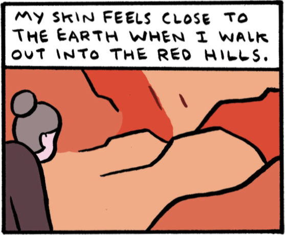
Excerpt from "Georgia In the Desert" by Todd Webb, a comic that draws from O'Keeffe's own writing.
Purchase your copy here or ask for issue 2 at your fave local bookstore. xox
Who We Are: Alexandra Rose Franco
art by Elizabeth Haidle
Name: Alexandra Rose Franco
Location: Mill Valley, California
Profession: Designer/Owner, Rito-ito: A floral, object and scent studio. Strategist, futureprüf: a digital design studio
Here I am making the beginning of a fall wreath
Favorite artist/illustrator:
Artist: I’ve always been drawn to Robert Motherwell paintings for their bold, dark expressiveness.
Illustrator: I recently came across a Japanese illustrator, Ryo Takemasa and love the work.
Fun food illustrations by Takemasa
Best book you've read in the past year: When Women Were Birds, by Terry Tempest Williams. I’m also currently reading A Natural History of the Senses, by Diane Ackerman and really enjoying it, and Americanah by Chimamanda Ngozi Adichie.
A beautiful read
Kids book you could read every night: Where the Sidewalk Ends by Shel Silverstein
Best memory of being a kid: Building forts with my brother in the marshland behind our house.
Favorite weekend activity: Going to the Sunday's farmers' market at the Marin Civic Center and cooking Sunday supper together with my partner, Max.
Coming home with farmer’s market bounty
Song currently on repeat: Currently, anything by The xx.
Favorite meal: It's hard to pick one favorite, but I always love clams and linguine with lots of garlic, chili flakes, and white wine.
Last time you made something with your hands: I try to make something with my hands almost everyday. Today I'm designing with fall flowers in preparation for Thanksgiving.
Fall flowers at Rito-ito
Fun fact about you: I studied at the Joffrey Ballet in NYC for a stint during highschool and had the opportunity to live on my own and explore the city as a teenager. It gave me a sense of adventure, responsibility, and confidence that I needed as a young person.
Immersed in Under Water, Under Earth + Q&A with the Creators
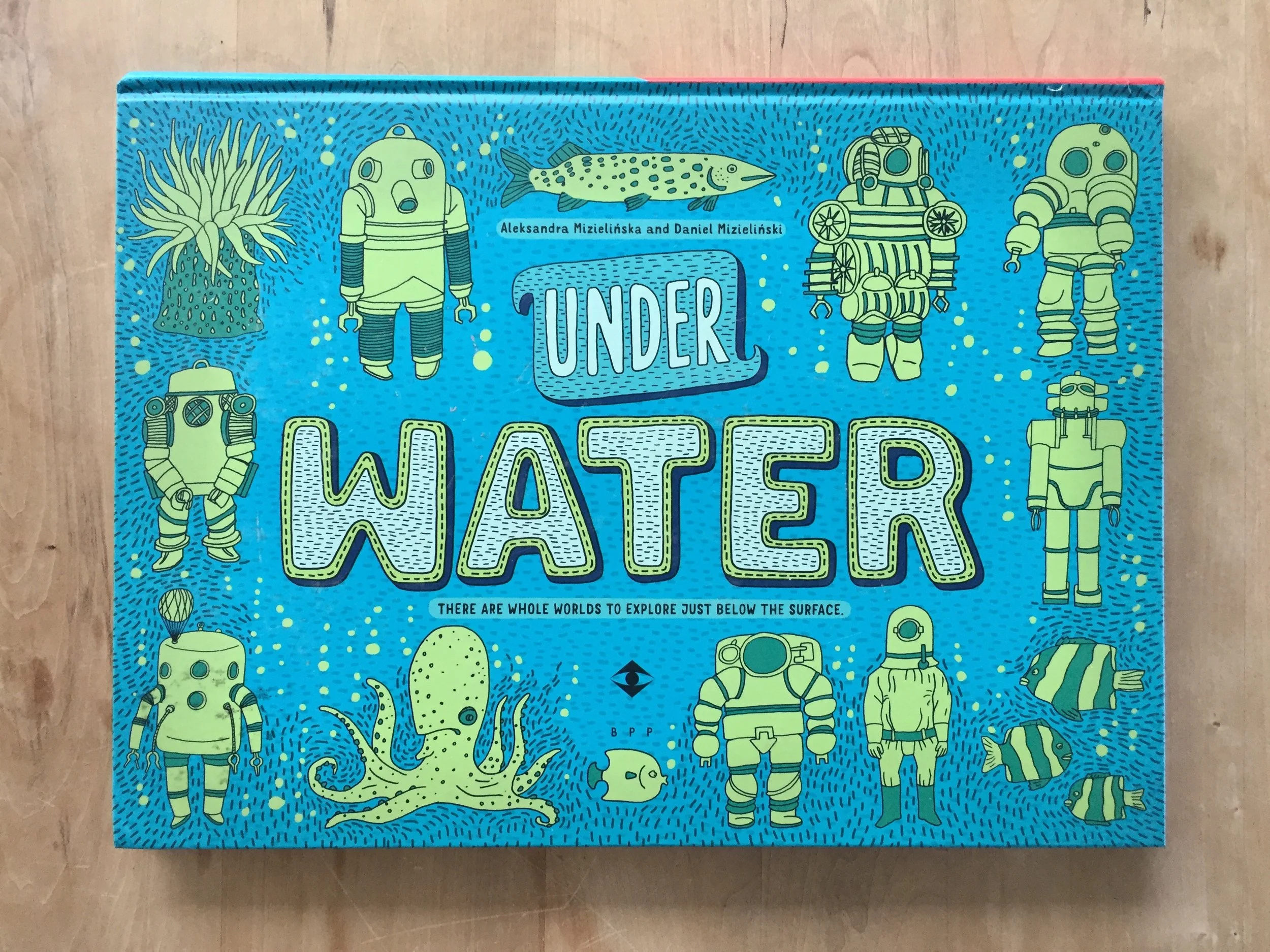
Under Water, Under Earth by Aleksandra Mizielinska & Daniel Mizielinkski, published by Big Picture Press, an imprint of Candlewick Press.
Internationally renowned illustrator duo Aleksandra Mizielinska and Daniel Mizielinski are back at it again with the tremendous Under Water, Under Earth, which just released and is in stores today. The Polish couple are founders of their creative incubator Hipopotam Studio and are the masterminds behind children’s books Welcome to Mamoko and Maps. Their immersive art, always teeming with color and information, is captivating for kids and parents alike--making them a favorite here at Illustoria.
In Under Water, Under Earth the Mizielińskis continue the encyclopedic theme of their past work Maps with a visually explosive double-sided book that explores the worlds that exist beneath the surface. Readers traverse their journey by starting from the surface and making their way down, beginning with earthworms and ending with the Mariana Trench, the lowest point of the ocean. The book’s organization is playfully idiosyncratic, hopping from root vegetables to subway train stations to tectonic plates.
Flip the pages and you’ll see each topic is stuffed to the brim with astonishing factoids, wildly vibrant illustrations and imaginative diagrams. The Mizielińskis offer an otherwise impossible look into the coolest things out there, like a train tunnel being gorged out of a mountain or boreholes that go 7.5 miles beneath earth’s surface. What’s even more astonishing is its breadth--the Mizielińskis seamlessly bring together ecosystems, technological processes, natural phenomena, physics and history. It’s easy to get lost in the artists' distinctive cartoon style, which is highly detailed and, given a second look, secretly mischievous.
You and your ever-curious youngin’ will want to devote an entire afternoon digging into this masterpiece. And don’t be mistaken, this isn’t a cool fact book your kid will read once and then tuck away forever in the closet. Rather, this enormous atlas is one they’ll want to return to again and again, each time to learn a new, mind-boggling fact. We were fortunate enough to get an interview with Daniel Mizielinski, thanks to Phoebe and Jean at Candlewick Press...so read on!
Q & A with Daniel Mizielinski
Can you talk about the research process for your books?
We follow information on internet sources, and check them with real people working in the field. After that, there are usually two or three or four specialized editors—we have a biologist, someone from construction, and so on, reading pages with images and text and they’re finding mistakes that we correct.
How do you find these experts?
They may be editors for other publishing houses, or in one of our books we had a physicist from CERN who’d done a book about space exploration and physics. Every person is just six Facebook or Twitter friends away, it’s really true. Whenever I can’t find someone, I just throw a question at my Academy of Fine Arts net of students, and within a day I have answers.
Please describe your roles in working together on your books.
In every book we have both text and images created by me and Ola. It’s hard for me to define how exactly we do that because it’s so seamless we don’t really think about it. We met at the first year of college and we learned how to design and created our first commercial, [bad] projects together and learned from our mistakes. We just know each other so well.
What is your drawing process? What mediums do you use?
Everything you see is drawn on paper and then usually colors are created in computer. And of course all the layouts are done on computer. But we always start on paper. We design both video games and books, and even with games we do sketches by hand. Usually a lot of assets are drawn by hand.
I think this is because the education process in the arts schools in Poland is different than in the US. In the US you have this very narrow specialization, and in Poland you go through everything, from the very traditional 16th-century graphics—I had two years of making fresco and other ancient techniques—through design, type design. On the side we are both programmers. There’s a lot of diversity. It’s good because you can always change what you do. If you have a low budget [for a commercial project], you don’t have to hire an illustrator.
Do you think that’s why there’s such creativity today in Polish children’s books?
There’s always been that creativity. The problem was that in the 90s, after Poland regained its independence and the capitalism came in, all those great old publishers didn’t know how to work in the new reality. Before the ’80s or the ’90s, all the books in Poland were published in runs of hundreds of thousands…. The ’90s were a period when people were adjusting to a new reality. We had a lot of great products, but we had a lot of cheap products. After [the collapse of the big publishing houses], small publishing houses started to pop up, created by two or three people, like our publishing house, Dwie Siostry. When we came to them, it was 2007, we’d just graduated from college, and they had like two books. We started working with them when they had this moment where they knew what they were doing but they still hadn’t sold a lot of rights to their own books.
Maps is another gorgeous, large-format book by the authors that flaunts an incredible breadth of information about the world and its inhabitants through detailed illustrations and hundreds of fascinating facts.
Discover something new as you draw, color, and doodle your way around the globe in the Maps Activity Book.
Here, because Poland is so much smaller than the US, the only way to make a living making books for children is to sell foreign rights. So Dwie Siorstry were the first ones to do this huge leap. This is the main reason we could abandon making any commercial projects and just do books and games, and they can have this greater reach and publish good books that are also not expensive in Poland…It’s very important here to keep the low price, because you don’t want to create exclusive books that are printed in low runs that designers want to put on their bookshelves. You want to create books for kids that are not only in the center of Warsaw but also in low-income areas. Those books are designed to be really for kids. Not just a trophy for us as graphic designers to create these achievements. We are lucky to have this publisher. It’s great to see your book in a library in a school where maybe students don’t have as many opportunities.
It sounds as though you’re driven to make sure that your books reach kids.
I hear from a lot of writers, not just designers but writers, that writing a book for children is something like a lesser task for a writer, right, it’s better to write some nonfiction for adults, you know what I mean? In Poland, when you look at illustrators and graphic designers, it was never like that. All the great designers, the famous Polish designers, they all did books for children; in the academies, in the art schools, books for children were always one of the most interesting topics.
Throughout my childhood, all of those books were designed really, really well. I was lucky enough to be taught by some of the teachers who created some of those books, because they’re still alive—because I’m not that old—and it was a great experience. I don’t know if it shaped this consciousness that you need to design for kids or something like that, but I think it’s shaped this idea that a book can be a really great experience.
Another captivating series by the authors, equally entertaining and scrumptious for kids and grownups.
Every one of our books is written using those two languages: one is words, one is images. We treat the visual language on the same level as written language, and we try to be careful that those two are not mirroring each other. The worst thing in my opinion an illustrator can do is when there’s a text says, “Mary’s going through a forest,” and you’re just drawing a regular Mary who is walking through a regular forest, and maybe there’s a blob of green for the trees. The best thing you can do is interpret a text and add things that are not in the text. We always try to do that, because it works great in educational books to write that way. If you can convey something much quicker using images, then why use a text?
How have your own children, twins who will be two in January, shaped your work? Do they like your books?
Thankfully, all of our books that we show them are working as designed. As I said before, we want the books to go directly to children, not to designers, that’s true—but while we’re making a book, we don’t think about those children. It’s funny but we make as good a book as possible [for ourselves], back when we were children or now. We were lucky enough that our idea of a good book is similar to a kids’ idea of a good book.
One more from Under Water, Under Earth.
We always treat children as adults who just have less knowledge. In the Polish language, there is this tendency, I don’t know if I know the correct term in English, [diminutives]— there is a “cat”, and there is a “kitty.” In Poland, you can say stół, a table, you can say stolik, like a small table, and you can say everything in this manner. A lot of the people who write for children are using this super-childish and stupid language. A lot of people who talk to their children also use this language—you know, because they’re children. In Polish, it’s very easy to do that. [Aleksandra and I] never use it. It’s called zdrobnienie—making something smaller. We never do that. We never do that. We never do this, in the language layer of our books or in the layer of knowledge.
If we're writing about radiation for kids, we say, ‘OK, the kid who is reading this book is about 9 years old. What else about radiation can I explain or omit? Will they ignore it or skip ahead?’ This is the only consideration. It’s not: ‘Can I tell them about radiation, it’s a hard topic?’ Yes I can. Only maybe you have to fill some knowledge gaps for them. But this is true for every human being. So you can write about anything you want.
Instagram followers: go to @illustoria_mag and enter to win our Under Water, Under Earth giveaway!
Todd Webb Follows Georgia O'Keeffe in the Desert
Meet Todd Webb, who lives in Virginia Beach, Virginia, and who graces the pages of the — upcoming! — second issue of Illustoria with a gorgeous, reflective piece about the great American painter Georgia O'Keeffe. Todd's comic is drawn, literally and figuratively, from O'Keeffe's own writings — he uses her own words. Webb shared shots of his studio, and his thoughts about creativity, and much more, in the following interview.
What were you like as a kid?
Shy and quiet — picked on a lot, so I kept to myself or a small but close group of friends. My favorite place was the library, and I was always reading or drawing.
What were some of your favorite childhood books?
Early on I read all the Encyclopedia Brown and Hardy Boys books — my dad still had a full set of Tom Swift books too and we read those together when I was really little. I've still got those. I read a lot of Peanuts collections. And Calvin & Hobbes. My dad had a lot of sci fi books so I read a bunch of those at an early age too, but eventually started reading "classics" — Salinger, Hemingway, etc. etc.
When did you know you wanted to be an artist and writer?
When I figured out that Charles Schulz made Peanuts and that was his job — the idea that you could grow up and draw comics for a living instantly overtook my brain, and I never stopped shooting for that goal, though eventually my aim shifted to comic books instead of comic strips.
Todd Webb's studio
Who or what inspires you?
Everything — haha. I'm constantly getting ideas from things and people I encounter, see, read about, etc. I like to read poetry. That always gives me weird fun ideas to try out with comics.
When do you feel you're most creative?
It used to be late at night, but as I've grown older I think I tend to do my best work if I get started first thing in the morning. But a big aspect of being creative is being able to make yourself just do the work every day — even if you're not feeling "inspired" — you've still gotta hit the drawing board and make something!
The artist at work
Do you have a favorite type of pen, or brush, or paper for drawing with?
For years now I've been inking with Faber Castell Pitt Artist brush pens. I love them! I usually draw on Strathmore Bristol board. I'll buy a big pad of it and trim the paper to whatever size I need for a specific project.
It all starts with pencil on paper.
What advice would you share with young aspiring artists?
Keep at it! And do it because you love it. Make work and show it to artists you admire. Don't be afraid of mistakes and don't think you need to draw a certain way or that you need special supplies. Do the best you can do with what you have!
Why did you draw something about Georgia O'Keefee?
There's a couple reasons. A few years back I got to see her painting "The Lawrence Tree" (which is a great painting of a tree she used to sit beneath on the Lawrence ranch, seen from beneath as if you were looking up through the branches) and I really liked it. So I started to dig through other works of hers I hadn't been familiar with, and that led me to a big collection of her letters, which were a great read as well. I ended up writing a song about the Lawrence Tree painting, as well as one inspired by a letter ("The Lawrence Tree" and "Georgia, 1931" respectively on the Seamonster album Baldessari). So that was one thing. In the interim, I've really enjoyed connecting with other artists and writers and musicians from the past whose work really speaks to me by making something myself inspired by their works, be it a comic, a drawing, or a piece of music. I think engaging with an inspiring piece of work by making a piece of my own helps me process and figure out what it is I like about it so much, and also serves as a way of having a "conversation" with that person who maybe isn't even alive anymore. Anyways, back to Georgia: in reading books about her I realized she was good friends with the photographer Todd Webb (which is my name!) and it was amusing to me when I'd come across a letter of hers addressed to someone with my name. It was pretty surreal. I was already familiar with that Todd Webb's work, because ever since Google was invented, if you search for me, you'd also get results for him (he was very well known, and many of his photos were of Georgia O'Keeffe) So I thought it would be fun to further confuse the internet by putting a work of my own out there about Georgia O'Keeffe.
Four panels from Todd's upcoming Illustoria comic
What was the process like, working from her own words?
Great fun! When I'm working on a piece like this, I really respond to particular writings of the artists that resonate with my own thinking. For years I used to keep a comic strip diary, and so working on a comic like "Georgia in the Desert" feels almost like drawing my own cartoon journal. I may be drawing about someone else and using their words, but it feels very personal to my own thinking. If that makes any sense!
How does the idea of making art from the things you come upon in everyday life — which is a theme of the comic you drew — inform your own work?
Immensely. I think the things we encounter every day we often take for granted, so it's fun to focus a work on something small and seemingly insignificant — we are surrounded by so much wonder and beauty and we often forget to pay it any mind — Georgia painting huge gorgeous abstractions based on the surface of a rock, or a bone, or a flower or a row of clouds is a perfect example of really appreciating your everyday surroundings, whatever they may be.
Todd's synthesizers are right on his studio bookshelf.
Tell us a bit about your music?
When I'm not drawing, I'm usually making music. At this point I have two projects: Seamonster is my main outlet, which is poppy semi-electronic songs that I guess sound a bit like girl groups from the 1950s mixed with something like Kraftwerk, haha. Contemporary songwriters like Stephen Merritt (of the Magnetic Fields), Mark Mulcahy (Miracle Legion, Polaris), and Dean Wareham (Galaxie 500) are huge influences. I also recently have started releasing music under the name Oahu, which is quieter ambient electronic experiments in the vein of Brian Eno or someone like William Basinski. Oahu uses lots of synthesizers and tape loops and has no singing. Its good background music for reading.
What work of yours should an Illustoria parent read next?
Chance Operations: it's a collection of shorter experimental comics where I used chance operations (made famous by composer John Cage) and flipped coins to determine where images, colors, and text would go. It reads more like poems than a traditional narrative, and has a little essay explaining the process in more detail.
An interior page from Webb's Chance Operations
What work of yours should an Illustoria kiddo read next?
Tuesday Moon: it's the story of a girl named Tuesday who has a rotten day at school, and is paid a visit by the Mann (two n's) in the Moon. They go on an adventure in space together and the moon helps her realize maybe her day wasn't as rotten as she thought it was. Raina Telgemeier, author of Smile, said, "Tuesday Moon is charming, thoughtful, and full of the best kind of whimsy."
An interior page from Tuesday Moon
Who We Are: Claire Astrow
illustration by Beth Haidle
Name: Claire Astrow
Location: Oakland, CA
Profession: Publishing Assistant at Illustoria Magazine
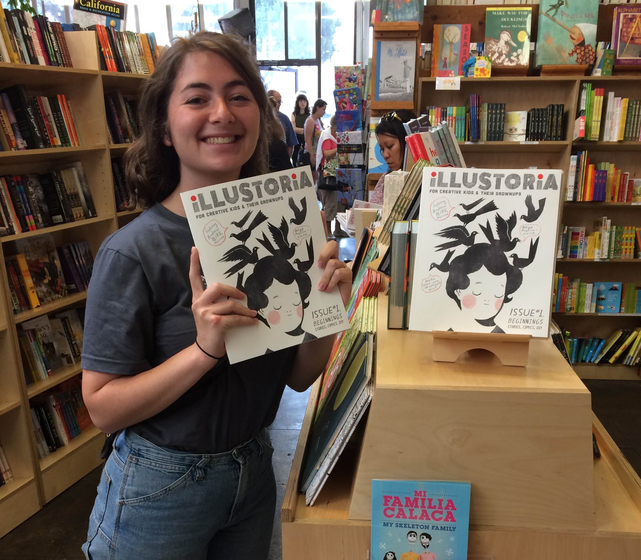
Claire holding the first issue of Illustoria at Skylight Books in Los Angeles.
Favorite Artist/Illustrator: My favorite all time illustrators are Jillian Tamaki, Daniel Clowes, and Tove Jansson. Currently, I’m obsessed with Phoebe Wall and Joohee Yoon. In the more general ‘artist’ category the list is always growing and growing, but my true heroes are Chris Johanson, Philip Guston, and Hope Gangloff.
Best book you’ve read in the past year: Americanah by Chimamanda Ngozi Adichie
Kids book you could read every night: Tar Beach by Faith Ringgold was my absolute favorite when I was a kid. I would get lost in the imaginative collage illustrations and pretend that I had the same super powers as Cassie Lightfoot to fly around New York City and have fabulous roof top parties with my family.
Tar Beach by Faith Ringgold
Best memory of being a kid: My family used to have a weekend ritual of loading up our car with bags of bagels and heading out for a picnic at the Marina del Rey beach. The bagels would always get half covered in sand but we would eat them anyways. Afterwards my sister and I would put on gobs of protective gear and get rollerskating lessons my mom, who was a 90s rollerskating fanatic.
Favorite weekend activity: Going to concerts and shows in SF, going on hikes, eating delicious food out in the Mission or Oakland’s Chinatown.
Song Currently on repeat: Jennifer Lara-I am in Love (so groovy)
Favorite meal: Pad thai, green curry, and sticky mango rice please!!!
Last time you made something with your hands: An EP album cover I made for my friend’s band, Dream Boat.
Loose Tooth EP cover for Dream Boat, by Claire Astrow
Fun fact about you: If I was born a boy, I would have been named Honus (after Honus Wagner) and my twin sister Lilly would have been named Cleon (Cleon Jones). I often fantasize about what Honus Gozonsky's life would have been like. Would he be ultra cool? Would he cope with all the name bullying? Would we be friends? The world will never know...
Drawing I made for my dad in 2015, Honus Wagner on the left and Cleon Jones on the right.
Creator Crush – Illustrator Edition
The First Warm Spring Day. Copyright © Phoebe Wahl 2015.
When I’m not painting, snacking, watching reruns of Curb Your Enthusiasm, or having the time of my life at Illustoria magazine, I spend my days surrounded by children’s books. Specifically, at Mr. Mopps’ Children’s Books, one of the finest bookstore establishments in the Bay Area (if not America, the World, Universe, etc). As an artist and lover of beautiful things, my favorite picture books often tend to be the ones with jaw dropping-ly cool illustrations (that is unless it’s The Book with No Pictures by B.J. Novak). So it’s with great joy that I share my current illustrator favorites with you. I’ve also included some really awesome up-and-coming artists who haven’t published a children’s book yet, but I really hope they one day do. I hope this list inspires you to visit your local bookstore and support these stellar artists.
1. Phoebe Wahl
Phoebe Wahl is my all time favorite illustrator at the moment. Working in various mix media from collage to watercolor and color pencil, all of Wahl’s creation are lush, whimsical, and filled with a love nature. The artist grew up in Washington and graduated from RISD in 2013 before plunging into the illustrator world. Her very first children’s book, Sonya’s Chicken’s is so wonderful-- I recommend it to everyone who comes into Mr.Mopps’. It tells the story of a young girl named Sonya who takes enormous pride in caring for her chickens. When one of her hens is killed by a neighborhood fox, Sonya learns an important lesson about the cycle of life and how to cope with loss. With gorgeously textured collage materials, rich colors, and folk inspired images, Sonya’s Chickens is a truly mesmerizing, heart warming tale you’ll want to reread again and again. It’s no wonder this book was the recipient of the Ezra Jack Keats award for new illustrators! I’m greatly anticipating Wahl’s next children’s book and whatever spectacular creation she spins up next. You can check out her work at http://www.phoebewahl.com/
Cover of Sonya's Chickens. Copyright © Phoebe Wahl. Published August 2015.
Interior page of Sonya's Chickens. Copyright © Phoebe Wahl. Published 2015.
2. Isabelle Arsenault
Isabelle Arsenault is a Canadian illustrator who has worked on over ten children’s books, each more wonderful than the next. Most recently, she illustrated Cloth Lullaby a tale of the life of world famous contemporary artist Louise Bourgeois, written by talented local author Amy Novesky. What I find stunning about Arsenault’s work is how she seamlessly integrates watercolor and pencil line work to create immersive, often extremely pattern-filled scenes.
Cover of Cloth Lullaby. Copyright © Words by Amy Novesky, Illustrated by Isabelle Arsenault. Published 2016.
Interior page of Cloth Lullaby. Copyright © Isabelle Arsenault. Published 2016.
Though her style has a sense of innocence and child-like wonder to it, Arsenault isn’t afraid of depicting a darker side. In her graphic novel Jane, the Fox, and Me Arsenault dramatic compositions and devilish character portrayal illustrate the anxiety and angst that we all go through as early teens. More of her work can be found at http://www.isabellearsenault.com/
Interior page of Jane, the Fox, and Me. Copyright © Isabelle Arsenault. Published 2013.
3. Esme Shapiro
Esme Shapiro’s work is delightful, fresh, and filled with curiosity. Similarly to Phoebe Wahl, Shapiro is a RISD grad who just published her first children’s book, Ooko. In this amusing tale, a fox named Ooko who has it all, except for a very best friend. So it goes off an adventure to find a companion but instead gets mistaken as an old lady’s dog. Filled with whimsy, flora, and fauna, Ooka is an easy favorite. Shapiro has many many more imaginative, Maria Kalman-esque pieces on her website http://esmeshapiro.com/
Cover of Ooko. Copyright © Esmé Shapiro. Published 2016.
Page of Ooko. Copyright © Esmé Shapiro. Published 2016.
4. Joohee Yoon
Joohee Yoon is a printmaker whose work never fails to amuse and inspire me. She has illustrated two children’s books, The Tiger Who Would Be King and Beastly Verse, as well as House Plant an art book about plants that outgrow their owners. You might also recognize her work as being a frequent feature in the New Yorker and New York Times. With wonderful overlapping colors and wonderful oversized cartoon characters, Yoon’s work overflows with vivacity and humor. If you’re as big of a fan as screen printing as I am, (or even if you’re not!) her illustrations will tickle you in all the right places. You can check out more of her striking work on her website http://jooheeyoon.com/index.html
Living Things interior spread. Copyright © JooHee Yoon.
Interior page of The Tiger Who Would Be King. Copyright © JooHee Yoon. Published 2015.
Interior Page of Beastly Verse. Copyright © JooHee Yoon. Published 2015.
5. Sally Nixon
Sally Nixon, an illustrator working from Little Rock, Arkansas is one of the raddest artists around. Though she hasn’t come out with any children’s books yet (I hope she will soon!), she’s an honorable mention on this list because she’s without a doubt my creator crush. Nixon lovingly depicts the mundane moments in an average girl’s life, like eating late night snacks of chocolate cake, brushing your teeth in the shower, scrolling through instagram, or simply sitting on the toilet. By giving these often overlooked moments extra attention with delicate marker coloring and detailed penmanship, Nixon makes the everyday special. Her illustrations have a feeling of voyeurism, as if for spectators to see what women do when no one’s watching. At the same time, the contemplative boredom Nixon depicts makes her characters so relatable and well loved. Visit her website at http://sally-nixon.squarespace.com/.
Copyright © Sally Nixon.
Copyright © Sally Nixon.
Copyright © Sally Nixon.
Claire Astrow is a publishing assistant at Illustoria and a recent grad from UC Berkeley as an Art Practice major. Check out her bio here and her illustrated work at claireastrow.com.
Who We Are: Genny McAuley
illustration by Agnes Lee
Name: Genny McAuley
Location: San Francisco, California
Profession: Book Peddler at Chronicle Books & florist
Genny with Grumpy Cat
Favorite artist/illustrator: Jon Stich & Oliver Jeffers
Best book you've read in the past year: The Keepers of the House by Shirley Ann Grau
Kids' book you could read every night: Weird Parents by Audrey Wood or Bears on Chairs by Shirley Parenteau
Best memory of being a kid: Going on road trips with my family. One time, we all went camping in Yosemite and after the first night, my mom and I decided we were too cold/the ground was no fun to sleep on so we left the boys in the woods and drove to my grandmother's house for the rest of the long weekend. I like camping now, but it was fun to fly by the seat of our pants and surprise my grandma with a visit from her girls!
Favorite weekend activity: Weeding the garden with my 18-month old nephew
Song currently on repeat: (this is embarassing) "Sorry" by Justin Beiber and (this isn't so embarassing) "Standing In the Shadow of Love" by The Four Tops
Genny dressed as an 80s hip hop cat (duh)
Favorite meal: A giant nicoise salad and chocolate coconut ice cream for dessert
Last time you made something with your hands: Yesterday! I put together many bouquets and hand-wrote notes for their recipients
Fun fact about you: My left eyebrow was born turning down at the end--it's grown up that way, too, and everything turned out all right!
Making a Magazine: Inside Issue 1
Snapshot of our Issue 1 Contents
Some of you have been asking about what you can expect to find in our premiere issue. After some months of feeling like an overprotective mama bear guarding her treasured babes, I'm finally ready to let these cubs roam just a tiny bit away from their cave.
In issue 1 you'll find interviews with Aaron Becker, Caldecott Honor award-winning author/illustrator of Journey; Newbery and Eisner award-winning graphic novelist Cece Bell; and chef Rayneil De Guzman of Ramen Shop Oakland. You'll read original essays by artists including the celebrated singer, violinist and master whistler Andrew Bird. You'll also discover original comics, illustrations, and stories by a list of swoon-worthy contributors including Lark Pien, David Goldin, Zack Soto, Laurel Snyder, Molly Maeda, Martin Cendreda, Andrew Jaffe, Katherine Tsina Bird, Zack Giallongo, Lisa Maloof, Leela Corman, Thien Pham, Teri Sloat, Brave the Woods and more. With activities, book reviews, music recommendations and a recipe to boot, kids and grownups are sure to find inspiration in these packed 64 pages of joyful visual storytelling and creative expression.
It's impossible to choose favorites, but I'm quite proud to be premiering Elizabeth Haidle's Literary Giants as Kids series, with the first of this 2-page Docu-comix featuring Maya Angelou and her remarkable story from silenced child to internationally renowned poet. I'm also especially thrilled to be sharing Cece Bell's story about the making of her graphic novel memoir, El Deafo, with an audience of young readers who will surely be as moved and inspired by Cece's making-of story as they are of her unforgettable, brilliant book.
Get ready: in just a couple months, these cubs will be off and running, roaming their way into your city, town, and (if you subscribe) mailbox. For now, I hope our issue 1 contents give you a sense of the fresh, new ideas we've been brewing up here at ILLUSTORIA and entices you to join us!
Who We Are: Elizabeth Haidle
Name:
Me & Eli
Location:
Portland, OR
Profession:
Freelance artist & musical saw player (& Creative Director of ILLUSTORIA)
Favorite artist/illustrator:
recent discovery: Nathaniel Russell; also Jillian Tamaki, Brecht Evens, Emily Carroll
Best book you've read in the past year:
Your Illustrated Guide to Becoming One with the Universe, by Yumi Sakugawa
Kids’ book you could read every night:
What Was I Afraid Of? by Dr. Suess
Best memory of being a kid:
Dressing up as a ham sandwich for Halloween, made with scraps I scrounged from my dad's studio. My head stuck out of a bite mark at the top. I had a little trouble climbing on the bus & standing during the ride to school, but it was worth it. Absolutely zero other people were a ham sandwich that year.
Favorite weekend activity:
3-course breakfasts. Also anything involving a hammock.
Song currently on repeat:
"The Very Thought of You," by Billie Holliday; I just know everything's gonna be alright when Billie sings.
Favorite meal:
Last time you made something with your hands:
Accordian fold mini book entitled: 'Inner Donkey'
Patterned postcards using eraser chunks as stamps
Fun fact about you:
I'm terrible at wrestling and my son always wants to, so I made up my own moves. One is called 'Cheek Pin', where you press the other person down by smushing your cheek really hard against theirs. Also they are maybe paralyzed by laughter, which helps. Another is called 'Cashmere Head Clamp' and requires one to be wearing a cashmere robe. Which I wear often.
Who We Are: Joanne Chan
illustration by Agnes Lee
Name: Joanne Chan
Location: Berkeley, CA / hometown: Oakland, CA
Profession: Mom of Sonia & Marcas and publisher of ILLUSTORIA
Happy Together: Marcas, Mark, me, Sonia
Favorite artist/illustrator: Pina Bausch and Hayao Miyazaki
Best book you’ve read in the past year: A Tale for the Time Being by Ruth Ozeki
Kids’ book you could read every night: Spider & the Fly by Tony DiTerlizzi (because we really do), Animals Should Definitely Not Wear Clothing by Judi Barrett & Ron Barrett, Mr. Tiger Goes Wild by Peter Brown.
Best memory of being a kid: shaking the blossoms off our plum tree and pretending it was snowing in Oakland; generally being out in the backyard and helping my dad water the garden, picking and eating apples, plums, mandarins, loquats and the sweetest cherry tomatoes on earth…catching butterflies and, sad to admit, putting them in jars to admire.
Favorite weekend activity: making granola and watching the kids play pirate-Harry Potter in the yard (a trip to the art museum at some point is a plus)
Marcas as pirate-Harry Potter with Dumbledore's staff
Song currently on repeat: Three White Horses by Andrew Bird (at home) and Piggies by The Beatles (in the car)
Favorite meal: any pasta dish made by Mark shared with family and friends, darkest chocolate and mint tisane for dessert
Last time you made something with your hands: lavender satchel necklace + denim tote bag + pencil case for Sonia’s 10th birthday
Birthday lunch note
Fun fact about you: I once choreographed and danced in a duet (with my dearest friend) in an abandoned subway tunnel in Brooklyn.


