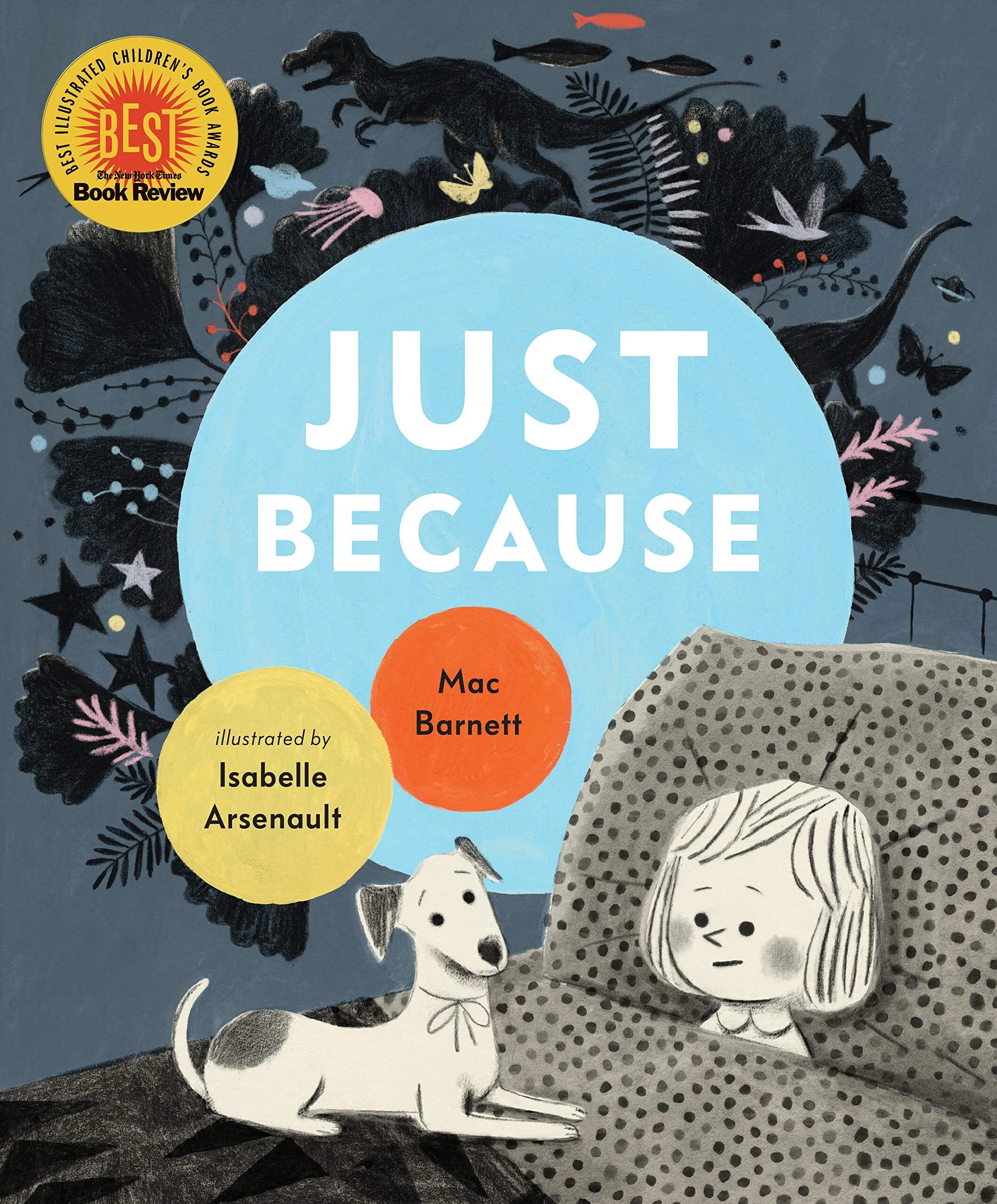
Interview with Isabelle Arsenault & Mac Barnett, Creators of Just Because
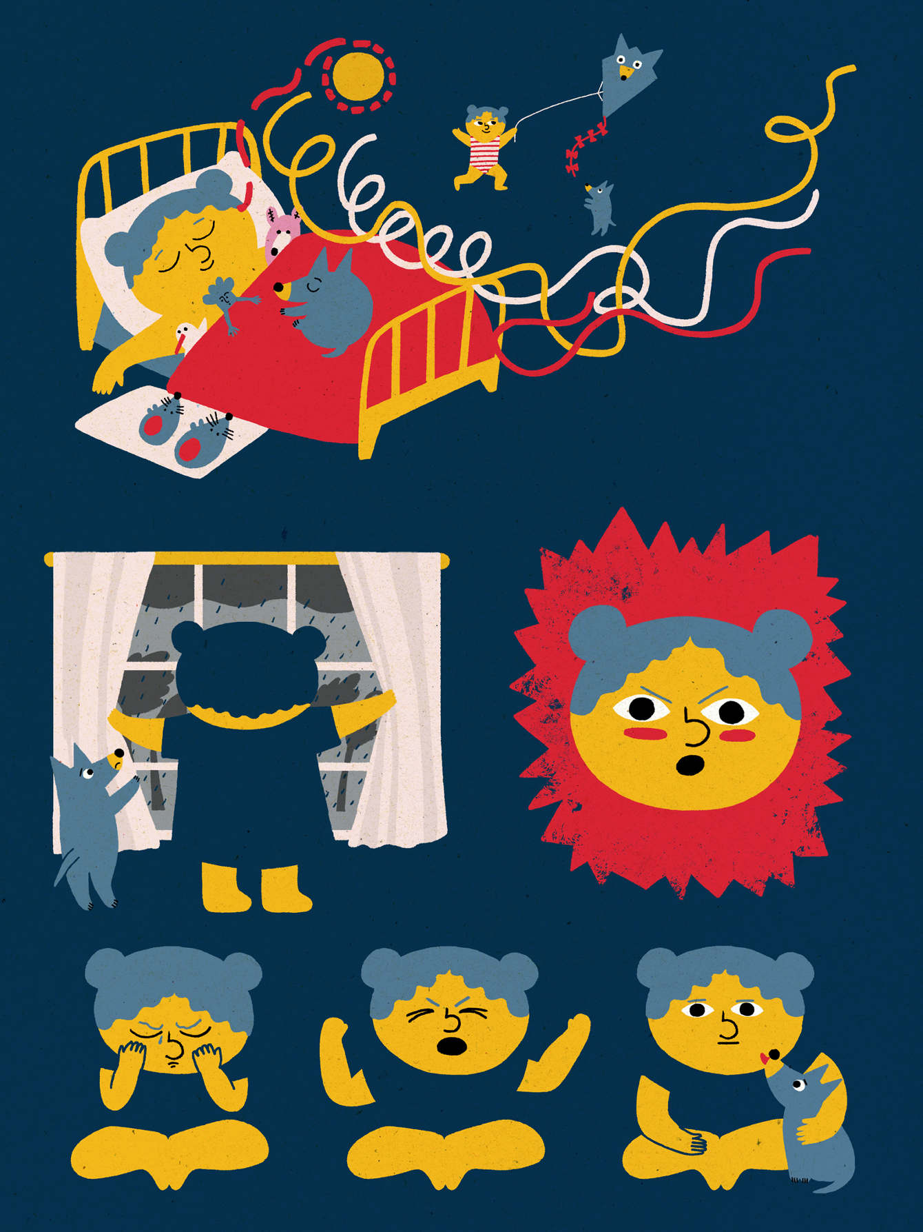
What kinds of things do you think about right before bed? Do you wonder what happened to the dinosaurs? Do you think about the day to come? Or do you perhaps fall right asleep and let your subconscious do the pondering? Nighttime musings nourish the inquisitive mind in Just Because, a question-filled bedtime story that draws readers into a wondrous space between wakefulness and sleep.
Just Because invites readers into the familiar, shadowy scape of a bedroom at night as a youngster prepares to go to sleep, and then into the wild world of her imagination. Flourishing with color, creatures, and familiar objects in unexpected places, these swirling scenes accompany a father’s clever responses to her endless questions. The result is a story that raises as many questions as it answers, and encourages us to seek answers in our dreams and imaginations.
It was our pleasure and privilege to interview the duo behind this dreamy collaboration: writer and Caldecott medalist Mac Barnett, and illustrator of the award-winning Jane, the Fox and Me, Isabelle Arsenault. We got to ask them about working together, their creative inspiration, and all the questions on our minds after reading their book!
Just Because- Art by Isabelle Arsenault, Words by Mac Barnett.
1. Some illustrations in this book are really colorful, and others are more shadowy and monochrome. How did you use color to help tell the story?
Isabelle: I associated a different colour to each of the questions in the book, creating a visual link between questions and answers. The question-pages are dimmer, as the light is turned down in the little girl’s bedroom, and the only colour is this big bold circle featuring her question addressed to her dad. The next page is her dad’s answer-spread where the same colour is used differently throughout the spread, with more nuancing and details. At the end of the book, colours are used in another way that breaks this convention, and brings the story to a more poetic level.
Mac: It makes sense that we read stories at bedtime. Stories are about crossing thresholds—between reality and fiction, between our experience and someone else’s. And bedtime is a liminal space—the threshold between waking and sleeping. I like these in-between spaces. When we’re more uncertain, there’s an opportunity to change, to grow, to think new thoughts.
sketches by Isabelle Arsenault.
2. How did you collaborate to tell this story?
Isabelle: I received Mac’s manuscript along with a suggestion for the layout, and two visual references/inspirations. These were old images from an encyclopedia I think, and right then, I felt we were on the same page with this book.
Mac: As a writer I prefer asking questions, as a civilian I prefer answering them. A lot of my stories pose questions. Figuring out what you think about a text can be hard work, but it’s one of the great pleasures of reading, and I’d never want to take that away from kids.
Just Because- Art by Isabelle Arsenault, Words by Mac Barnett.
3. What was your process for creating the other-worldly scenes in this story?
Isabelle: The Q&A style of this manuscript reminded me of the science documentary series I use to read (and loved) as I kid. I felt inspired by this cold factual form and liked the way it contrasted with the content, somehow. The little girl’s questions are serious, but the answers her father makes up are absurd and funny. I thought representing these seriously was perfect. So I worked with a realistic approach, trying to make these senseless images believable.
Mac: Isabelle is one of my favorite illustrators working today, and I’ve been wanting to make a book with her for almost ten years. In the manuscript for Just Because, I noted that the story alternates between a child’s room and the fantastic landscape’s described by her father, but that’s all. Once I handed my words off to Isabelle, the story belonged to her. And because she is a great illustrator, she added so much to this book, including a lovely arc between father and daughter that’s told only by their poses from picture to picture.
Isabelle Arsenault’s studio.
4. What sorts of questions do you think about before bed?
Isabelle: Oh, l’m the doubtful person type, always wondering if I’m doing the right thing... What will be my next book? Will it be good enough? Will kids like it? What if I fail?... What other job could I do?... etc. That sort of funny questions.
Mac: I fall asleep so fast, pretty much the moment I lie down.
Just Because sketches by Isabelle Arsenault.
Just Because can be found in Illustoria’s Issue 10: Color’s On Our Bookshelf feature, which is available to order now. You can also find it at bookstores and libraries across the country. Many thanks to Candlewick for helping sponsor this issue and for this interview opportunity.
Creator Crush: Kelsey Garrity-Riley, Author-Illustrator of Frankie’s Favorite Food
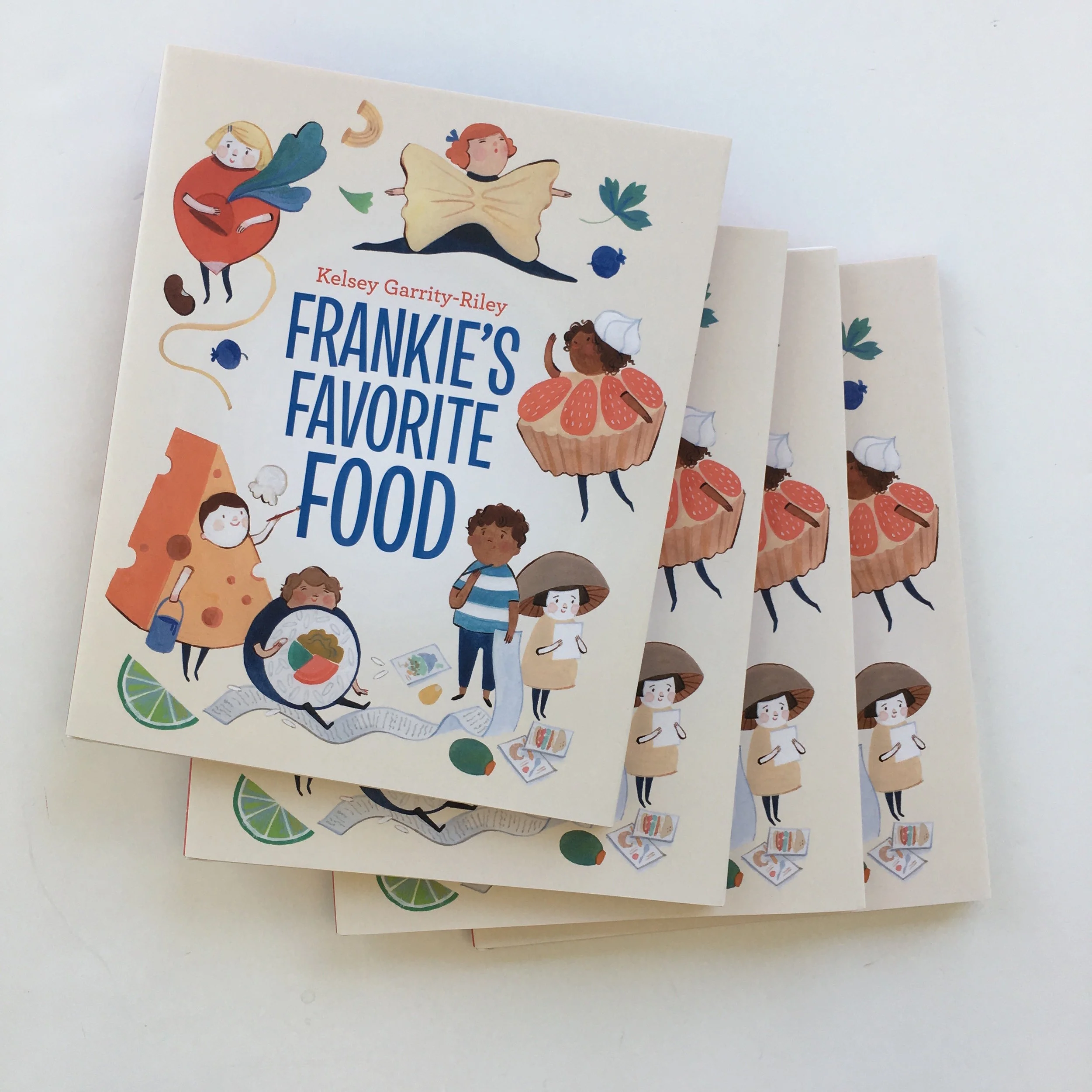
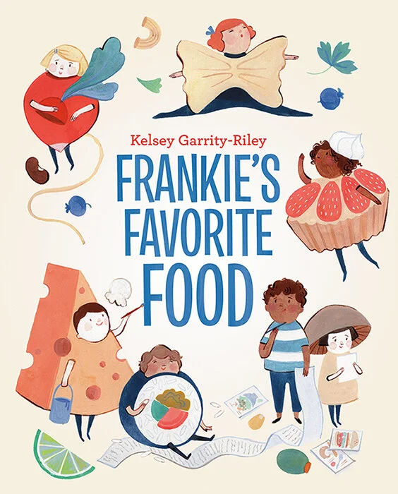
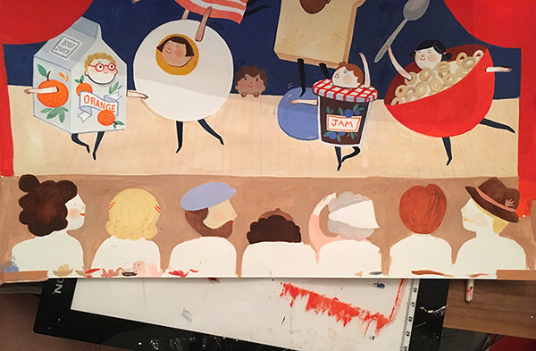
It’s almost Halloween and that means it’s the season for the costume brainstorming, last minute trips to the thrift store and tearing down the house to find your beloved glue gun. Speaking as someone who recently stayed up until two in the morning paper-macheing my friend’s son’s Halloween costume, I can safely say this is a holiday I adore (and take very seriously). Thus, when I read Frankie's Favorite Food by author and illustrator Kelsey Garrity-Riley (released in August) my heart skipped a beat. This utterly-charming book tells the story of a boy named Frankie who becomes appointed the Costume Manager of his food themed school play. He does a stellar job creating outfits for all of his friends, but can’t decide what to make for himself. Just in time for the performance, Frankie harnesses his creativity to overcome his indecision and makes the perfect costume.
This book is filled with adorable processions of scrumptious, gouache-painted food outfits that come just in time for Halloween (hello costume ideas!). What I loved most about this read is how well Garrity-Riley captures the all too familiar feeling of indecision. With humor, charm, and a healthy helping of food puns, the author offers a delicious antidote to the sometimes dreadful, extremely universal experience of not being able to choose.
Frankie's Favorite Food is Kelsey Garrity-Riley’s author-illustrator debut, and it’s one of our favorite children’s book releases this Fall. This brilliant read made our book roundup for our recent release Issue 9: FOOD, available to order now! We had the ultimate treat of interviewing Kelsey on her process and inspiration for creating this story. We hope you enjoy learning a bit more about the artist! Happy costume making season everyone.
What are you currently working on?
The main things I'm working on right now are a second book with Tundra that’s currently in the writing and early sketching-of-ideas phase that I'm super excited about, as well as a lovely book called You are A Beautiful Beginning (written by Nina Laden) with Roaring Brook Press. I often have cards/wrapping paper projects going on as well (mostly with Red Cap Cards who I adore working with), and the occasional editorial or surface design project but I've lately had to readjust and stay focused almost exclusively on books now that I spend much of the day watching our little boy.
Can you talk about your process of creating Frankie’s Favorite Food from start to finish?
Frankie's Favorite Food was a slow moving amalgamation of a bunch of different things I was interested in creating. I was stuck inside working on a project one Halloween night 5 years ago and as a distraction I sketched out ideas for costumes I thought would be fun to dress up in. That sort of developed into a Halloween card I later created for Red Cap Cards and solidified my interest in drawing kids in fun costumes. At the same time - we had just moved to New York City and I was enamoured with having all different kinds of food to try suddenly just a subway ride away. Specifically I would make a point of going to Chinatown in Manhattan once a week, trying a new place for lunch, and painting the meal in a little sketchbook. (I would take a photo and paint it later, too hard to eat and paint at the same time!) I initially started working on a book idea about highlighting different foods from different cultures (like dumplings and wraps from around the world). I found myself continuing to be drawn to creating kids in little costumes just for fun and eventually I got the spark to combine the two projects. My family helped brainstorm some of the little puns that are used throughout the story (and loads more that didn't make it into the book). The brilliant editors at Tundra were instrumental once they bought the book in editing it all down in just the right ways.
What is your favorite snack?
Like Frankie I definitely struggle with this question! But I’ve never met a dumpling, berry, or chocolate mousse I didn't like.
What was it like moving from Europe to the United States, to attend school at the Savannah College of Art and Design in Georgia? Do you have any advice for people who are moving across the world to a new home?
A sense of belonging and place is a very personal and important thing. Traveling a lot as a kid was very informative to who I am. I talk about this more in another question- but having grown up not really fully European or American it was confusing and hard to first acclimate in America. But I love Savannah, and really loved my experience at school there and once I made good friends America started to feel more like home. Really that's probably everyone's experience with moving anywhere. Finding people you connect with makes all the difference. I also fell in love with the strangely specific town of Savannah and the American South and elements of it still inspire me. I think I just had to learn to embrace it for what it was and not mourn the fact that it wasn't Europe.
What is the most challenging part of illustrating and writing a children’s book? The most rewarding?
The hardest part for me is taking a loose idea that feels very specific in my mind, and figuring out how to actually get it down on paper in a way that communicates it properly. Figuring out the right flow is such a big challenge but thankfully I get to work with amazing editors who have a brilliant understanding of these things. The most rewarding feeling is certainly getting to hold the finished printed book in my hands! And then to see it out in the world with children reading and interacting with it.
What were your favorite books to read as a kid?
The first picture books that come to mind are Roxaboxen and Miss Rumphius (both illustrated by the amazing Barbara Cooney) and the Brambly Hedge stories by Jill Barklem.
What was it like growing up in Germany and Belgium?
I loved my experience of growing up in Europe very much. I feel like I should clarify though that my parents are American and so my experience was that of a third culture kid. Not being fully immersed or part of any European culture but also not feeling fully American. It brings up strange feelings of identity. But I dearly dearly loved Europe and would still live there if we could (work and our American passports are keeping us on this side of the Atlantic for now.) I know I'm guilty of romanticizing lots of aspects of my childhood. Especially the small town on the edge of the Black Forest in Germany where I spent most of my childhood. The freedom of running free in the hills and forests and vineyards behind our house with my imagination has been formative in everything I create. The layers of history and nature are still an enormous inspiration.
Where is your favorite place to draw in New York besides your studio?
My days of drawing out and about are on pause at the moment because I pretty much always have my one year old son with me! But I miss the days of drawing while grabbing a pastry at a Maison Kayser cafe or jotting down ideas while riding the subway.
Where do you find inspiration?
Everywhere! In remembering feelings of where I grew up and travels. From time spent with close family and friends (my brother Collin is an amazing woodworker and we've had fun collaborating on occasion). My best friend Reba creates beautiful patterns and has inspired much of that work in me. I talk over everything I create with my wonderful husband Erik who is also an incredibly talented illustrator and graphic designer. Getting to see glimpses again of experiencing the world as a child through the eyes of our sweet little boy Llewyn is a new source of inspiration. I love plants and gardening and certain memories attached to specific flowers have always inspired me. I love interior design and the feeling of old spaces. Strange antiques and collections. Weird old picture books.
Frankie’s Favorite Book can be found in Illustoria’s Issue 9: FOOD On Our Bookshelf feature, which is available to order now. Many thanks to Tundra for sponsoring this issue.
Creator Crush: Lindsay Stripling
art by Lindsay Stripling
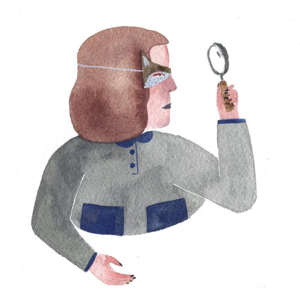
It's clear that we love Lindsay Stripling here at ILLUSTORIA. Not only did she do the breathtaking cover for Issue 4: Grow, but she does regular features with Alexis Joseph (hi, Case for Making!) on the brief history of all of the coolest colors. A master of watercolors, she creates amazing fantastical worlds and nature-infused portraits that make you contemplate what your inner animal would be. From creating a booklet series to teaching classes, Lindsay puts her expertise to spread the good word of watercolor. We were able to pick her brain on all things creative, so be prepared to get inspired by her rad art!
photo courtesy of Lindsay Stripling
What are you currently working on?
Currently I am working on the second booklet in my watercolor booklets series, this one will be for people looking for expanded information on how to paint with watercolor. I planned a mural for Point Reyes Bookstore which is nautical themed, I just hung a tiny show in June at Fayes Video in the Mission District here in SF, and I am always working on commissioned paintings.
How did you transition from your day job to being a full time artist?
Well, honestly its still a work in progress. I currently work full time as a restaurant manager for my friends at Outerlands here in the Sunset, I teach watercolor classes at Case for Making regularly and I try and have a regular painting schedule when I am not doing those things. It is hard to balance and I think I will be taking the plunge soon into working freelance full-time, but that is a scary and exciting step, and one that I don’t take lightly. I believe in checking in with myself regularly, assessing where i am at mentally as well as financially- being an artist requires a lot of administrative work that isn’t as fun as the painting part, but over the years I have come up with my own systems that work for me.
photo courtesy of Lindsay Stripling
Can you talk about your process of creating a work/project/book/zine/product from start to finish, and share some process pics with us?
When i am working on a painting or an illustration, I first start with really loose sketches. It is hard for me to allow myself to make quick doodles and concept sketches, so I do them as really small thumbnails. Then I choose my favorite layout from there and do a more detailed sketch- or sometimes I move straight into my under drawing. I typically draw out my painting first in a 3H or 4H pencil on watercolor paper and then before painting I erase the majority of it. I like to erase it because it gives me the freedom to adjust small things, and also removes most of the pencil lines from the final. THEN i get to move into the fun part. I typically start with light washes to cover larger areas and then move into the detail colors and pieces. There is usually a part in the beginning as I am laying down washes where I hate the painting, or I can’t see it coming together. It is hard to push past that sometimes, but when I do and I trust in the process I am usually really happy with the result. And if I am not, I do it over again...
art by Lindsay Stripling; lettering for A Brief History of Ultramarine Blue, from Illustoria Issue 4: Grow
What makes watercolor your medium of choice?
Watercolor is so vibrant, accessible and easy to take with me on trips- and I LOVE watercolor paper. In the last few years I have gotten to work with Alexis at Case for Making to make watercolors from scratch and experiment with color in a different way than I ever have before.
We love the Brief Histories of Color series in the mag! What is your favorite color?
I don’t really have a favorite color, I love all of them too much. But I do have favorite color combos- a tried and true combo is dirty pink and burgundy with a splash of neon orange but recently I’ve been really into lemon yellow and brown (think old banana).
photo courtesy of Lindsay Stripling
Much of your work involves half-human, half-animal characters. What would the animal-half of your body be?
Probably a coyote!
What were you like as a kid?
I was always swimming and playing different sports, and when I wasn’t doing that or going to school I was reading and drawing. I would make maps of stories that didn't exist yet because that was my favorite part of the books I would read. So many maps. I also would practice my handwriting all the time, my friends and I would spend hours drawing, making maps and copying our favorite handwriting.
When did you know you wanted to be an artist and writer?
I think I have always wanted to do that, I just didn’t know I actually could until I was much older. I had no actual examples of people around me who were artists or writers so it didn’t feel like something that was attainable. When I got older I realized that the best thing about this world we live in is that if you want to achieve something, you just gotta hustle. The best part of that is maybe you don’t achieve that thing that you were initially hustling for but you’ll figure out what it is that you want along the way, through many failures and mistakes and realizing who it is that you are and where it is that you actually want to go.
Who or what inspires you?
Reading and being outside.
Now get lost in Lindsay's dreamy paintings and make some of your own! You can also check out Lindsay's latest features in Issue 7: Black and White!
Day in the Life of Jess Smart Smiley
photograph courtesy of Jess Smart Smiley
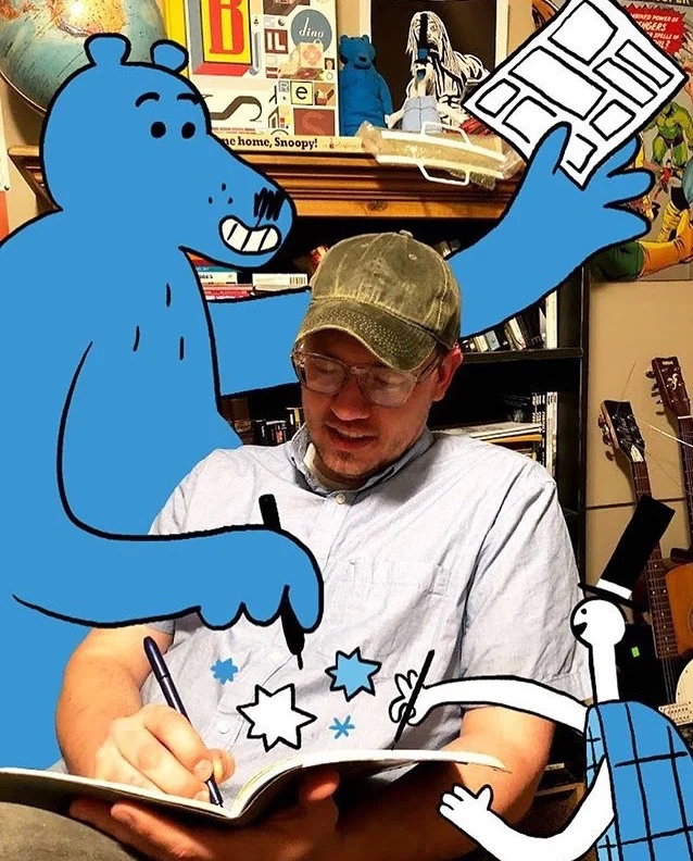
If you haven't heard of the multi-talented, rad cartoonist, teacher, illustrator, and writer Jess Smart Smiley, you're in for a treat. Smiley is based in Utah and has created six rad kid's books including Upside Down: A Vampire Tale and Rude Dude Book of Food. His bold drawing style and witty characters are not only smile-inducing, they're approachable. By creating hilarious, instantly love-able personalities out of simple shapes and lines, Smiley makes illustration inviting for readers of all ages and drawing skill. In his latest book Let's Make Comics Smiley leads readers through a roller-coaster ride of 90 jam-packed activity pages that offers a foundation for any budding cartoonist. Best friends Peanut (a turtle donning a top hat) and Bramble (a lady-bug loving bear) star as the teachers of the activity book, creating mischief and adventure on every page. Because the book is set up with its own comic book narrative, Smiley makes learning the ins-and-outs of drawing feel just like watching Sunday morning cartoons. And for kids and grownups that have a paralyzing fear of picking up a pen, this book is a refreshing antidote. We were lucky enough to pick Jess Smart Smiley's brain a bit about the joys and challenges of being a professional artist, the process of making Let's Make Comics, and some of his favorite graphic novel and comic recommendations. We hope you enjoy, and don't forget to check out ILLUSTORIA's Instagram giveaway of the book running now until June 31st!
Let's Make Comics! by Jess Smart Smiley
Hi Jess! Tell us about yourself.
Jess Smart Smiley is a joke. Seriously. He makes rad pictures with his bare hands and has helped more than 1,000 children, teenagers, and adults create their very first comics. See more at jess-smiley.com.
What was the last thing you made with your hands?
I drew this tiger face in my sketchbook.
art by Jess Smart Smiley
In your latest release, Let’s Make Comics, you offer tons of creative, engaging ways for comic book beginners to start creating their own story lines. What was the inspiration behind this book?
6 years ago I was invited to teach a week-long comics workshop to teenagers. I came up with the activity pages as a way for students to complete a comic while also exploring the nature of comics, the role of words and pictures, and a variety of tools, methods, and techniques for creating comics. Since that very first workshop, I’ve used the activity pages to introduce children and their parents to the exciting world of storytelling through comics!
Let's Make Comics by Jess Smart Smiley
What do you love most about creating comic books?
Because a comic can display several illustrations on a single page, it gives me the opportunity to draw a character I love from a bunch of different angles, in a variety of situations, and with a range of emotional expressions.
art by Jess Smart Smiley
Can you talk about your process of creating Let’s Make Comics from start to finish, and share some process pics with us?
Sure! Once I had created a handful of activity pages for my workshop and had seen how helpful they were for beginning creators, I started writing ideas for other possible pages onto index cards. I used something like 350 index cards and then picked my favorite 100 or so from the stack.
From here, I grabbed a bunch of blank 8.5" x 11" copy paper and spent some time drawing very rough versions of each activity. The drawings were sloppy and the writing wasn’t usually well-thought-out, but my goal was to get the idea down on paper in a way that I could understand and make a final version from.
art by Jess Smart Smiley
I scanned each rough activity page and pulled them one at a time into Photoshop, where I created new layers for my final drawings, colors, and text.
art by Jess Smart Smiley
(As a side note, there was one Sunday when I still had something like 20 activity pages to rough out. I was starting to lose steam from so much drawing, but there was a sudden rainstorm and our power went out. I love a good rainstorm, so I sat on the porch and drew the final 20 pages, charged by the energy of the storm.)
Let's Make Comics by Jess Smart Smiley
If you could be any comic book character from history, who would you be and why?
Probably Snoopy. Now THERE’S a dog who knows how to have a good time! Plus, his dog house can fly!
What were you like as a kid?
Quiet. Timid. Always drawing in class. I loved playing basketball and kickball at recess and reading everything from Roald Dahl and Beverly Cleary.
art by Quentin Blake from Roald Dahl's Fantastic Mr. Fox
art by Louis Darling from Beverly Cleary's Ramona
What is the most challenging part about being an artist/writer/maker?
Pitching a new idea. Publishers want to make great books, but they can’t just trust a creator to do whatever they want. Publishers want to know what your next book will be before you’ve made it. That means a creator has to prepare some illustrations and writing that demonstrate and describe a book before it ever exists. If I don’t put enough thought into the drawings and writing in my pitch, then I leave too many gaps in the story and holes in the idea for publishers to guess at. It’s like not finishing a sentence—and how often do people guess at exactly what you were trying to say?
art by Jess Smart Smiley
Where/ do you feel your most creative?
When I’m working on a project I’m really enjoying, but also have time to explore doodling in my sketchbook and time to read.
What is your favorite activity from Let’s Make Comics?
I love watching children, teenagers, and adults complete the “Let’s Take a Walk” activity on page 26. The comic is missing backgrounds and environments, so it’s up to the reader to draw their own into the comic.
Let's Make Comics by Jess Smart Smiley, page 26
What are some comics every kid should get their hands on, ASAP?
There are so many great comics out there and I’ll never be able to list them all. That being said, here are some of my favorites that I often recommend:
Bone by Jeff Smith is a wonderful fantasy adventure centered around a lovable cast of friendly cousins who find themselves in a magical and terrifying forest, where they encounter horrific creatures, the Great Red Dragon, and a host of mysteries.
The Hazardous Tales series by Nathan Hale recount true tales from history in an incredibly informative and entertaining way. There are currently 7 books in the series, covering everything from the Revolutionary War to the Donner party and World War II.
The Unsinkable Walker Bean by Aaron Renier is the book I’ve gifted the most—to young readers, to my cartoonist friends, and to anyone who enjoys a good story. Walker Bean is a young boy who takes to the high-seas in an attempt to relieve his grandfather from an ancient curse. Along the way, Walker Bean encounters pirates, sea witches, mysterious machines, and a magical glowing skull. Do yourself a favor and read it before the sequel comes out this October!
Raina Telgemeier’s Smile tells the story of the author’s sixth-grade experience with injuring her front teeth, getting braces, trying to understand boys, and finding her true friends.
Luke Pearson’s Hilda books are incredibly charming, filled with beautiful illustrations, giants, sprites, trolls, and hounds, adventurous stories, idyllic landscapes, and a curious blue-haired girl named Hilda. (Did I mention Hilda is coming to Netflix this Fall?!)
What is the day in the life of Jess Smart Smiley?
On any given day I might be working on a new comic, illustrating a picture book, designing a video game, creating character designs, developing story ideas, drawing in my sketchbook, teaching a comics workshop, or doing some combination of these things.
I prefer to wake up and get right to work, usually by finishing something I started the night before. (It’s helpful for me to finish something early in the day, so I can stay motivated to keep going.) I keep a to-do list in my sketchbook of different things that need to be done for each of my projects, which makes it easy for me to know what to do next. I’ll often prioritize my projects by ranking them in the order they should be completed, and then I’ll try to come up with a rough idea of how much time any one task with take. I never have to ask myself What should I do next?, because I’ve already thought through what needs to be done.
art by Jess Smart Smiley
After writing, drawing, and planning at home, I might spend a few hours working at the library, the local Barnes & Noble, or my neighborhood comic shop, Dragon’s Keep. I meet up with local business owners, friends, and fellow creators to talk about upcoming projects, or I might take the role of consultant, offering what I hope are helpful thoughts for writers, artists, comic book creators, and others in the community.
In-person events are also a big part of my schedule. Over the last few years I’ve been able to help more than 1,000 children, teenagers, and adults complete their first comics. I started with a week-long comics workshop, and have since introduced others to making comics at school visits, library events, Girl Scout meetings, comic conventions, book festivals, writing and art symposiums, and Skype visits. Last month I was able to visit a group of schoolchildren in Pakistan and a comic festival in England, all thanks to the magic of Skype!
I love seeing people’s reactions to Let’s Make Comics, and knowing that I’ll be teaching others about the things I’m learning about making comics helps me stay committed and really consider what I’m doing and how I’m doing it.
My family and I spend time together and I like to get a little reading in, maybe go for a walk, and then I do a little more drawing or writing before bed. Pretty exciting!
We hope you enjoyed this interview with Jess Smart Smiley! Don't forget to head on over to our Instagram for a chance to win Let's Make Comics in our giveaway (closes 7/31).
If you've got the comic-loving-bug, you will obsess over ILLUSTORIA's Issues #1 - #7. Each issue of ILLUSTORIA is filled to the brim with comics, illustrated short stories, interviews with artists, coloring pages, DIYs and more. Order an issue or a subscription today and fill your days with creativity!
Q & Artist: Cover Artist Marina Muun
Illustrator Marina Muun
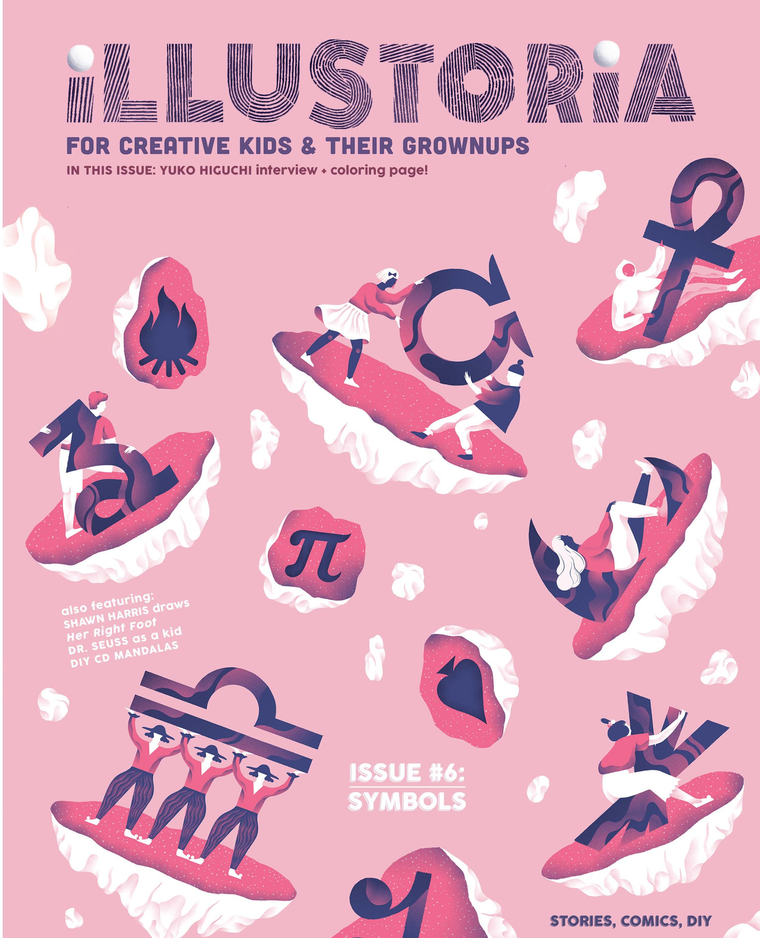
We are so thrilled to showcase Marina Muun, our cover artist for The Symbols Issue. Marina hails from Bulgaria and currently resides in Vienna, Austria. She has illustrated for The New York Times, Tate Publishing, Google, BuzzFeed, The New Yorker, Wrap Magazine, and many more esteemed publications. We fell head over heels in love with her beautiful, bold artwork for our latest cover:
Check out The Symbols Issue to see her beautiful illustrated comic, "The Rock Garden," which combines her fascination with modern architecture with her reverence for the antiquated.
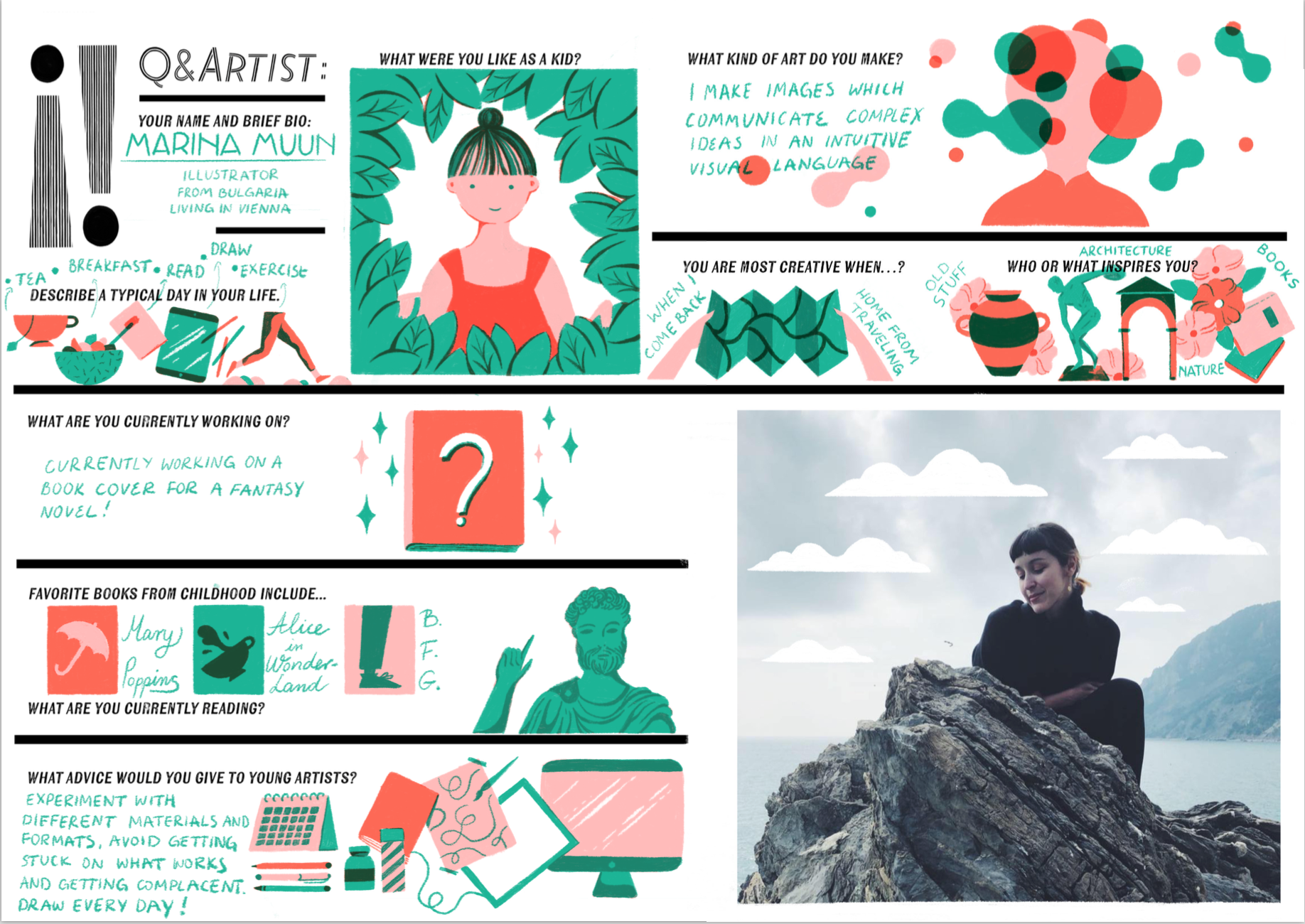
Enjoy Marina's illustrated Q & Artist interview. We're pretty sure you will fall in love with her and her artwork as much as we have!
Creator Crush: Mike Lowery
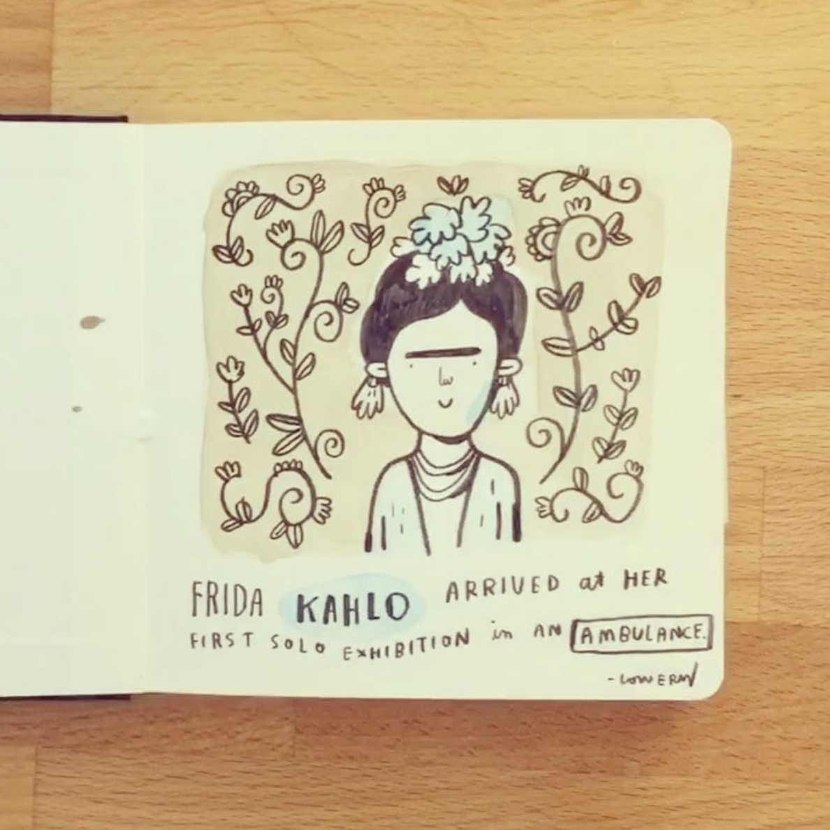
Who cannot absolutely adore Mike Lowery for his amazing doodles, hand-lettering, books, and inspiring-hilarious-addicting-to-watch #randomillustratedfacts?
From Mike Lowery's Instagram feed, where he regularly shares videos of his sketchbook drawings featuring engaging and adorable random illustrated facts.
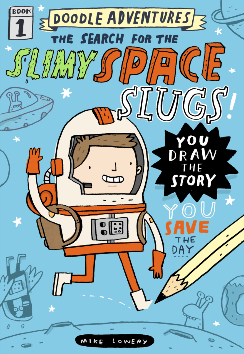
Mike is a prolific children's book writer and illustrator who infuses his work with a sense of humor and child-like simplicity that never fails to amuse and delight us. His latest series with Workman Publishing, Doodle Adventures, invites kids to draw their own characters into the story and, page by page, the interactive book continues along via prompts for more illustrations by the reader. It's an ingenious format that combines drawing and doodling with the silly escapades of a wonky cast of characters that will keep everyone anticipating the next funny episode. By the end of the book, the reader will have helped to co-write a totally unique story that can be read over and over again with family and friends for a riotous good time.
Thankfully with three books out (The Search for the Slimy Space Slugs!, The Pursuit of the Pesky Pizza Pirate!, The Rise of the Rusty Robo-Cat!) and counting in this series, your little doodlers will have enough to keep them creatively satisfied for some time. We are thrilled to share Mike's book trailer for this series, a series which has been described as "a visual Mad Libs: part game, part graphic novel, and a thrilling, interactive experience in which the reader draws him- or herself into the story and becomes the star." So much good!
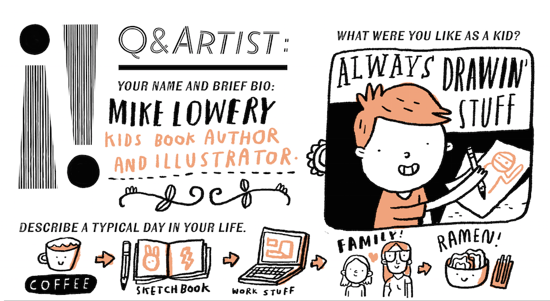
And a few more glances at Mike's Q & Artist for Illustoria, issue 5: Motion:
Yes! Roald Dahl books...we couldn't agree more.
Art by Mike Lowery. See The Motion Issue for the full Q & Artist feature!
Don't miss out on Mike's awesome books and make sure to get a copy of The Motion Issue to learn more about what inspires Mike, what he's currently up to, and when he feels his most creative.
And be sure to enter our GIVEAWAY in partnership with Workman Publishing between now and Friday, 9/15/17, for a chance to win a set of Mike's Doodle Adventures books. Head to our Instagram feed for contest details.
Women Who Draw, Write, and Inspire Us
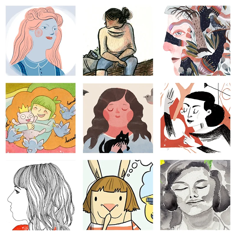
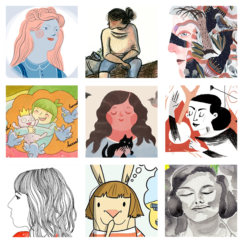
Images left to right: Louise Bourgeois by Elizabeth Haidle (issue 2); sketchbook drawing by Lisa Brown (issue 3); watercolor portrait by Lindsay Stripling (issue 2); "Dream Before Building" by Lark Pien (issue 1); Beatrix Potter by Elizabeth Haidle (issue 3); Martha Graham by Marlowe Dobbe (issue 2); self-portrait by Nina Chakrabarti (issue 3); excerpt from El Deafo by Cece Bell (issue 1); "Hiroshima Mon Amour" by Britt Browne (issue 3)
Women's History Month is coming to a close, but we at Illustoria think every month should be women's history month! We are proud to pay homage to the courageous, intelligent, and rebellious women who have revolutionized their fields and empower us to dream big. Of recent, we've been thrilled to see collectives and movements such as Women Who Draw creating an inspiring platform for talented women illustrators. Today, we would like to take a moment to thank some of the amazing women who draw, write, and inspire us here at Illustoria.
artwork © Lisa Brown
cover art © Lisa Brown
artwork © Lisa Brown
Lisa Brown
Lisa Brown, the stupendous illustrator behind our Issue 3 cover, is a critically acclaimed illustrator, author, and cartoonist who resides in foggy San Francisco. She is the mastermind illustrator behind Emily's Blue Period by Cathleen Daly and 29 Myths on the Swinster Pharmacy by Lemony Snicket and has written and illustrated the fantastic Depressed. Repressed. Obsessed. 3 Panel Book Reviews as well as Vampire Boy's Goodnight, The Airport Book, and How to Be. (And this is all just for starters!) Brown also featured her sketchbook and mini-drawing activity in Issue 3, which we love to pieces. Stay tuned for more highlights of Brown this spring, in our super-exciting-filled-to-the-brim-with-inspiration Issue 4: The Grow Issue! You can find more of her amazing work at http://www.americanchickens.com/.
artwork © Cece Bell
images © Cece Bell
Cece Bell
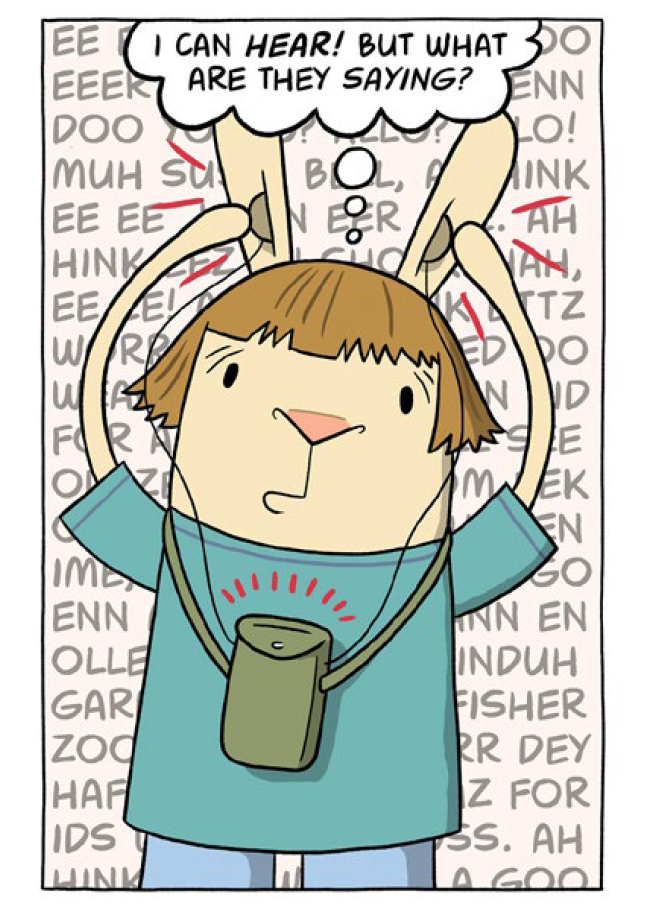
If you haven't gotten your hands on the heart-melting and hilarious El Deafo by the genius Cece Bell, you might want to stop reading right now and run to the nearest book store immediately. El Deafo is a graphic novel memoir that tells the story of Bell's hearing loss and subsequent adventures with a clunky hearing-aid-turned-super-power. Alongside this Newbery Award Winner, Bell has published I Yam Donkey, Rabbit and Robot: The Sleepover, and Chuck and Woodchuck amongst many others. We are so honored to have featured an interview with Cece in Issue 1 and a full length Q&A which you can read here. Check out more of Cece Bell's work on her website https://cecebell.wordpress.com.
artwork © Lark Pien; from "Dream Before Building" in Illustoria issue 1, The Beginnings Issue
artwork © Lark Pien
sketchbook art © Lark Pien
Lark Pien
Lark Pien is a Portland-based acclaimed illustrator and the amazing talent behind the Long Tail Kitty series (for which she won the Friends of LuLu Award) and Mr.Elephanter. Pien was the colorist of American Born Chinese by Gene Luen Yang and Sunny Side Up, two graphic novels for young readers that we could not recommend more highly. We are blown away by "Dream Before Building," a mini-comic she created for Issue 1, and cannot wait to share some new projects she's dreaming up for Illustoria. Find more of Pien's work at http://larkpien.blogspot.com/?view=classic.
artwork by © Elizabeth Haidle
artwork by © Elizabeth Haidle
artwork by © Elizabeth Haidle
Elizabeth Haidle
Have you ever met an artist so talented you want to simultaneously: do cart wheels, bake them a 10-layered Boston cream pie, and hold a radio outside their window à la John Cusack in Say Anything? That's how we feel about our genius, prolific, and awe-inspiring Creative Director Elizabeth Haidle. In addition to spinning up magic at Illustoria, Haidle is the creator of Literary Giants As Kids, a fantastic series you can find in each issue of Illustoria, and illustrator of the dreamy Mind Afire - The Visions of Nikola Tesla, written by Abigail Samoun. We absolutely cannot hold our excitement for the release of I, Parrot, her most recent (breathtaking) graphic novel written by Deb Olin Unferth, which she is currently putting the final touches on. We love the ever-busy Haidle, whose work you can find at http://www.docucomix.com/ and http://www.ehaidle.com/
Cloth Lullaby by Amy Novesky, illustrated by Isabelle Arsenault
Iomogen by Amy Novesky, illustrated by Lisa Congdon
Me, Frida by Amy Novesky, illustrated by David Diaz
Georgia in Hawaii by Amy Novesky, illustrated by Yuyi Morales
Amy Novesky
Amy Novesky is an award-winning children's book author and editor whom we adore five trips to the moon and back. Most recently, she has written Cloth Lullaby, a gorgeous tale of the illustrious, world-famous artist Louise Bourgeois, with stunning illustrations by Isabelle Arsenault. She has also written critically acclaimed books including Georgia in Hawaii, Me, Frida, and Imogen. We are so excited to have featured a full length interview with Novesky which you can find in issue 3. To read more about Novesky's work, check out http://amy-novesky.squarespace.com/.
Laurel Snyder
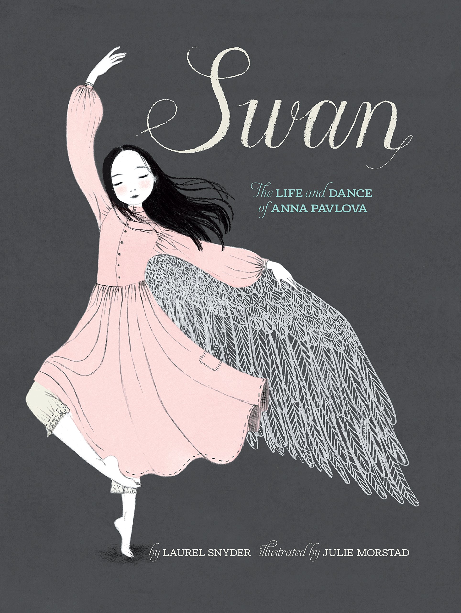
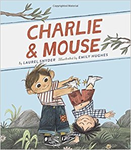
Laurel Snyder is a prolific, critically acclaimed children's author who makes us want to smile for days. She is the author of numerous, joyfully fun-to-read novels for children of which some of our favorites include Orphan Island and Bigger than a Bread Box. She has also written the gorgeous picture books Swan, the Life and Dance of Anna Pavlova and the adorable Charlie and Mouse. You can find Snyder in issue 2, with her biographical piece "Martha Graham In Motion," illustrated by fantastic artist Marlowe Dobbe, about the revolutionary Martha Graham, the Mother of Modern Dance. Check out http://laurelsnyder.com/ for more work by this beloved author.
art © Lindsay Stripling for "The Best Invisible Thing" in Illustoria Issue 2
art © Lindsay Stripling
art © Lindsay Stripling
Lindsay Stripling
A phenomenal woman artist whom we couldn't admire more, Lindsay Stripling works from her studio in the Outer Sunset of San Francisco. We fell in love with her paintings the first time we laid eyes on them for their dreamy palettes, mystical settings, and ethereal subjects. Her folk and fairy tale-inspired narratives lead us into inner worlds that are rich and boundless. We're thrilled to announce that Lindsay's gorgeous artwork will grace the cover of our upcoming issue 4: The Grow Issue--so be on the lookout. Find more of Lindsay's work here: https://www.lindsaystripling.com/
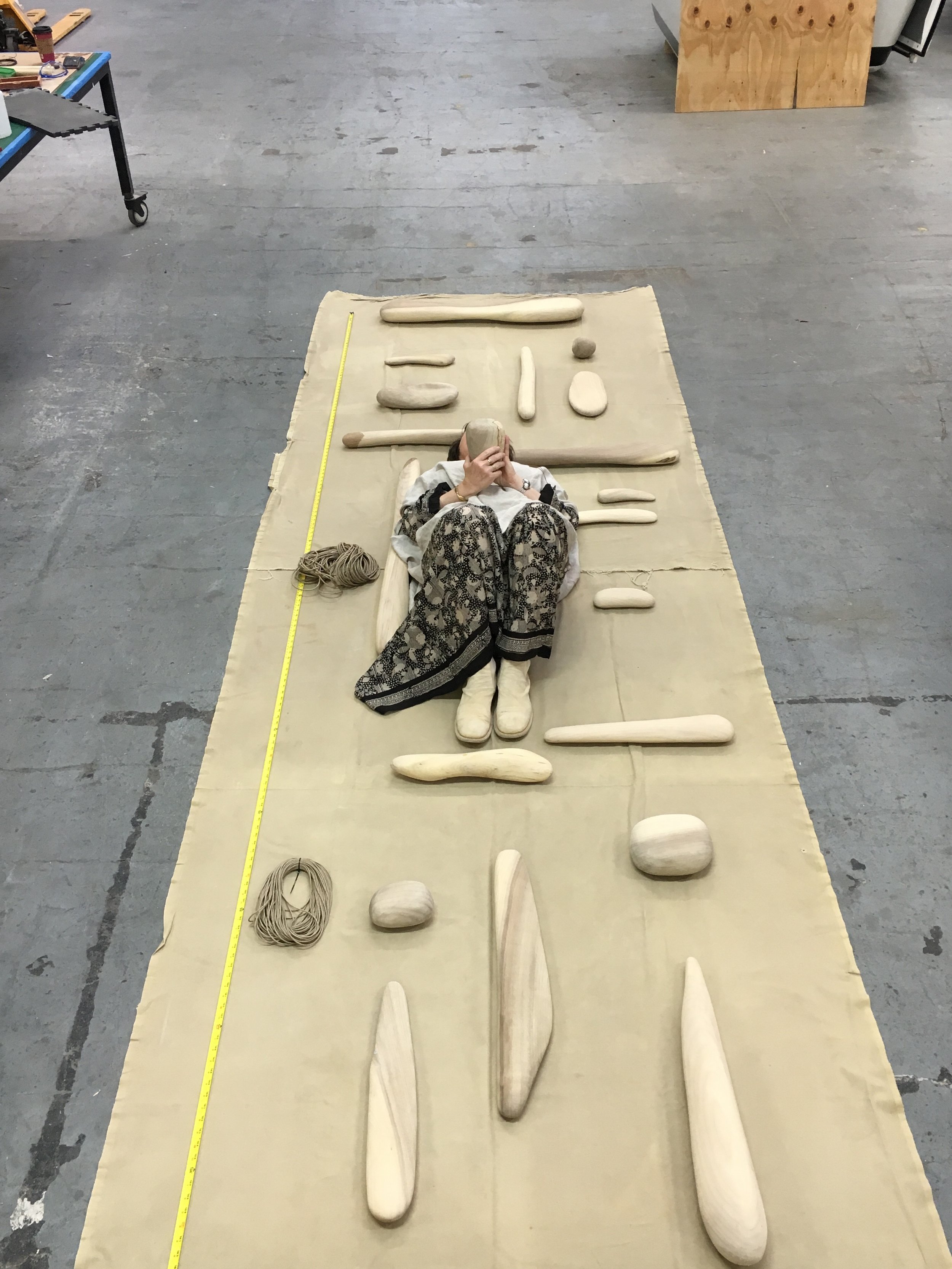
Ruth Kneass laying with the meticulously sculpted pieces of her Bay Tower mobile. © Ruth Kneass
Blonde Driftwood © Ruth Kneass
Nine pieces in collage; a search-and-find activity in issue 3
© Ruth Kneass
Ruth Kneass
Driftwood artist and mobile sculptor Ruth Kneass creates stunning works of art that take years of patience, time, and skill to produce. She shares the story of her mother's influence and her inspiration growing up to be an artist in Illustoria issue 3. A true appreciator of beauty and nature, Ruth infuses her art and life with a feminine love, care, determination, wisdom, and strength that we find simultaneously awe-inspiring and reassuring. You'll find a treat in issue 3, where she disassembled one of her precious driftwood mobiles to create the most gorgeous search-and-find activity we've ever seen! Find more of Ruth's work here: http://www.kneassboatworks.com/
self-portrait © Nina Chakrabarti
art © Nina Chakrabarti; from Nina's upcoming title My Collection of Collections: A Sticker Book
Nina Chakrabarti
We had the chance to interview talented illustrator and activity book creator Nina Chakrabarti and learn all about her inspiration growing up between Calcutta, India and the UK. Born to an English mother and an Indian father, Nina's vivid childhood memories of bright colored saris and streets clamoring with the sounds of trams, trains, and rickety rickshaws; Chinatown and Brick Lane in London; and museums and nature all inspire the joyful work she produces today. In issue 3, she talks about her process creating books such as Hello Nature, My Wonderful World of Fashion, and her upcoming title, My Collection of Collections that will equally inspire young artists and grownup ones. Fun fact: Nina doesn't keep sketchbooks but rather "scribbles on loose scraps of paper, post-its, and newspapers that eventually get tucked away in a box, put up on a wall, or thrown away"! We love her passion for life and her eclectic style, which encourages us to get outside, observe, and appreciate all the diversity our wonderful world has to offer. Find her work here: http://ninachakrabarti.com/
These are just a few of the many amazing women whom we've had the chance to collaborate with over the course of our first three issues. At Illustoria, we are dedicated to increasing the visibility of female creatives by continually supporting and showcasing their work. Additionally, we are committed to promoting women's empowerment in the pages of our mag with stories of both world-famous and lesser-known female leaders from Beatrix Potter to Lee Bontecou. We hope that the stories in Illustoria and the artists behind them will inspire you and the next generation of strong, creative women for years to come.
Creator Crush: Yuliya Gwilym
artwork by © Yuliya Gwilym
artwork by © Yuliya Gwilym
artwork by © Yuliya Gwilym
artwork by © Yuliya Gwilym
One day I was flipping through a draft of Illustoria Issue 3: Outside-In and Yuliya Gwilym's illustrations immediately caught my eye. The bold shapes and extraordinarily unique color palette struck a chord in me, as if my subconscious always wished and longed for Gwilym's unmatched style and then boom -- it was miraculously handed to me on a silver plater.
Yuliya's piece, "Axe Soup," in ILLUSTORIA issue 3: The Outside-In Issue.
I became quickly obsessed with the graphic simplicity and dynamism of her artwork, reminiscent of the Soviet illustrations of Nathalie Parain and Suprematist Kazimir Malevich. Gwilym's accessible, energetic, and endlessly playful work will add an extra dose of happiness to your day. We're so lucky to have the chance to interview Yuliya, as well as showcase her work in Issue 3 and Issue 4 (which comes out this spring)! Make sure to catch more of Yuliya's work at http://cargocollective.com/yufrukt.
What are you currently working on?
I’m currently experimenting with a flip animation book that tells a story about a little elephant. I’m also designing a little game kit for kids with special needs.
artwork by © Yuliya Gwilym
Can you talk about your process of creating a project, from start to finish?
I start by talking about an idea I have with my partner or artist friends. I try to turn visuals I have in my head into words which usually helps me get a clearer idea. I then do a lot of rough sketches and after that go straight into finals, that way I have some room for experimentation and mistakes which sometimes bring the most fun results. I like to work with different media so my design process varies from time to time.
artwork by © Yuliya Gwilym
artwork by © Yuliya Gwilym
Where did you grow up? Where do you live now?
I grew up in Kiev, Ukraine. It’s a big but very cozy city, I spent my summers in the countryside hut built by my grandparents, helping grandma harvest tomatoes and pick up lost animals from the forest in my spare time. For the past 10 years I’ve been living by the North sea, in the Hague, the Netherlands. I definitely miss hot summers and sweet tomatoes but I love to live abroad -- exposure to other cultures brings out the best in people.
photo by © Yuliya Gwilym
What were you like as a kid?
Its hard to say these things about yourself, my mum says I made friends with everyone wherever I went and was generally very open (which often included telling our personal family stuff to strangers).
What were your favorite childhood books?
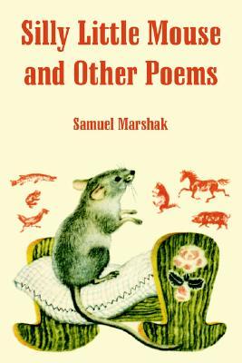
When I was very young I loved the poetry of Samuil Marshak, I knew most of his books by heart and they had beautiful illustrations by graphic artist Vladimir Lebedev who I still admire very much.
Slonenok (The Elephant's Child) by Vladimir Lebedev
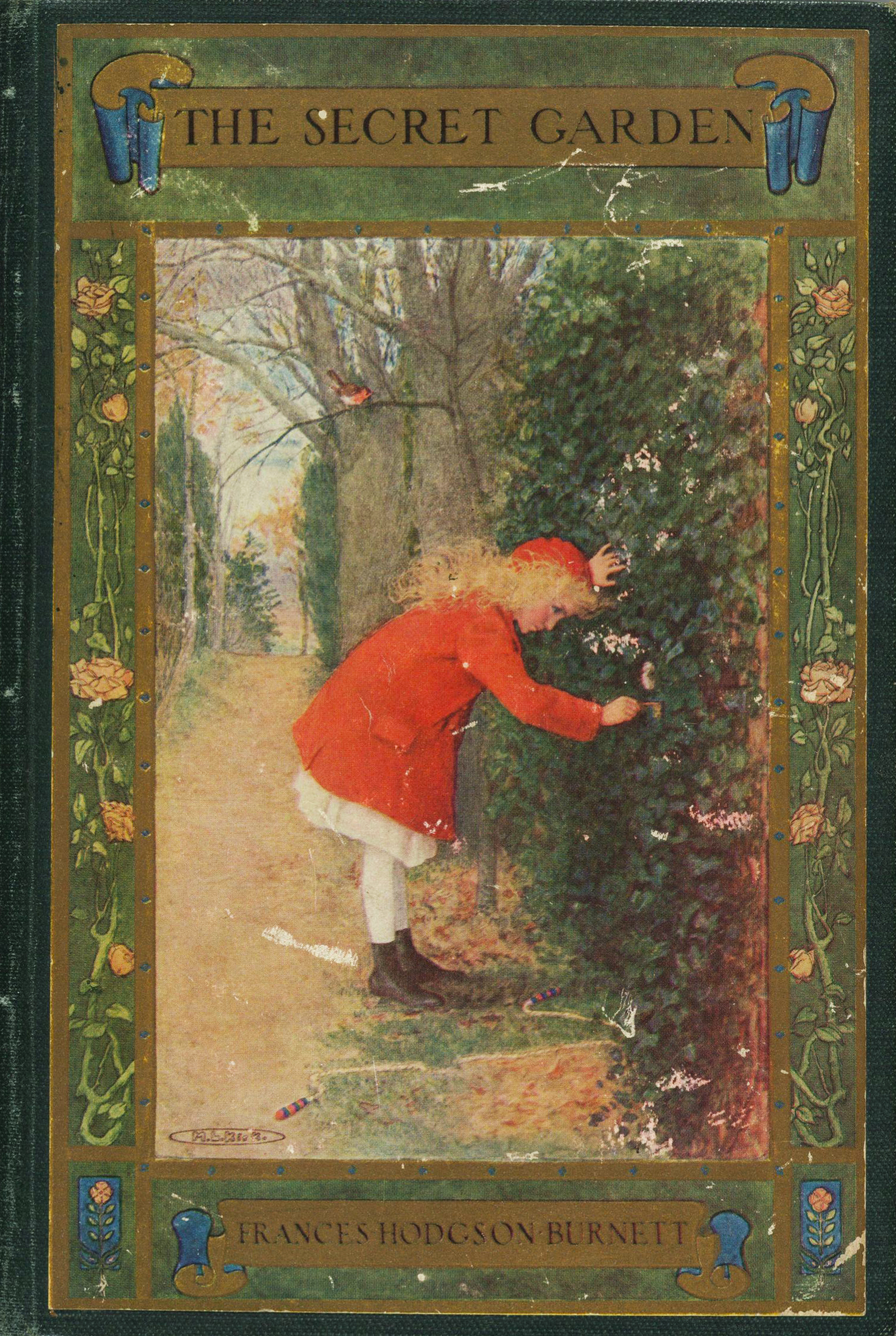
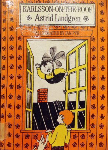
A bit later my favorite books were A Little Princess and The Secret Garden by Frances Hodgson Burnett, The Adventures of Family Mumin-trolls series by Tove Jansson and Karlsson On The Roof by Astrid Lindgren.
Did you have a favorite subject in school? A least favorite subject?
I liked classes of drawing, crafts, mythology, choreography and biology. I really didn't like math…
artwork by © Yuliya Gwilym
When did you know you wanted to be an artist and writer?
In primary school I wanted to build hotels for homeless animals (there are a lot of stray cats and dogs in Ukraine) or be a vet. Later in high school I decided I want to be artist and designer.
Who or what inspires you?
My biggest inspiration comes from children, listening to the weird things they say. I love starting strange discussions with kids and seeing where it brings their adventurous minds. I also find animation and movies very inspiring, old things and folklore, stories from when my grandma was a little girl, I’m inspired by Japan and Japanese yokai, traveling and meeting new people.
photo by © Yuliya Gwilym
What is the most challenging part about being an artist/writer/maker?
Constantly promoting your work, communicating the value, time and care you put into your craft to people who aren’t artists/makers themselves. Staying organised and being able to push forward and keep working even when you’re “not feeling inspired or motivated.”
When do you feel your most creative?
Just before I get into bed.
What advice would you share with young aspiring artists?
Try to be patient. When things seem slow, its not because you're not good it just takes lots of time. Make friends with other artists! It's so much easier when you're not alone and I find young artists’ community very supportive.
artwork by © Yuliya Gwilym
Lisa Brown cover art: The OUTSIDE-IN Issue
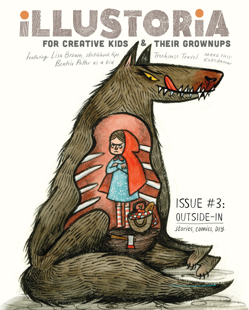
We are so pleased to reveal our cover for issue 3, The Outside-In Issue, featuring delectably delicious, wondrously charming art by the amazing Lisa Brown!
As many of you picture book and comic fans know, Lisa is the creator of the ingenious Three Panel Book Review strips featured in The Rumpus, co-creator with Lemony Snicket of The Latke Who Couldn't Stop Screaming, author/illustrator of the hilarious Baby Be of Use board book series, and author/illustrator of her very latest, The Airport Book. Needless to say we've had a creator crush on Lisa Brown for some time....
So when a few months ago Lisa graciously took a morning out of her busy schedule as a writer, illustrator, teacher, mom, and passionate kid-lit advocate to meet with me at one of her favorite cafes in San Francisco, I was beyond excited and a little nervous. I knew through her work that she was exceedingly intelligent and bitingly witty. Being the warm and generous person that she is, Lisa immediately put me at ease. I should have known--after all, those who work in children's books generally are a kind-hearted bunch! Lisa shared with me her thoughts on why it's important to cultivate creativity in kids through that excruciating, self-conscious phase around the middle school years, the range of diverse picture books on her syllabus at CCA, the challenges that women illustrators face in the publishing industry, and she even gave me a sneak peek of her upcoming picture book. (Psst...interview with her and her elusive co-author to come in issue 4!) By the end of the meeting, she sent me along with a list of fabulous artists to contact and agreed to create cover art for an upcoming issue. I was totally blown away...and so grateful, and excited!
Now, here we are several months later with a gorgeous cover by Lisa that speaks volumes about what we at Illustoria care most about: timeless, captivating art with a unique point of view that resonates across generations; the value and delights of print publishing; the power of illustration; our ever-lasting love for visual storytelling. And how cool is this take on the swallowed-whole dilemma from Little Red Riding Hood??! Just wait until you see her back cover....
Thank you, Lisa, for your fabulous contribution to The Outside-In Issue!!
Inside you'll also find Lisa's sketchbook tips to aspiring artists. Truly the inside of issue 3 is just as delectable as the outside, with contributions by an array of lovely artists and writers whom we couldn't have pulled this off without, including: Nina Chakrabarti, Amy Novesky, Paul duCoudray, Micah Player, Willie Real, Elizabeth Haidle, Ruth Kneass, Mike Dutton, Alexis Joseph / Case for Making, Britt Browne, Claire Astrow, Yuliya Gwilym, Alexandra Rose Franco of Rito-ito, Rachel Garrison, Kristen Solecki, Clark Jackson, Martin Cendreda, Anne Pomel, Karl Dotter, and Jeremy Anderson. More sneak peeks to come so follow us on Instagram to see the latest updates.
Here's a look at #3's table of contents, and be sure to check out our Shop page to see sample spreads from this issue and to pre-order. We'll send out copies in March 2017.
I hope you enjoy this issue as much as we loved putting it together.
Lastly, thanks to Sakura of America and Case for Making for sponsoring issue 3!
Immersed in Under Water, Under Earth + Q&A with the Creators
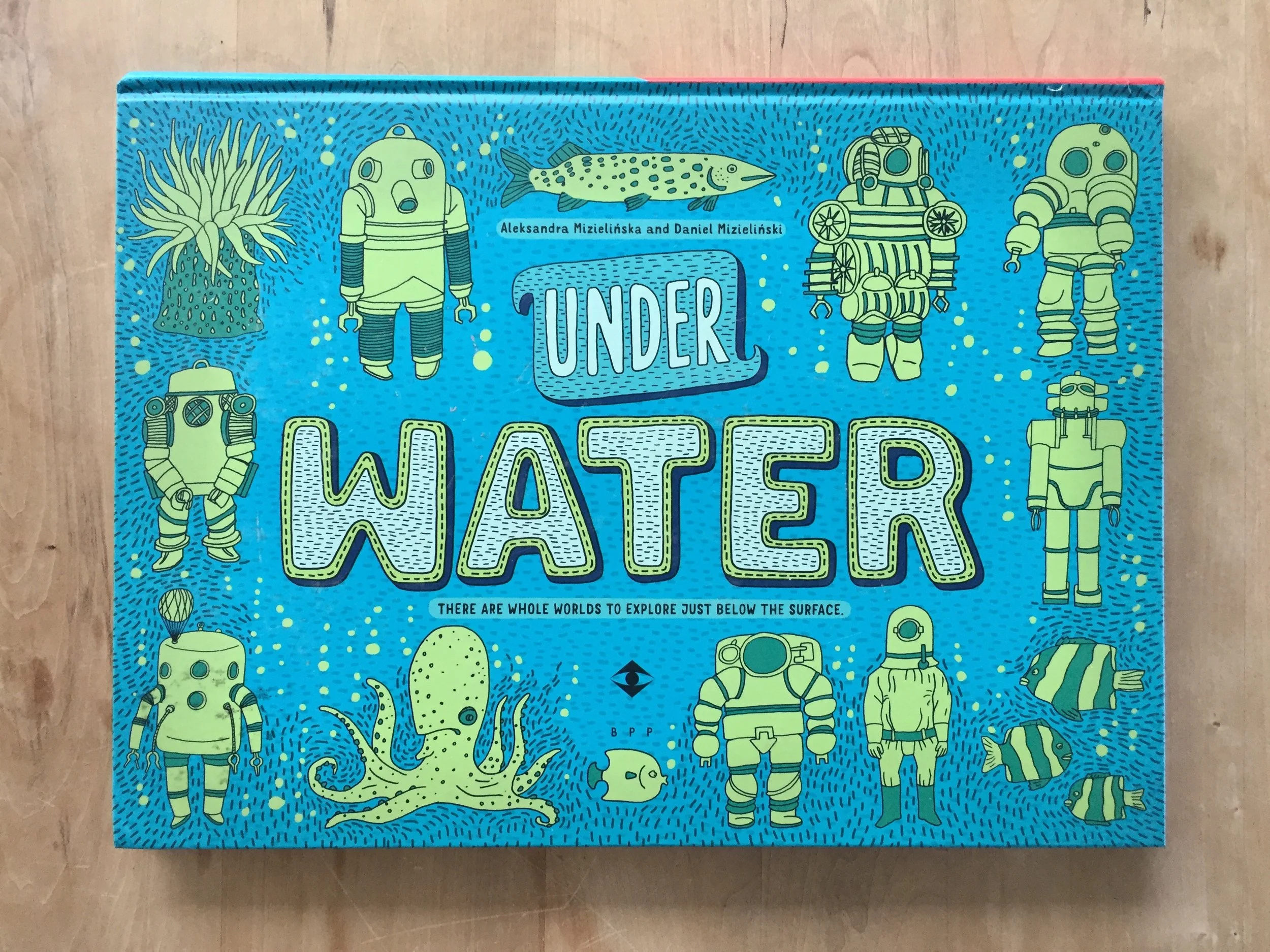
Under Water, Under Earth by Aleksandra Mizielinska & Daniel Mizielinkski, published by Big Picture Press, an imprint of Candlewick Press.
Internationally renowned illustrator duo Aleksandra Mizielinska and Daniel Mizielinski are back at it again with the tremendous Under Water, Under Earth, which just released and is in stores today. The Polish couple are founders of their creative incubator Hipopotam Studio and are the masterminds behind children’s books Welcome to Mamoko and Maps. Their immersive art, always teeming with color and information, is captivating for kids and parents alike--making them a favorite here at Illustoria.
In Under Water, Under Earth the Mizielińskis continue the encyclopedic theme of their past work Maps with a visually explosive double-sided book that explores the worlds that exist beneath the surface. Readers traverse their journey by starting from the surface and making their way down, beginning with earthworms and ending with the Mariana Trench, the lowest point of the ocean. The book’s organization is playfully idiosyncratic, hopping from root vegetables to subway train stations to tectonic plates.
Flip the pages and you’ll see each topic is stuffed to the brim with astonishing factoids, wildly vibrant illustrations and imaginative diagrams. The Mizielińskis offer an otherwise impossible look into the coolest things out there, like a train tunnel being gorged out of a mountain or boreholes that go 7.5 miles beneath earth’s surface. What’s even more astonishing is its breadth--the Mizielińskis seamlessly bring together ecosystems, technological processes, natural phenomena, physics and history. It’s easy to get lost in the artists' distinctive cartoon style, which is highly detailed and, given a second look, secretly mischievous.
You and your ever-curious youngin’ will want to devote an entire afternoon digging into this masterpiece. And don’t be mistaken, this isn’t a cool fact book your kid will read once and then tuck away forever in the closet. Rather, this enormous atlas is one they’ll want to return to again and again, each time to learn a new, mind-boggling fact. We were fortunate enough to get an interview with Daniel Mizielinski, thanks to Phoebe and Jean at Candlewick Press...so read on!
Q & A with Daniel Mizielinski
Can you talk about the research process for your books?
We follow information on internet sources, and check them with real people working in the field. After that, there are usually two or three or four specialized editors—we have a biologist, someone from construction, and so on, reading pages with images and text and they’re finding mistakes that we correct.
How do you find these experts?
They may be editors for other publishing houses, or in one of our books we had a physicist from CERN who’d done a book about space exploration and physics. Every person is just six Facebook or Twitter friends away, it’s really true. Whenever I can’t find someone, I just throw a question at my Academy of Fine Arts net of students, and within a day I have answers.
Please describe your roles in working together on your books.
In every book we have both text and images created by me and Ola. It’s hard for me to define how exactly we do that because it’s so seamless we don’t really think about it. We met at the first year of college and we learned how to design and created our first commercial, [bad] projects together and learned from our mistakes. We just know each other so well.
What is your drawing process? What mediums do you use?
Everything you see is drawn on paper and then usually colors are created in computer. And of course all the layouts are done on computer. But we always start on paper. We design both video games and books, and even with games we do sketches by hand. Usually a lot of assets are drawn by hand.
I think this is because the education process in the arts schools in Poland is different than in the US. In the US you have this very narrow specialization, and in Poland you go through everything, from the very traditional 16th-century graphics—I had two years of making fresco and other ancient techniques—through design, type design. On the side we are both programmers. There’s a lot of diversity. It’s good because you can always change what you do. If you have a low budget [for a commercial project], you don’t have to hire an illustrator.
Do you think that’s why there’s such creativity today in Polish children’s books?
There’s always been that creativity. The problem was that in the 90s, after Poland regained its independence and the capitalism came in, all those great old publishers didn’t know how to work in the new reality. Before the ’80s or the ’90s, all the books in Poland were published in runs of hundreds of thousands…. The ’90s were a period when people were adjusting to a new reality. We had a lot of great products, but we had a lot of cheap products. After [the collapse of the big publishing houses], small publishing houses started to pop up, created by two or three people, like our publishing house, Dwie Siostry. When we came to them, it was 2007, we’d just graduated from college, and they had like two books. We started working with them when they had this moment where they knew what they were doing but they still hadn’t sold a lot of rights to their own books.
Maps is another gorgeous, large-format book by the authors that flaunts an incredible breadth of information about the world and its inhabitants through detailed illustrations and hundreds of fascinating facts.
Discover something new as you draw, color, and doodle your way around the globe in the Maps Activity Book.
Here, because Poland is so much smaller than the US, the only way to make a living making books for children is to sell foreign rights. So Dwie Siorstry were the first ones to do this huge leap. This is the main reason we could abandon making any commercial projects and just do books and games, and they can have this greater reach and publish good books that are also not expensive in Poland…It’s very important here to keep the low price, because you don’t want to create exclusive books that are printed in low runs that designers want to put on their bookshelves. You want to create books for kids that are not only in the center of Warsaw but also in low-income areas. Those books are designed to be really for kids. Not just a trophy for us as graphic designers to create these achievements. We are lucky to have this publisher. It’s great to see your book in a library in a school where maybe students don’t have as many opportunities.
It sounds as though you’re driven to make sure that your books reach kids.
I hear from a lot of writers, not just designers but writers, that writing a book for children is something like a lesser task for a writer, right, it’s better to write some nonfiction for adults, you know what I mean? In Poland, when you look at illustrators and graphic designers, it was never like that. All the great designers, the famous Polish designers, they all did books for children; in the academies, in the art schools, books for children were always one of the most interesting topics.
Throughout my childhood, all of those books were designed really, really well. I was lucky enough to be taught by some of the teachers who created some of those books, because they’re still alive—because I’m not that old—and it was a great experience. I don’t know if it shaped this consciousness that you need to design for kids or something like that, but I think it’s shaped this idea that a book can be a really great experience.
Another captivating series by the authors, equally entertaining and scrumptious for kids and grownups.
Every one of our books is written using those two languages: one is words, one is images. We treat the visual language on the same level as written language, and we try to be careful that those two are not mirroring each other. The worst thing in my opinion an illustrator can do is when there’s a text says, “Mary’s going through a forest,” and you’re just drawing a regular Mary who is walking through a regular forest, and maybe there’s a blob of green for the trees. The best thing you can do is interpret a text and add things that are not in the text. We always try to do that, because it works great in educational books to write that way. If you can convey something much quicker using images, then why use a text?
How have your own children, twins who will be two in January, shaped your work? Do they like your books?
Thankfully, all of our books that we show them are working as designed. As I said before, we want the books to go directly to children, not to designers, that’s true—but while we’re making a book, we don’t think about those children. It’s funny but we make as good a book as possible [for ourselves], back when we were children or now. We were lucky enough that our idea of a good book is similar to a kids’ idea of a good book.
One more from Under Water, Under Earth.
We always treat children as adults who just have less knowledge. In the Polish language, there is this tendency, I don’t know if I know the correct term in English, [diminutives]— there is a “cat”, and there is a “kitty.” In Poland, you can say stół, a table, you can say stolik, like a small table, and you can say everything in this manner. A lot of the people who write for children are using this super-childish and stupid language. A lot of people who talk to their children also use this language—you know, because they’re children. In Polish, it’s very easy to do that. [Aleksandra and I] never use it. It’s called zdrobnienie—making something smaller. We never do that. We never do that. We never do this, in the language layer of our books or in the layer of knowledge.
If we're writing about radiation for kids, we say, ‘OK, the kid who is reading this book is about 9 years old. What else about radiation can I explain or omit? Will they ignore it or skip ahead?’ This is the only consideration. It’s not: ‘Can I tell them about radiation, it’s a hard topic?’ Yes I can. Only maybe you have to fill some knowledge gaps for them. But this is true for every human being. So you can write about anything you want.
Instagram followers: go to @illustoria_mag and enter to win our Under Water, Under Earth giveaway!
Creator Crush – Illustrator Edition
The First Warm Spring Day. Copyright © Phoebe Wahl 2015.
When I’m not painting, snacking, watching reruns of Curb Your Enthusiasm, or having the time of my life at Illustoria magazine, I spend my days surrounded by children’s books. Specifically, at Mr. Mopps’ Children’s Books, one of the finest bookstore establishments in the Bay Area (if not America, the World, Universe, etc). As an artist and lover of beautiful things, my favorite picture books often tend to be the ones with jaw dropping-ly cool illustrations (that is unless it’s The Book with No Pictures by B.J. Novak). So it’s with great joy that I share my current illustrator favorites with you. I’ve also included some really awesome up-and-coming artists who haven’t published a children’s book yet, but I really hope they one day do. I hope this list inspires you to visit your local bookstore and support these stellar artists.
1. Phoebe Wahl
Phoebe Wahl is my all time favorite illustrator at the moment. Working in various mix media from collage to watercolor and color pencil, all of Wahl’s creation are lush, whimsical, and filled with a love nature. The artist grew up in Washington and graduated from RISD in 2013 before plunging into the illustrator world. Her very first children’s book, Sonya’s Chicken’s is so wonderful-- I recommend it to everyone who comes into Mr.Mopps’. It tells the story of a young girl named Sonya who takes enormous pride in caring for her chickens. When one of her hens is killed by a neighborhood fox, Sonya learns an important lesson about the cycle of life and how to cope with loss. With gorgeously textured collage materials, rich colors, and folk inspired images, Sonya’s Chickens is a truly mesmerizing, heart warming tale you’ll want to reread again and again. It’s no wonder this book was the recipient of the Ezra Jack Keats award for new illustrators! I’m greatly anticipating Wahl’s next children’s book and whatever spectacular creation she spins up next. You can check out her work at http://www.phoebewahl.com/
Cover of Sonya's Chickens. Copyright © Phoebe Wahl. Published August 2015.
Interior page of Sonya's Chickens. Copyright © Phoebe Wahl. Published 2015.
2. Isabelle Arsenault
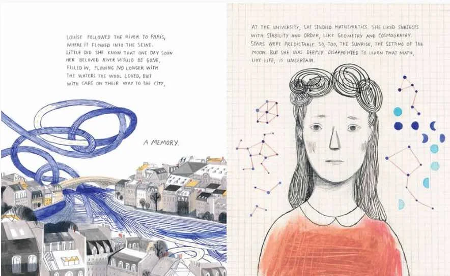
Isabelle Arsenault is a Canadian illustrator who has worked on over ten children’s books, each more wonderful than the next. Most recently, she illustrated Cloth Lullaby a tale of the life of world famous contemporary artist Louise Bourgeois, written by talented local author Amy Novesky. What I find stunning about Arsenault’s work is how she seamlessly integrates watercolor and pencil line work to create immersive, often extremely pattern-filled scenes.
Cover of Cloth Lullaby. Copyright © Words by Amy Novesky, Illustrated by Isabelle Arsenault. Published 2016.
Interior page of Cloth Lullaby. Copyright © Isabelle Arsenault. Published 2016.
Though her style has a sense of innocence and child-like wonder to it, Arsenault isn’t afraid of depicting a darker side. In her graphic novel Jane, the Fox, and Me Arsenault dramatic compositions and devilish character portrayal illustrate the anxiety and angst that we all go through as early teens. More of her work can be found at http://www.isabellearsenault.com/
Interior page of Jane, the Fox, and Me. Copyright © Isabelle Arsenault. Published 2013.
3. Esme Shapiro
Esme Shapiro’s work is delightful, fresh, and filled with curiosity. Similarly to Phoebe Wahl, Shapiro is a RISD grad who just published her first children’s book, Ooko. In this amusing tale, a fox named Ooko who has it all, except for a very best friend. So it goes off an adventure to find a companion but instead gets mistaken as an old lady’s dog. Filled with whimsy, flora, and fauna, Ooka is an easy favorite. Shapiro has many many more imaginative, Maria Kalman-esque pieces on her website http://esmeshapiro.com/
Cover of Ooko. Copyright © Esmé Shapiro. Published 2016.
Page of Ooko. Copyright © Esmé Shapiro. Published 2016.
4. Joohee Yoon
Joohee Yoon is a printmaker whose work never fails to amuse and inspire me. She has illustrated two children’s books, The Tiger Who Would Be King and Beastly Verse, as well as House Plant an art book about plants that outgrow their owners. You might also recognize her work as being a frequent feature in the New Yorker and New York Times. With wonderful overlapping colors and wonderful oversized cartoon characters, Yoon’s work overflows with vivacity and humor. If you’re as big of a fan as screen printing as I am, (or even if you’re not!) her illustrations will tickle you in all the right places. You can check out more of her striking work on her website http://jooheeyoon.com/index.html
Living Things interior spread. Copyright © JooHee Yoon.
Interior page of The Tiger Who Would Be King. Copyright © JooHee Yoon. Published 2015.
Interior Page of Beastly Verse. Copyright © JooHee Yoon. Published 2015.
5. Sally Nixon
Sally Nixon, an illustrator working from Little Rock, Arkansas is one of the raddest artists around. Though she hasn’t come out with any children’s books yet (I hope she will soon!), she’s an honorable mention on this list because she’s without a doubt my creator crush. Nixon lovingly depicts the mundane moments in an average girl’s life, like eating late night snacks of chocolate cake, brushing your teeth in the shower, scrolling through instagram, or simply sitting on the toilet. By giving these often overlooked moments extra attention with delicate marker coloring and detailed penmanship, Nixon makes the everyday special. Her illustrations have a feeling of voyeurism, as if for spectators to see what women do when no one’s watching. At the same time, the contemplative boredom Nixon depicts makes her characters so relatable and well loved. Visit her website at http://sally-nixon.squarespace.com/.
Copyright © Sally Nixon.
Copyright © Sally Nixon.
Copyright © Sally Nixon.
Claire Astrow is a publishing assistant at Illustoria and a recent grad from UC Berkeley as an Art Practice major. Check out her bio here and her illustrated work at claireastrow.com.
Creator Crush: Cece Bell!
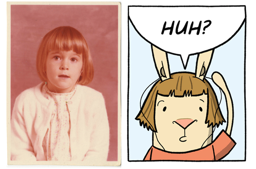
When the book EL DEAFO begins, Cece is 4. When it ends, she is about 10 or 11. Cece used these photos to help "age" the bunny version of herself as the book progresses. Photos and art © Cece Bell.
I first heard the adorable name "Cece Bell" spoken of while working as an editor at Lucasfilm. At the time, I was co-editing Tom Angleberger’s Origami Yoda series. I’ll never forget Tom visiting our offices and gifting me an origami R2-D2 that he folded himself. There were many perks of working at Lucasfilm, and receiving an origami Star Wars character by Tom in all his stookiness was most definitely, geekishly one of them. But I had no idea that I would soon meet Tom’s wife, Cece Bell, and be blown away by her own amazing work as a children’s book author and illustrator. I met Cece only briefly at a BEA in New York a couple years ago, where she was signing galleys of her book El Deafo. The booth was crowded with Cece fans and the galleys were quickly disappearing, but I was fortunate to snatch one up.
Illustration © 2014 by Cece Bell; Design by Caitlin Keegan and Chad W. Beckerman. Published by Amulet Books, an imprint of Abrams.
When I returned home to California, I couldn't wait to get El Deafo into the hands of my eight-year-old daughter. As I predicted, she gulped down the book in one sitting—meaning she did come up for air several times to point out some particularly hilarious excerpt from the book. (“Mom—look down your shirt and spell ‘attic’!”) The rest of the time she stayed quietly and contemplatively behind closed doors, unwilling to pull her eyes from the page—just as her mom did (sometimes teary-eyed with sadness sometimes teary-eyed with laughter) on that plane ride back to Oakland. When months later she and I discovered El Deafo in all its full-color, award-winning glory at the bookstore, we were overjoyed by its brilliance. It didn't occur to us that we had been missing anything at all in the uncolored proof.
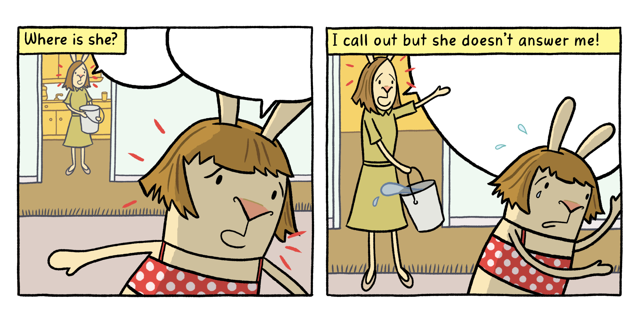
When Cece's character can't hear anything, the speech balloons are empty. Art © Cece Bell.
El Deafo is a phenomenal graphic novel memoir based on Cece’s childhood experiences with hearing loss and hearing aids. It also chronicles her quest to find true friendship. The graphic novel format is a perfect medium for Cece's story, where pictures and words (in some cases, the lack of words) powerfully demonstrate what her character is experiencing.
The elaborate Phonic Ear hearing aid and microphone set-up had Cece feeling like a superhero with superpowers! But most of the time she just felt like a confused kid. Was she deaf? And what did that mean? Art © Cece Bell.
Read Cece’s firsthand account on the making of El Deafo in our premiere issue and learn about her creative process as an artist and writer. In the meantime, here's an extended version of our Q&A with Cece.
Where did you grow up? Where do you live now?
I grew up in a little city called Salem, in the southwestern part of Virginia. Now I live in an old church just a half-an-hour away, but more in the mountains (and therefore, in the boonies!).
What were you like as a kid?
I was driven to do well and pushed myself hard. I wanted people to think of me as “that smart girl in our class” instead of as “that deaf girl in our class.” I loved making people laugh, especially my older siblings. My sense of humor veered toward the absurdist...and the naughty!
What were some of your favorite childhood books?
Our Animal Friends of Maple Hill Farm by the Provensens
The Meanest Squirrel I Ever Met by Gene Zion and Margaret Bloy Graham
The Snowy Day by Ezra Jack Keats
Ed Emberley’s drawing books
Arnold Lobel's Frog and Toad series
Judy Blume's books
Beverly Cleary's books
The Secret Garden by Frances Hodgson Burnett
The Little House books by Laura Ingalls Wilder
Caddie Woodlawn by Carol Ryrie Brink
When did you know you wanted to be an artist and writer?
I started to figure the art stuff out in college. I had always loved drawing, but never really saw a career in it until I saw other kids making a go of it. As to the writing, no one would hire me to illustrate their children’s books, so I realized I had to write my own books and make my own path.
Who or what inspires you?
My husband, author/illustrator Tom Angleberger, is a huge source of inspiration. He's so encouraging...and he's so good, which triggers my competitive reflexes to be better and to make more stuff.
When do you feel your most creative?
In the morning, when the house is quiet and nothing has happened yet.
Do you have a favorite type of pen, or brush, or paper for drawing with?
I like lots of media and have to admit that I love drawing on my Wacom Cintiq. I love to draw LINES so simple pen-and-ink is a favorite. Gouache! Watercolors! But no oil paints, ick. If I could make a book with illustrations made of felt and colored thread, I'd do it. Love that stuff.
What advice would you share with young aspiring artists?
If you aren't enjoying it, don't do it!
Thank you, Cece, for your words of wisdom and for sharing El Deafo with us!

