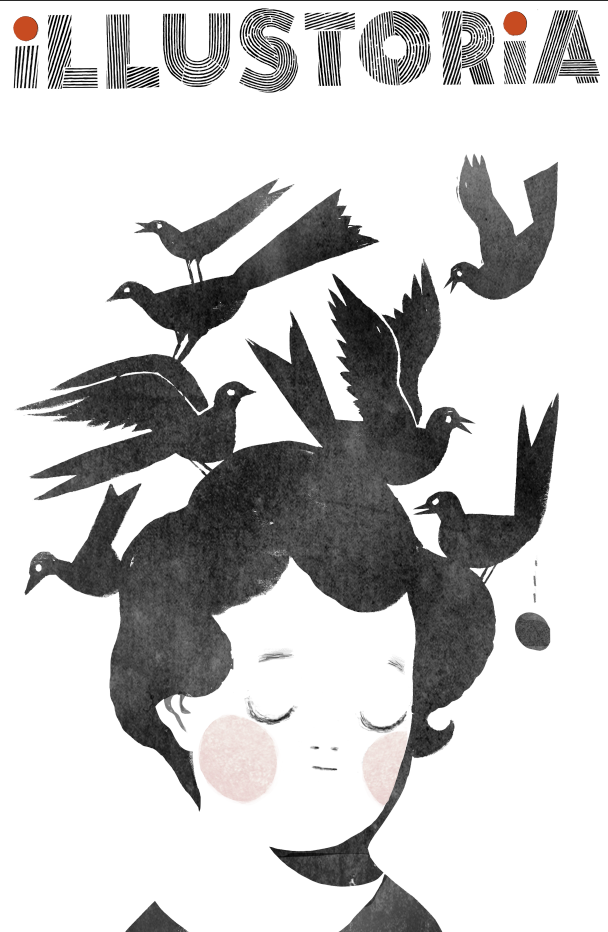
Lisa Brown cover art: The OUTSIDE-IN Issue

 
Issue 3 coming soon.... Cover art by Lisa Brown; Cover design by Elizabeth Haidle

Issue 3 coming soon.... Cover art by Lisa Brown; Cover design by Elizabeth Haidle


We are so pleased to reveal our cover for issue 3, The Outside-In Issue, featuring delectably delicious, wondrously charming art by the amazing Lisa Brown!

As many of you picture book and comic fans know, Lisa is the creator of the ingenious Three Panel Book Review strips featured in The Rumpus, co-creator with Lemony Snicket of The Latke Who Couldn't Stop Screaming, author/illustrator of the hilarious Baby Be of Use board book series, and author/illustrator of her very latest, The Airport Book. Needless to say we've had a creator crush on Lisa Brown for some time....

So when a few months ago Lisa graciously took a morning out of her busy schedule as a writer, illustrator, teacher, mom, and passionate kid-lit advocate to meet with me at one of her favorite cafes in San Francisco, I was beyond excited and a little nervous. I knew through her work that she was exceedingly intelligent and bitingly witty. Being the warm and generous person that she is, Lisa immediately put me at ease. I should have known--after all, those who work in children's books generally are a kind-hearted bunch! Lisa shared with me her thoughts on why it's important to cultivate creativity in kids through that excruciating, self-conscious phase around the middle school years, the range of diverse picture books on her syllabus at CCA, the challenges that women illustrators face in the publishing industry, and she even gave me a sneak peek of her upcoming picture book. (Psst...interview with her and her elusive co-author to come in issue 4!) By the end of the meeting, she sent me along with a list of fabulous artists to contact and agreed to create cover art for an upcoming issue. I was totally blown away...and so grateful, and excited!

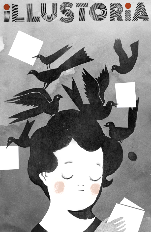
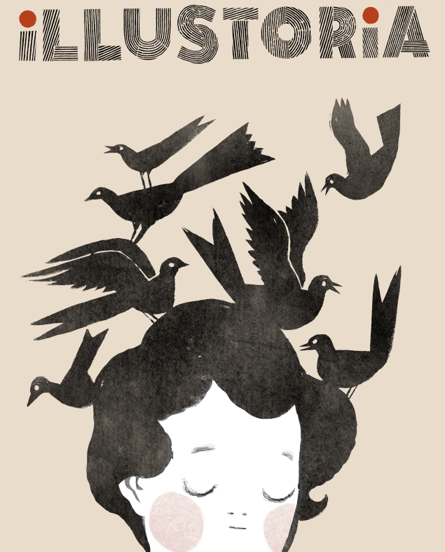
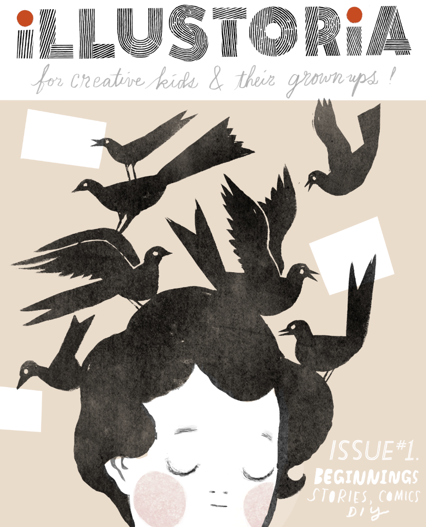
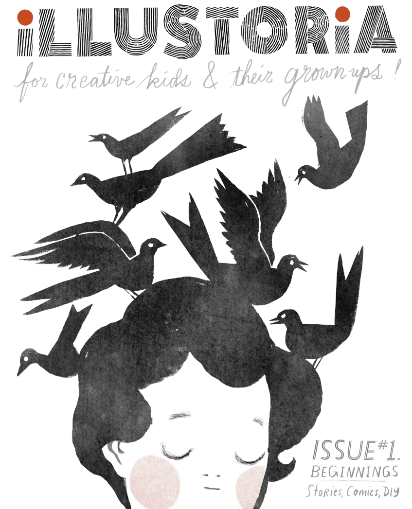
Now, here we are several months later with a gorgeous cover by Lisa that speaks volumes about what we at Illustoria care most about: timeless, captivating art with a unique point of view that resonates across generations; the value and delights of print publishing; the power of illustration; our ever-lasting love for visual storytelling. And how cool is this take on the swallowed-whole dilemma from Little Red Riding Hood??! Just wait until you see her back cover....

Thank you, Lisa, for your fabulous contribution to The Outside-In Issue!!

Inside you'll also find Lisa's sketchbook tips to aspiring artists. Truly the inside of issue 3 is just as delectable as the outside, with contributions by an array of lovely artists and writers whom we couldn't have pulled this off without, including: Nina Chakrabarti, Amy Novesky, Paul duCoudray, Micah Player, Willie Real, Elizabeth Haidle, Ruth Kneass, Mike Dutton, Alexis Joseph / Case for Making, Britt Browne, Claire Astrow, Yuliya Gwilym, Alexandra Rose Franco of Rito-ito, Rachel Garrison, Kristen Solecki, Clark Jackson, Martin Cendreda, Anne Pomel, Karl Dotter, and Jeremy Anderson. More sneak peeks to come so follow us on Instagram to see the latest updates. 

Here's a look at #3's table of contents, and be sure to check out our Shop page to see sample spreads from this issue and to pre-order. We'll send out copies in March 2017. 

 
The Outside-In issue's table of contents. So much good inside....

The Outside-In issue's table of contents. So much good inside....


I hope you enjoy this issue as much as we loved putting it together. 

Lastly, thanks to Sakura of America and Case for Making for sponsoring issue 3!

Immersed in Under Water, Under Earth + Q&A with the Creators


Under Water, Under Earth by Aleksandra Mizielinska & Daniel Mizielinkski, published by Big Picture Press, an imprint of Candlewick Press.


Internationally renowned illustrator duo Aleksandra Mizielinska and Daniel Mizielinski are back at it again with the tremendous Under Water, Under Earthwhich just released and is in stores today. The Polish couple are founders of their creative incubator Hipopotam Studio and are the masterminds behind children’s books Welcome to Mamoko and Maps. Their immersive art, always teeming with color and information, is captivating for kids and parents alike--making them a favorite here at Illustoria.


In Under Water, Under Earth the Mizielińskis continue the encyclopedic theme of their past work Maps with a visually explosive double-sided book that explores the worlds that exist beneath the surface. Readers traverse their journey by starting from the surface and making their way down, beginning with earthworms and ending with the Mariana Trench, the lowest point of the ocean. The book’s organization is playfully idiosyncratic, hopping from root vegetables to subway train stations to tectonic plates. 


Flip the pages and you’ll see each topic is stuffed to the brim with astonishing factoids, wildly vibrant illustrations and imaginative diagrams. The Mizielińskis offer an otherwise impossible look into the coolest things out there, like a train tunnel being gorged out of a mountain or boreholes that go 7.5 miles beneath earth’s surface. What’s even more astonishing is its breadth--the Mizielińskis seamlessly bring together ecosystems, technological processes, natural phenomena, physics and history. It’s easy to get lost in the artists' distinctive cartoon style, which is highly detailed and, given a second look, secretly mischievous.


You and your ever-curious youngin’ will want to devote an entire afternoon digging into this masterpiece. And don’t be mistaken, this isn’t a cool fact book your kid will read once and then tuck away forever in the closet. Rather, this enormous atlas is one they’ll want to return to again and again, each time to learn a new, mind-boggling fact. We were fortunate enough to get an interview with Daniel Mizielinski, thanks to Phoebe and Jean at Candlewick Press...so read on!

Q & A with Daniel Mizielinski 

Can you talk about the research process for your books?

We follow information on internet sources, and check them with real people working in the field. After that, there are usually two or three or four specialized editors—we have a biologist, someone from construction, and so on, reading pages with images and text and they’re finding mistakes that we correct.

How do you find these experts? 

They may be editors for other publishing houses, or in one of our books we had a physicist from CERN who’d done a book about space exploration and physics. Every person is just six Facebook or Twitter friends away, it’s really true. Whenever I can’t find someone, I just throw a question at my Academy of Fine Arts net of students, and within a day I have answers.


Please describe your roles in working together on your books. 

In every book we have both text and images created by me and Ola. It’s hard for me to define how exactly we do that because it’s so seamless we don’t really think about it. We met at the first year of college and we learned how to design and created our first commercial, [bad] projects together and learned from our mistakes. We just know each other so well. 

What is your drawing process? What mediums do you use?

Everything you see is drawn on paper and then usually colors are created in computer. And of course all the layouts are done on computer. But we always start on paper. We design both video games and books, and even with games we do sketches by hand. Usually a lot of assets are drawn by hand. 


I think this is because the education process in the arts schools in Poland is different than in the US. In the US you have this very narrow specialization, and in Poland you go through everything, from the very traditional 16th-century graphics—I had two years of making fresco and other ancient techniques—through design, type design. On the side we are both programmers. There’s a lot of diversity. It’s good because you can always change what you do. If you have a low budget [for a commercial project], you don’t have to hire an illustrator.

Do you think that’s why there’s such creativity today in Polish children’s books?

There’s always been that creativity. The problem was that in the 90s, after Poland regained its independence and the capitalism came in, all those great old publishers didn’t know how to work in the new reality. Before the ’80s or the ’90s, all the books in Poland were published in runs of hundreds of thousands…. The ’90s were a period when people were adjusting to a new reality. We had a lot of great products, but we had a lot of cheap products. After [the collapse of the big publishing houses], small publishing houses started to pop up, created by two or three people, like our publishing house, Dwie Siostry. When we came to them, it was 2007, we’d just graduated from college, and they had like two books. We started working with them when they had this moment where they knew what they were doing but they still hadn’t sold a lot of rights to their own books.

Maps is another gorgeous, large-format book by the authors that flaunts an incredible breadth of information about the world and its inhabitants through detailed illustrations and hundreds of fascinating facts.

Discover something new as you draw, color, and doodle your way around the globe in the Maps Activity Book

Here, because Poland is so much smaller than the US, the only way to make a living making books for children is to sell foreign rights. So Dwie Siorstry were the first ones to do this huge leap. This is the main reason we could abandon making any commercial projects and just do books and games, and they can have this greater reach and publish good books that are also not expensive in Poland…It’s very important here to keep the low price, because you don’t want to create exclusive books that are printed in low runs that designers want to put on their bookshelves. You want to create books for kids that are not only in the center of Warsaw but also in low-income areas. Those books are designed to be really for kids. Not just a trophy for us as graphic designers to create these achievements. We are lucky to have this publisher. It’s great to see your book in a library in a school where maybe students don’t have as many opportunities.

It sounds as though you’re driven to make sure that your books reach kids.

I hear from a lot of writers, not just designers but writers, that writing a book for children is something like a lesser task for a writer, right, it’s better to write some nonfiction for adults, you know what I mean? In Poland, when you look at illustrators and graphic designers, it was never like that. All the great designers, the famous Polish designers, they all did books for children; in the academies, in the art schools, books for children were always one of the most interesting topics. 

Throughout my childhood, all of those books were designed really, really well. I was lucky enough to be taught by some of the teachers who created some of those books, because they’re still alive—because I’m not that old—and it was a great experience. I don’t know if it shaped this consciousness that you need to design for kids or something like that, but I think it’s shaped this idea that a book can be a really great experience. 

Another captivating series by the authors, equally entertaining and scrumptious for kids and grownups. 

Another captivating series by the authors, equally entertaining and scrumptious for kids and grownups. 

Every one of our books is written using those two languages: one is words, one is images. We treat the visual language on the same level as written language, and we try to be careful that those two are not mirroring each other. The worst thing in my opinion an illustrator can do is when there’s a text says, “Mary’s going through a forest,” and you’re just drawing a regular Mary who is walking through a regular forest, and maybe there’s a blob of green for the trees. The best thing you can do is interpret a text and add things that are not in the text. We always try to do that, because it works great in educational books to write that way. If you can convey something much quicker using images, then why use a text?

How have your own children, twins who will be two in January, shaped your work? Do they like your books?

Thankfully, all of our books that we show them are working as designed. As I said before, we want the books to go directly to children, not to designers, that’s true—but while we’re making a book, we don’t think about those children. It’s funny but we make as good a book as possible [for ourselves], back when we were children or now. We were lucky enough that our idea of a good book is similar to a kids’ idea of a good book. 


One more from Under Water, Under Earth.


We always treat children as adults who just have less knowledge. In the Polish language, there is this tendency, I don’t know if I know the correct term in English, [diminutives]— there is a “cat”, and there is a “kitty.” In Poland, you can say stół, a table, you can say stolik, like a small table, and you can say everything in this manner. A lot of the people who write for children are using this super-childish and stupid language. A lot of people who talk to their children also use this language—you know, because they’re children. In Polish, it’s very easy to do that. [Aleksandra and I] never use it. It’s called zdrobnienie—making something smaller. We never do that. We never do that. We never do this, in the language layer of our books or in the layer of knowledge. 

If we're writing about radiation for kids, we say, ‘OK, the kid who is reading this book is about 9 years old. What else about radiation can I explain or omit? Will they ignore it or skip ahead?’ This is the only consideration. It’s not: ‘Can I tell them about radiation, it’s a hard topic?’ Yes I can. Only maybe you have to fill some knowledge gaps for them. But this is true for every human being. So you can write about anything you want. 

Instagram followers: go to @illustoria_mag and enter to win our Under Water, Under Earth giveaway! 

Creator Crush – Illustrator Edition


The First Warm Spring Day. Copyright © Phoebe Wahl 2015. 

When I’m not painting, snacking, watching reruns of Curb Your Enthusiasm, or having the time of my life at Illustoria magazine, I spend my days surrounded by children’s books. Specifically, at Mr. Mopps’ Children’s Books, one of the finest bookstore establishments in the Bay Area (if not America, the World, Universe, etc). As an artist and lover of beautiful things, my favorite picture books often tend to be the ones with jaw dropping-ly cool illustrations (that is unless it’s The Book with No Pictures by B.J. Novak). So it’s with great joy that I share my current illustrator favorites with you. I’ve also included some really awesome up-and-coming artists who haven’t published a children’s book yet, but I really hope they one day do. I hope this list inspires you to visit your local bookstore and support these stellar artists.  

1. Phoebe Wahl

Phoebe Wahl is my all time favorite illustrator at the moment. Working in various mix media from collage to watercolor and color pencil, all of Wahl’s creation are lush, whimsical, and filled with a love nature. The artist grew up in Washington and graduated from RISD in 2013 before plunging into the illustrator world. Her very first children’s book, Sonya’s Chicken’s is so wonderful-- I recommend it to everyone who comes into Mr.Mopps’. It tells the story of a young girl named Sonya who takes enormous pride in caring for her chickens. When one of her hens is killed by a neighborhood fox, Sonya learns an important lesson about the cycle of life and how to cope with loss. With gorgeously textured collage materials, rich colors, and folk inspired images, Sonya’s Chickens is a truly mesmerizing, heart warming tale you’ll want to reread again and again. It’s no wonder this book was the recipient of the Ezra Jack Keats award for new illustrators!  I’m greatly anticipating Wahl’s next children’s book and whatever spectacular creation she spins up next. You can check out her work at http://www.phoebewahl.com/

Cover of Sonya's Chickens. Copyright © Phoebe Wahl. Published August 2015.

Interior page of Sonya's Chickens. Copyright © Phoebe Wahl. Published 2015. 

2. Isabelle Arsenault

Isabelle Arsenault is a Canadian illustrator who has worked on over ten children’s books, each more wonderful than the next. Most recently, she illustrated Cloth Lullaby a tale of the life of world famous contemporary artist Louise Bourgeois, written by talented local author Amy Novesky. What I find stunning about Arsenault’s work is how she seamlessly integrates watercolor and pencil line work to create immersive, often extremely pattern-filled scenes. 

Cover of Cloth Lullaby. Copyright © Words by Amy Novesky, Illustrated by Isabelle Arsenault. Published 2016. 

Interior page of Cloth Lullaby. Copyright © Isabelle Arsenault. Published 2016. 

Though her style has a sense of innocence and child-like wonder to it, Arsenault isn’t afraid of depicting a darker side. In her graphic novel Jane, the Fox, and Me Arsenault dramatic compositions and devilish character portrayal illustrate the anxiety and angst that we all go through as early teens. More of her work can be found at http://www.isabellearsenault.com/

Interior page of Jane, the Fox, and Me. Copyright © Isabelle Arsenault. Published 2013.

3. Esme Shapiro

Esme Shapiro’s work is delightful, fresh, and filled with curiosity. Similarly to Phoebe Wahl, Shapiro is a RISD grad who just published her first children’s book, Ooko. In this amusing tale, a fox named Ooko who has it all, except for a very best friend. So it goes off an adventure to find a companion but instead gets mistaken as an old lady’s dog. Filled with whimsy, flora, and fauna, Ooka is an easy favorite. Shapiro has many many more imaginative, Maria Kalman-esque pieces on her website http://esmeshapiro.com/

Cover of Ooko. Copyright © Esmé Shapiro. Published 2016. 

Page of Ooko. Copyright © Esmé Shapiro. Published 2016. 

4. Joohee Yoon

Joohee Yoon is a printmaker whose work never fails to amuse and inspire me. She has illustrated two children’s books, The Tiger Who Would Be King and Beastly Verse, as well as House Plant an art book about plants that outgrow their owners. You might also recognize her work as being a frequent feature in the New Yorker and New York Times. With wonderful overlapping colors and wonderful oversized cartoon characters, Yoon’s work overflows with vivacity and humor. If you’re as big of a fan as screen printing as I am, (or even if you’re not!) her illustrations will tickle you in all the right places. You can check out more of her striking work on her website http://jooheeyoon.com/index.html

Living Things interior spread. Copyright © JooHee Yoon. 

Interior page of The Tiger Who Would Be King. Copyright © JooHee Yoon. Published 2015.

Interior Page of Beastly Verse. Copyright © JooHee Yoon. Published 2015.

5. Sally Nixon

Sally Nixon, an illustrator working from Little Rock, Arkansas is one of the raddest artists around. Though she hasn’t come out with any children’s books yet (I hope she will soon!), she’s an honorable mention on this list because she’s without a doubt my creator crush. Nixon lovingly depicts the mundane moments in an average girl’s life, like eating late night snacks of chocolate cake, brushing your teeth in the shower, scrolling through instagram, or simply sitting on the toilet. By giving these often overlooked moments extra attention with delicate marker coloring and detailed penmanship, Nixon makes the everyday special. Her illustrations have a feeling of voyeurism, as if for spectators to see what women do when no one’s watching. At the same time, the contemplative boredom Nixon depicts makes her characters so relatable and well loved. Visit her website at http://sally-nixon.squarespace.com/.

Copyright © Sally Nixon. 

Copyright © Sally Nixon. 

Copyright © Sally Nixon. 


Claire Astrow is a publishing assistant at Illustoria and a recent grad from UC Berkeley as an Art Practice major. Check out her bio here and her illustrated work at claireastrow.com.

Process: Designing ILLUSTORIA's First Cover


Introducing...our cover for the premiere issue of ILLUSTORIA!

After a long cover design process during which we conceptualized, developed, reiterated and debated for many months, we had that "A-ha!" moment when we saw this version. We think it's contemporary and fresh with a DIY feel that speaks to who we are: a totally new kind of magazine for kids & grownups. 

As we worked on our cover, we asked ourselves: how do we spark the curiosity and interest of a 9-year-old and his or her parent? Will artists and writers find camaraderie? Will teachers and librarians see value? How do we stand out from the crowd with a single image and just a few words? 

It was a real identity challenge and pushed us to make an authentic statement about who we are and what we value through pictures and words—which is what our magazine is all about, after all. 

For those who want to get beneath the surface, here’s a behind-the-scenes look at the making of our very first cover. 

Step 1: Settle on a logo!

Our very first logo, which we still love and use sometimes. 

This is the logo we were very happy with for quite some time. Interestingly, when we applied it to a mock-up cover we learned that what worked on stationary and business cards felt out of sync with our visual aesthetics, which had evolved over almost two years of incubation and development. 

We wanted our logo to show off a DIY attitude and be, as one of our team members put it, “perfectly imperfect.” Our aim was to not stray too far off course from the original which, as mentioned, we were still smitten with.

Logo variant #1

Logo variant #1

Logo variant #2

Logo variant #2

Logo variant #3...which we really liked.

Logo variant #3...which we really liked.

We finally settled on a design close to the more understated original but with a bit of an edge. 

Final logo. We opted for the simplicity of b & w + red.

Final logo. We opted for the simplicity of b & w + red.

Step 2: Cover art!

We went through several really strong cover mockups that were quite beautiful. But beauty isn’t everything and we needed to make an instant connection on an emotional level too. That happens through tone, mood and an original voice which can be really hard to pinpoint. We wanted to say to our readers-to-be, “This is good stuff. We have something unique to offer you. Look and linger a while.” Even, “You and I—we’re gonna become quick friends, I can tell.”

The experiment that inspired our cover art.

The experiment that inspired our cover art.

It's strange how you sometimes find inspiration--or rather, it jumps at you--when you least expect it to. Our creative director, Elizabeth Haidle, was working on an ILLUSTORIA gift card. Out of convenience she used an existing piece of art to create a placeholder fake cover, meaning to swap it out later. But seeing the image and the logo together…something immediately clicked for us. A happy, happy accident.

I asked Beth to illustrate a young reader in the same pose, perhaps with a book in her hands. Within a day she came back with several cover options that instantly said to us, “Watch out, world—there’s a new kid (err, magazine) in town!”

These were gorgeous though I'm sad to say we ended up nixing the egg being laid in midair!

We experimented with a colored background and hand lettering. Along the way we corrected the trim size, which was off in the first iterations. See how minor details take time to finesse?!

Step 3: Integrating text and art

We experimented with showcasing our featured articles through words and pictures—sometimes only pictures. A high priority for us, as a magazine that celebrates visual storytelling, was to integrate the text callouts with the cover art in a way that worked together seamlessly. I didn’t want the text to feel secondary, and we certainly didn’t want the art to get cluttered by too much editorial content. It was important for the callouts to not be dry and overly informative. They needed to engage and appeal to both kids and grownups.

As much as we adored the thumbnail images, they distracted some from the simplicity and impact of our main illustration. It was a tough call, but ultimately the word balloons won out. We continued to futz around with the typefaces and hand lettering and even corrected a typo that had (admittedly) been overlooked for weeks, until we settled on...our winning cover!

Step 4: Make it look effortless


Our final cover


So get to it and spread the word! Order and subscribe to ILLUSTORIA and ask your local bookstore or shop about stocking it. You won’t be disappointed by all the good stuff in the packed 64 pages of each issue. We're just scratching the surface of what may become a wonderful, lasting friendship with all of you: our coveted readers-to-be. 

Who We Are: Elizabeth Haidle

Me & Eli

Me & Eli

Location: 

Portland, OR

Profession: 

Freelance artist & musical saw player (& Creative Director of ILLUSTORIA)


Favorite artist/illustrator: 

recent discovery: Nathaniel Russell; also Jillian Tamaki, Brecht Evens, Emily Carroll 

Best book you've read in the past year: 

Your Illustrated Guide to Becoming One with the Universe, by Yumi Sakugawa

Kids’ book you could read every night: 

What Was I Afraid Of?  by Dr. Suess

Best memory of being a kid: 

Dressing up as a ham sandwich for Halloween, made with scraps I scrounged from my dad's studio. My head stuck out of a bite mark at the top. I had a little trouble climbing on the bus & standing during the ride to school, but it was worth it. Absolutely zero other people were a ham sandwich that year. 

Favorite weekend activity: 

3-course breakfasts. Also anything involving a hammock.

 Song currently on repeat: 

"The Very Thought of You," by Billie Holliday; I just know everything's gonna be alright when Billie sings.

Favorite meal: 

Blue Star Donuts

Last time you made something with your hands: 

Accordian fold mini book entitled: 'Inner Donkey'

Patterned postcards using eraser chunks as stamps

Fun fact about you: 

I'm terrible at wrestling and my son always wants to, so I made up my own moves. One is called 'Cheek Pin', where you press the other person down by smushing your cheek really hard against theirs. Also they are maybe paralyzed by laughter, which helps. Another is called 'Cashmere Head Clamp' and requires one to be wearing a cashmere robe. Which I wear often.